
58 Kitchen Backsplash Ideas: Tile, Marble & Budget-Friendly Options
A backsplash is the smallest wall in the kitchen and the one people remember. It sits at eye level, catches the light, and takes every splash.
The right choice protects the wall and finishes the design. The wrong one leaves a beautiful kitchen looking unfinished.
This guide covers 58 kitchen backsplash ideas, from quiet classics to full drama. Each one names the material, the grout, and the pairing that makes it work.
Read straight through, or jump to the section that matches your style. Then take one idea to your tiler or fabricator and ask what it costs in your room.
Every idea is written in short, plain notes. That makes it easy to copy the details into a quote or a shopping list.
Timeless White and Marble Looks
Start with the finishes that have already proved themselves. White tile and pale marble still win because they never fight with the rest of the room.
These walls are the safest choice for resale and the easiest to restyle later. Add colour through cabinets, brass, and timber instead.
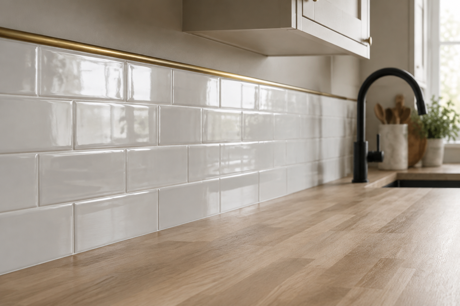
Glossy White Subway Tile with Brass Pencil Trim
Nothing beats glossy white subway tile for pure, honest shine. It has held its place in kitchens for more than a century.
Run a slim brass pencil trim along the top edge instead of a wooden rail. That one line lifts the wall from standard to custom.
Choose a light grey grout rather than bright white so the grid stays readable. A two millimetre joint keeps the surface calm.
It is budget friendly and easy to wipe down. It also suits both modern and traditional rooms, which is why it never dates in photos.
MATERIAL Glazed ceramic · PAIRS WITH pale oak counters and unlacquered brass
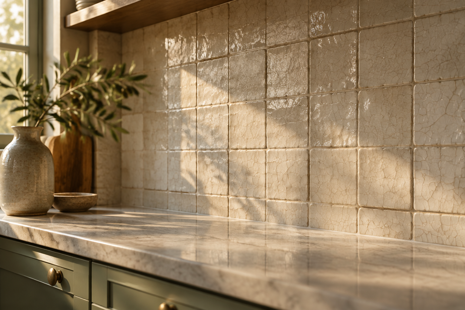
Handmade Crackle-Glaze Ceramic Tile
Crackle glaze gives a wall the quiet look of old porcelain. Fine crazing lines appear across each tile and catch the light.
Every tile is pressed by hand, so the surface sits slightly uneven. That small imperfection is exactly the point.
Warm off-white tile works well with sage or olive cabinetry. Use an off-white grout so the pattern reads softly.
Seal the glaze if the wall sits behind a heavy cooking zone. It costs more than standard tile but rewards you every day.
MATERIAL Crackle-glaze ceramic · PAIRS WITH sage or olive cabinets and honed marble
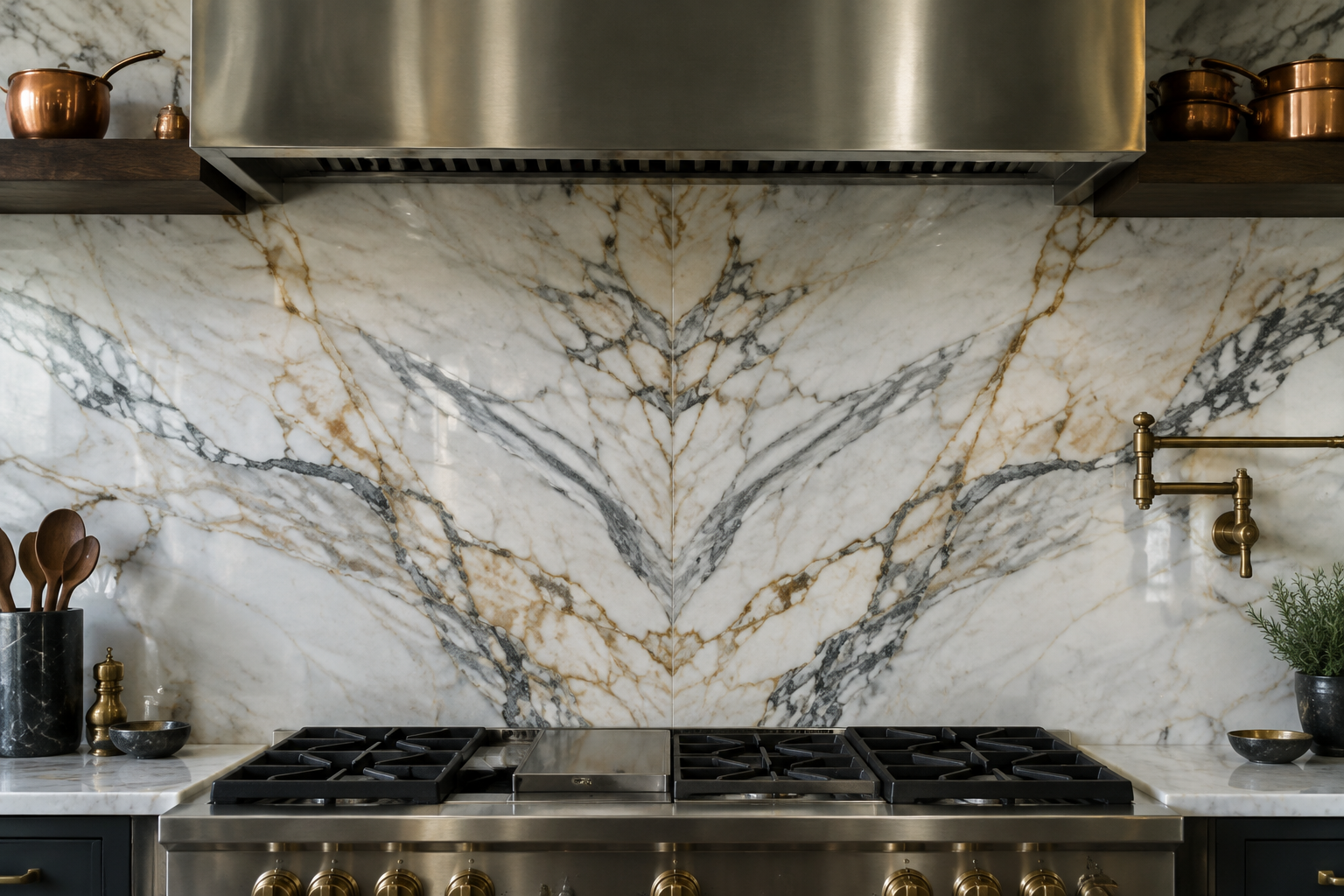
Book-Matched White Marble Slab
A book-matched slab is cut, opened like a book, and joined at the centre. The veining then mirrors itself into one dramatic image.
This is the fastest way to make a kitchen look like it belongs in a magazine. No grout lines interrupt the picture.
Ask your fabricator to dry-lay the slabs before cutting. Vein matching is a decision made by eye, not by order form.
Seal marble twice a year if you cook with turmeric, wine, or citrus. It is a soft stone, so treat it with respect.
MATERIAL Polished marble slab · PAIRS WITH dark walnut shelving and copper accents
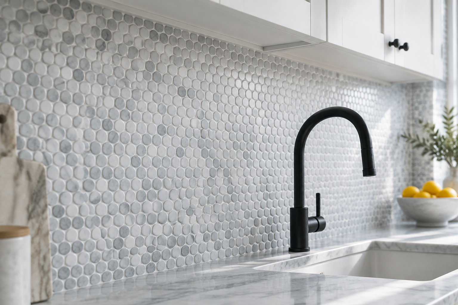
Marble Herringbone Mosaic
Small marble strips set in herringbone add movement without shouting. The pattern is old, but the small scale feels current.
Use honed marble rather than polished for a softer, less glossy look. A pale grey grout keeps the zigzag crisp.
Herringbone suits narrow walls where a large slab would look stretched. It also hides small measuring errors very well.
Clean it with a pH-neutral spray and keep acidic cleaners away from the stone. That care keeps the surface bright for years.
MATERIAL Honed marble mosaic · PAIRS WITH white shaker cabinets and warm brass
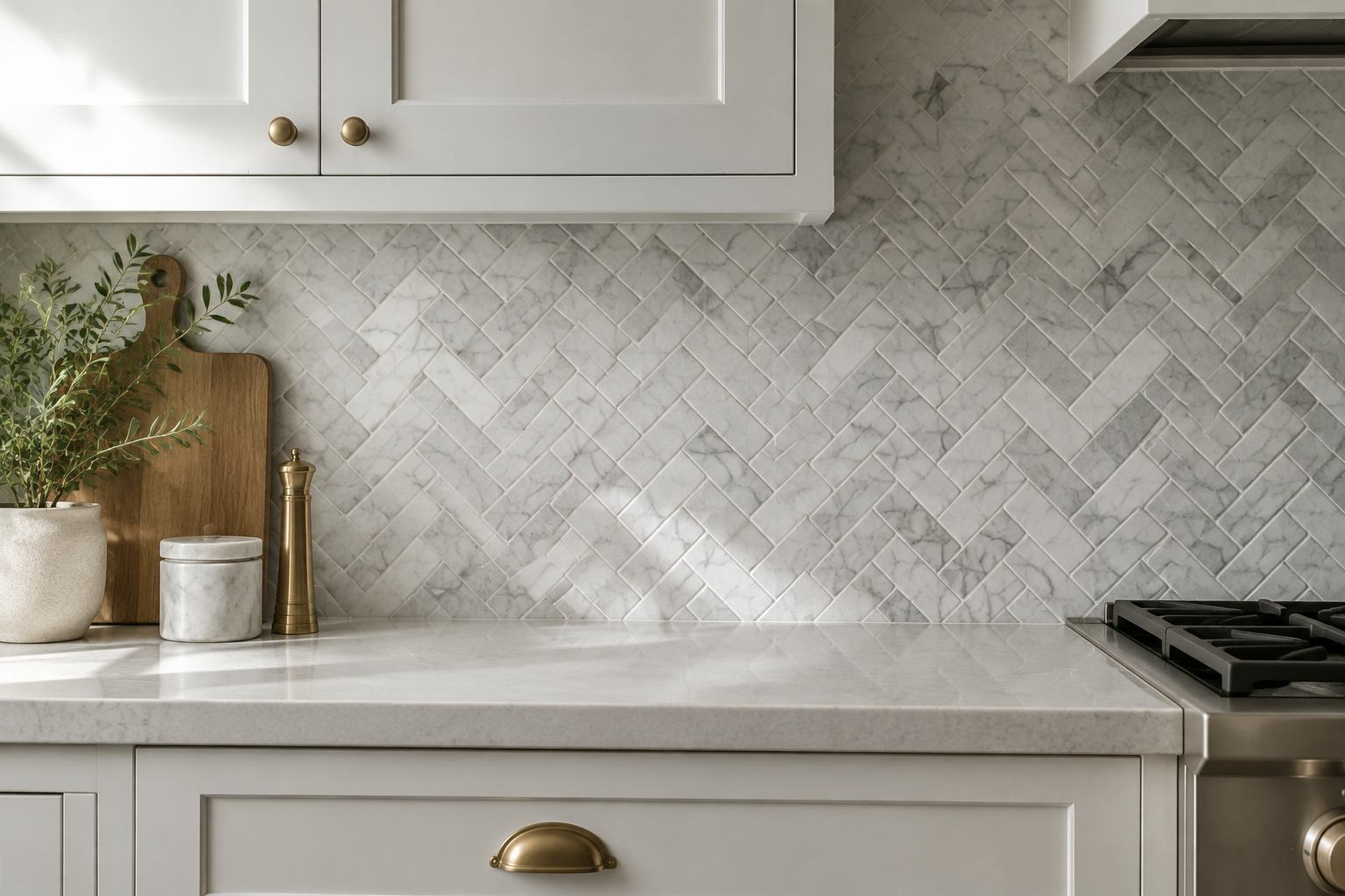
Matte White Square Grid
Matte white squares give a soft, paper-like wall with almost no glare. Under-cabinet lights glow gently instead of sparkling.
A ten centimetre square in a straight grid looks calm and architectural. Keep the grout half a shade darker so the grid stays visible.
This finish hides water marks better than gloss and photographs beautifully. It is a favourite in minimal Scandinavian kitchens.
Matte surfaces want a microfibre cloth rather than a scrub pad. Gentle cleaning keeps the finish even over time.
MATERIAL Matte ceramic · PAIRS WITH charcoal base cabinets and brushed steel
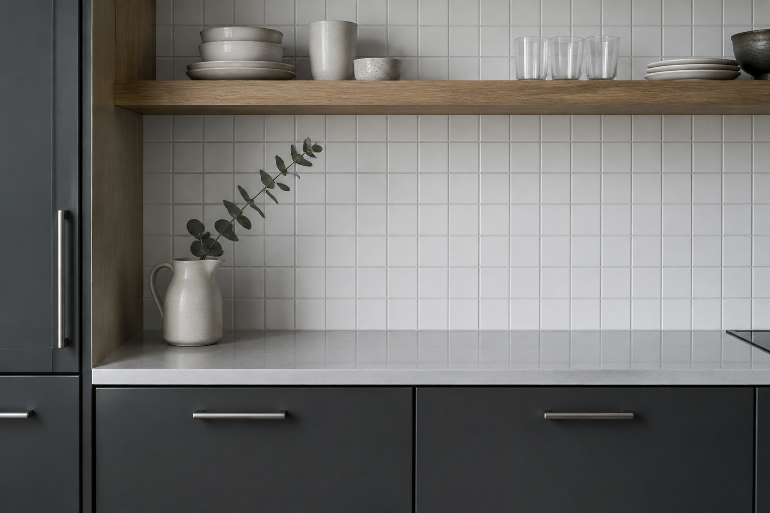
Beveled Subway Tile with Charcoal Grout
A beveled edge catches a thin line of light on every single tile. Charcoal grout then turns that line into a fine graphic outline.
The result reads as high contrast without adding any colour to the room. It looks sharp against navy, black, or deep green cabinets.
Beveled tiles need a slightly wider joint so the profile stays visible. Ask your tiler to keep the joints perfectly straight.
This is a strong choice for busy family kitchens. The bevel hides small chips and the dark grout hides stains.
MATERIAL Beveled ceramic · PAIRS WITH navy or deep green cabinetry and brass fittings
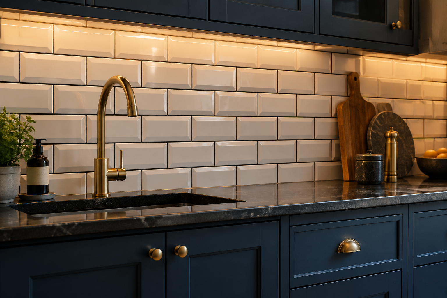
Carrara Penny Round Mosaic
Penny rounds bring a soft dotted texture that no large tile can copy. Carrara marble versions add gentle grey shading.
Use them at full splash height behind the hob for a quiet focal point. White grout makes the dots read as one soft field.
This mosaic bends easily around curves and window reveals. That makes it ideal for older kitchens with awkward walls.
Small tiles mean more grout, so seal the surface once a year. It is a small task that keeps the wall looking new.
MATERIAL Marble mosaic · PAIRS WITH white cabinetry and a black iron tap
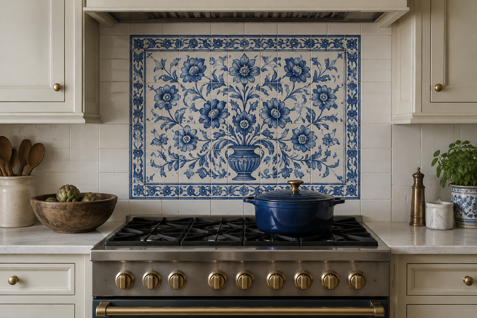
Hand-Painted Delft Blue Accent Tile
A single panel of hand-painted blue and white tile changes a whole room. It works like a framed artwork behind the range.
Keep the surrounding field tile plain so the pattern stays the hero. Cream cabinets and aged brass finish the picture.
Choose a panel sized to your hood width for a balanced look. Custom painters can match a motif you already love.
This look suits period homes and modern cottages alike. Expect a longer lead time because each tile is painted to order.
MATERIAL Hand-painted ceramic · PAIRS WITH cream cabinets and aged brass knobs
Modern and Minimal Surfaces
Full-height surfaces and almost invisible joints define this group. These are the walls that make a small kitchen feel calm and expensive.
The trick is restraint, so keep one texture and one colour across the whole plane. Let the precision do the talking.
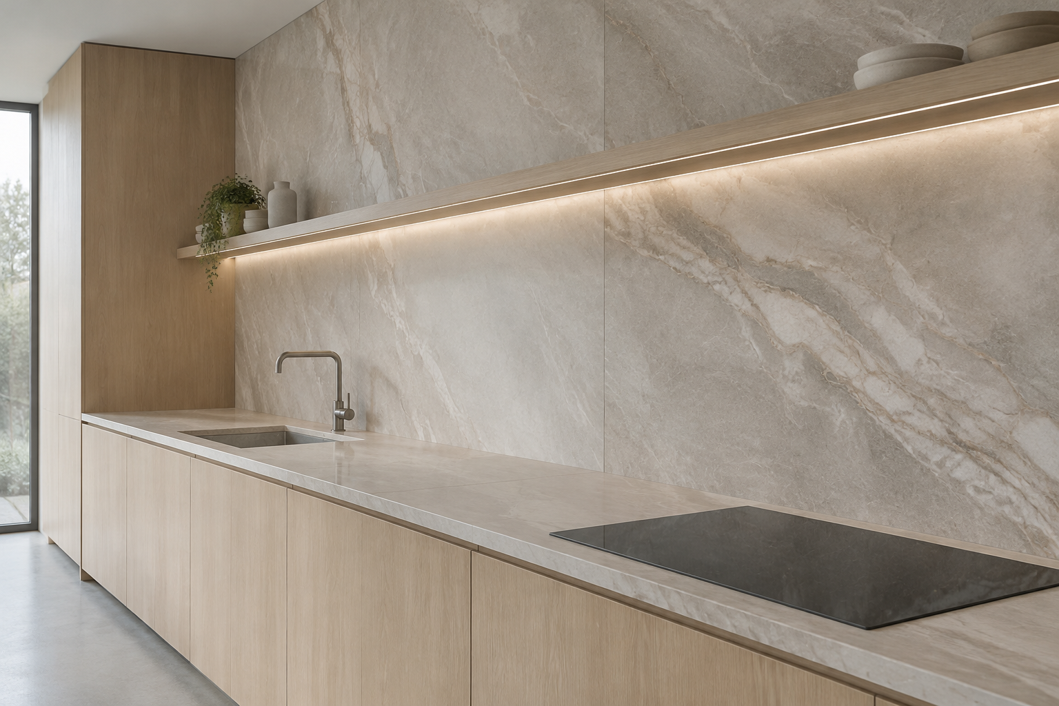
Full-Height Porcelain Slab
Large-format porcelain runs from worktop to ceiling with almost no joints. The wall becomes one continuous plane of stone.
Modern slabs copy marble, travertine, and concrete with real accuracy. They also resist stains better than natural stone.
Ask for a three millimetre joint and a colour-matched grout so the seams disappear. Book-matching two slabs makes the pattern flow.
Full height makes low ceilings feel taller and small kitchens feel wider. It is the most effective upgrade per square metre.
MATERIAL Large-format porcelain · PAIRS WITH handleless pale oak and linear lighting
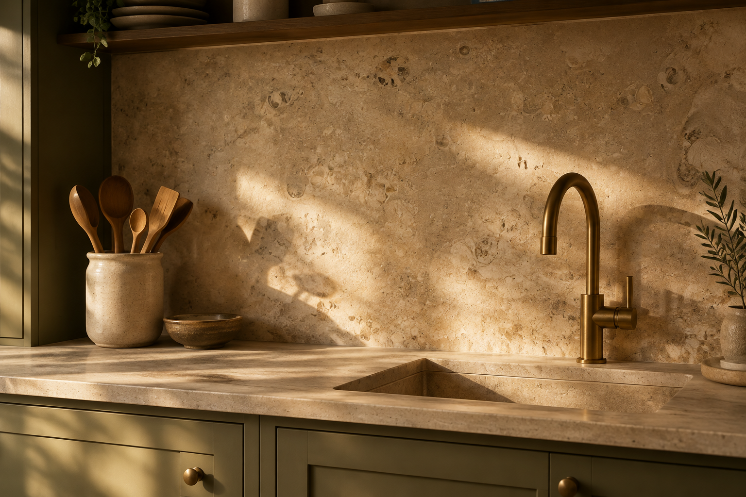
Honed Limestone Slab
Honed limestone has a warm, sandy softness that polished stone cannot match. Fine fossil speckles give it quiet character.
Pair it with olive, clay, or putty cabinets for a Mediterranean feel. Brass taps warm the palette even further.
Limestone is porous, so seal it before the first splash of oil. Re-seal every year if the wall sits behind the hob.
This finish works best in rooms with generous natural light. In dark kitchens it can read flat rather than warm.
MATERIAL Honed limestone · PAIRS WITH olive or clay cabinets and brass taps
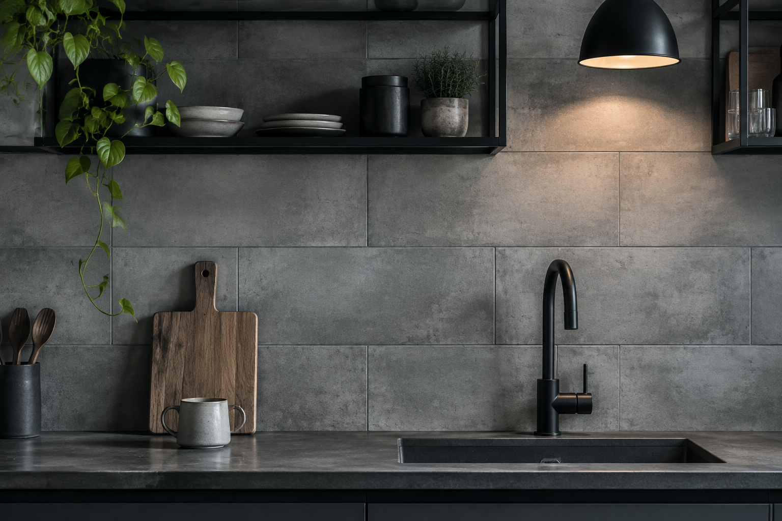
Concrete-Look Porcelain Tile
Concrete-look porcelain gives industrial texture without the weight of real concrete. It is tough, affordable, and easy to wipe.
Mid-grey tones look best beside black steel shelves and matte black taps. Add oak somewhere so the room stays liveable.
Choose a tile with subtle cloudiness rather than a flat grey. Slight variation stops the wall looking like plastic.
Use a dark grey grout to make the surface feel like one poured panel. This is a smart pick for loft conversions.
MATERIAL Concrete-effect porcelain · PAIRS WITH black steel shelving and matte black taps
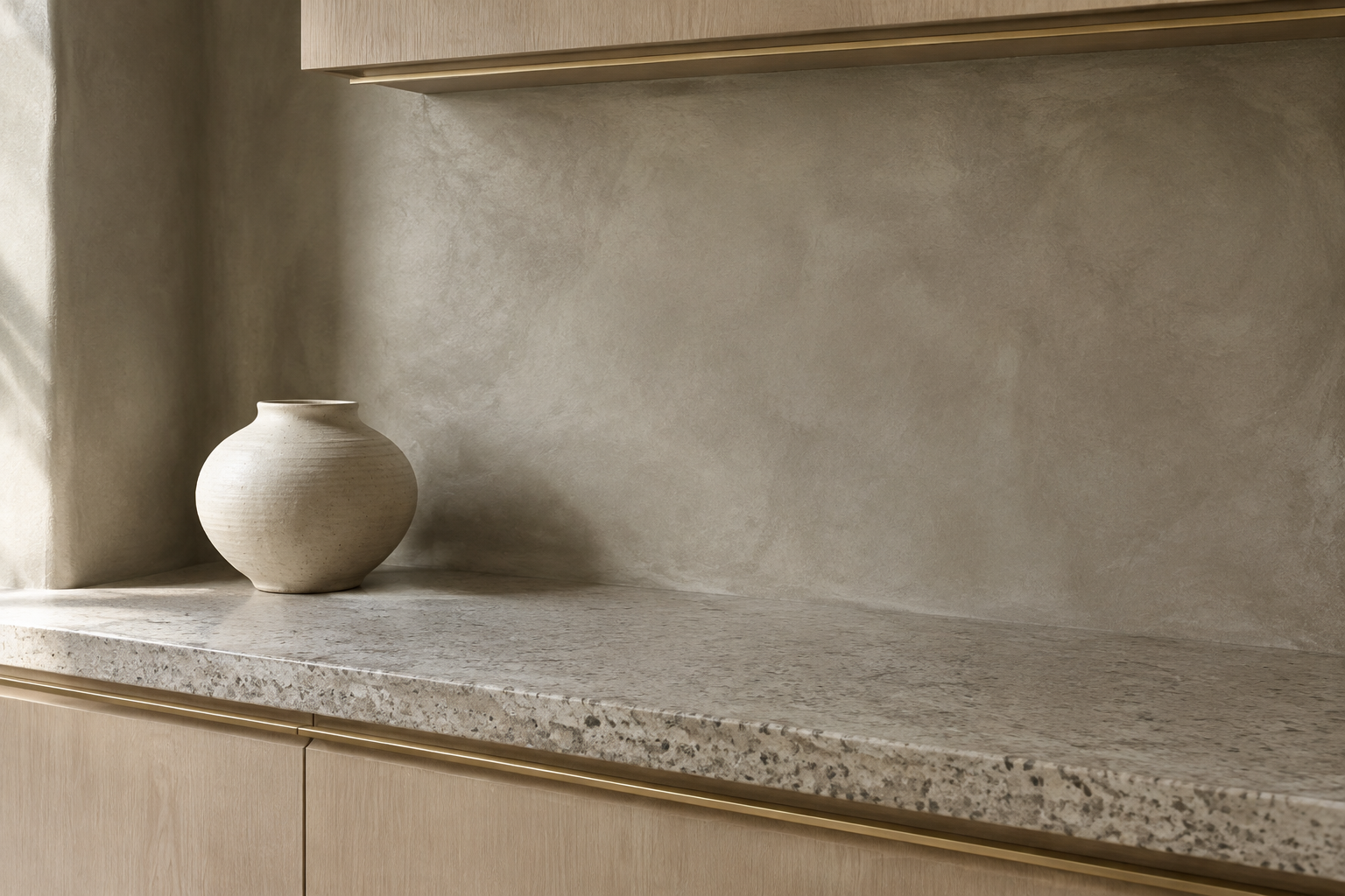
Troweled Micro-Cement Finish
Micro-cement is troweled on by hand, so it has no joints at all. The wall curves into corners as one continuous skin.
Warm greige tones look soft and expensive in daylight. Each wall also carries the faint record of the trowel.
This finish needs a skilled applicator, so ask to see past work. A poor job shows every wobble under raking light.
Seal it with a food-safe topcoat and wipe spills quickly. Done well, it is one of the most elegant minimal options.
MATERIAL Micro-cement · PAIRS WITH pale oak cabinets and speckled stone counters
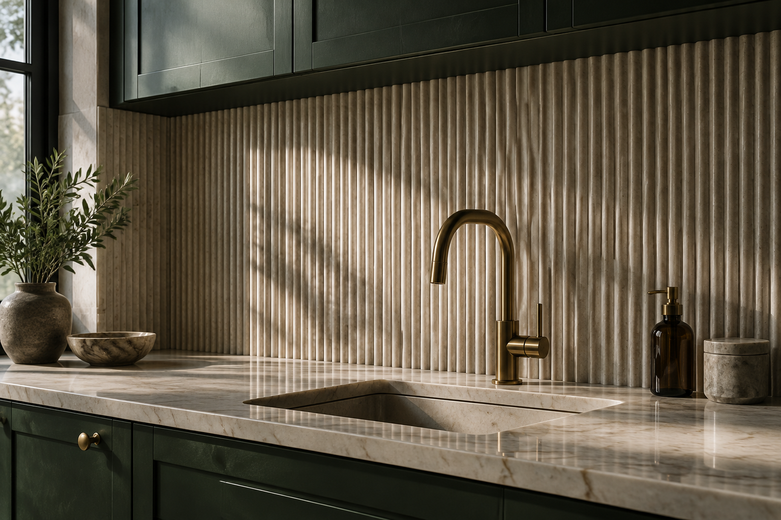
Reeded Fluted Stone Panel
Reeded panels turn a flat wall into a rhythm of light and shadow. Each vertical rib throws a soft line down the surface.
Pale travertine is the most popular choice right now. Marble and limestone versions look equally refined.
Place reeding behind open shelves so the texture reads at eye level. Keep the countertop simple to avoid competition.
Dust settles between the ribs, so a soft brush becomes part of the routine. The visual payoff is worth that small effort.
MATERIAL Fluted travertine · PAIRS WITH forest green cabinets and brass hardware
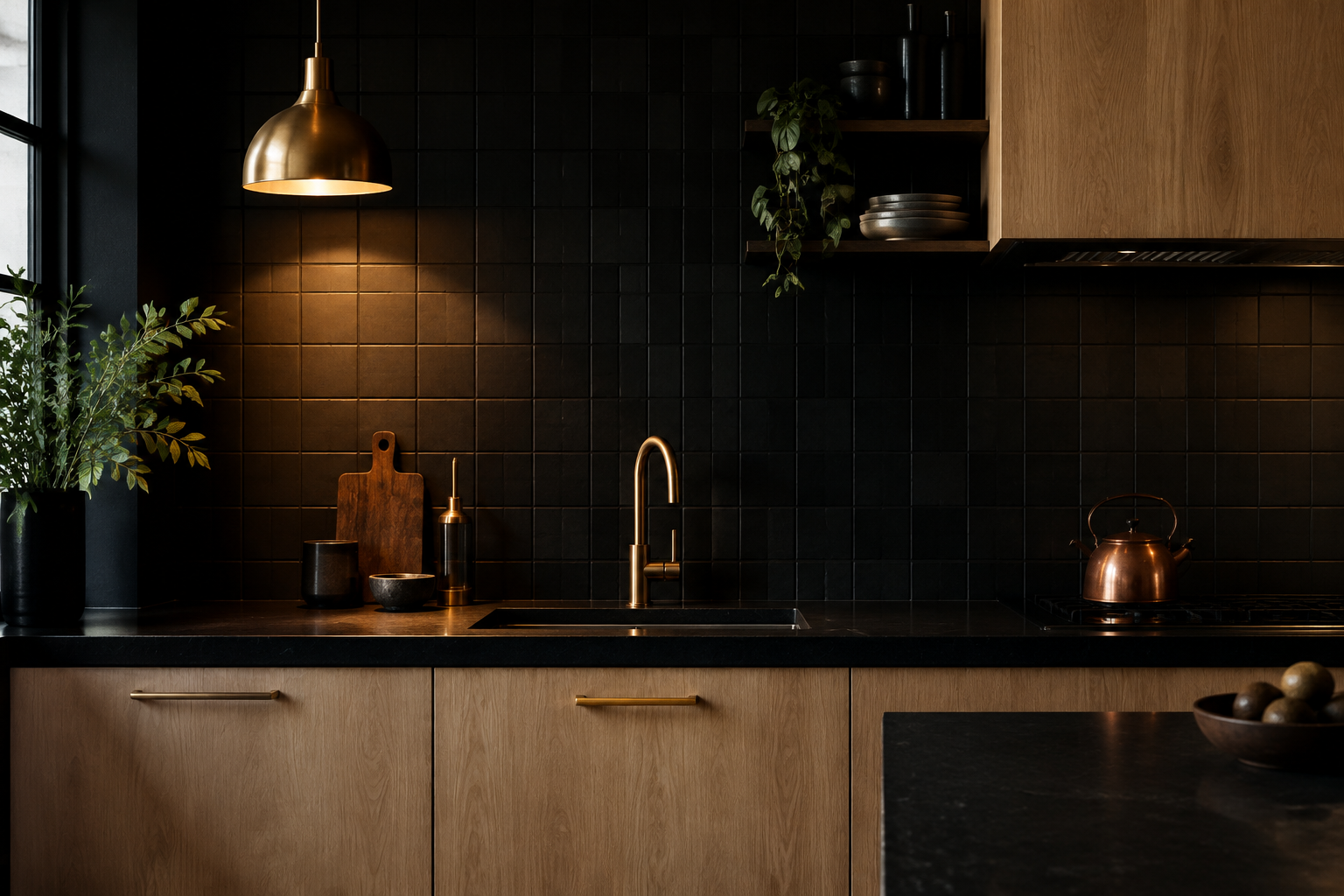
Matte Black Tile with Matching Grout
Matte black tile with black grout creates a deep, monolithic wall. Nothing breaks the surface, so the kitchen feels sculptural.
Pair it with pale oak or warm white cabinets for maximum contrast. Brass fittings add a single warm note.
Black walls absorb light, so plan two layers of task lighting. Under-cabinet strips and a pendant keep the counter usable.
This is the boldest neutral you can choose. It suits modern apartments and dark, moody kitchens beautifully.
MATERIAL Matte ceramic · PAIRS WITH pale oak cabinets and brass pendants
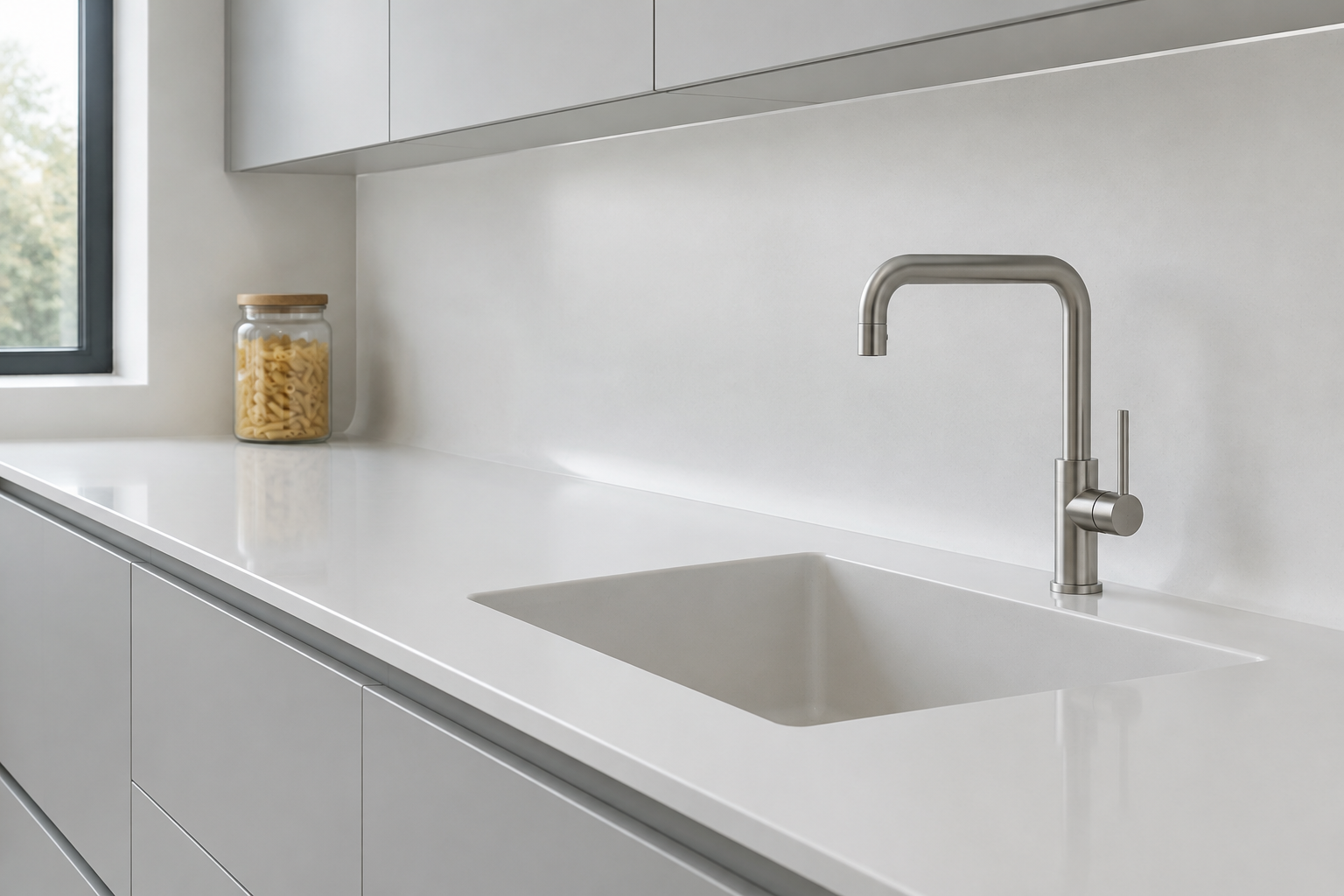
Seamless Solid-Surface Backsplash
Solid surface can be shaped with a coved join, so wall and worktop become one piece. There is no grout line left to scrub.
Warm white and pale grey are the most popular shades. Integrated drainer grooves and small shelves are easy to add.
The surface can be sanded back if it ever marks. That makes it the most repairable option on this list.
It suits busy households and anyone who hates cleaning joints. The look is quiet rather than dramatic.
MATERIAL Solid surface · PAIRS WITH pale grey handleless cabinets and slim steel taps
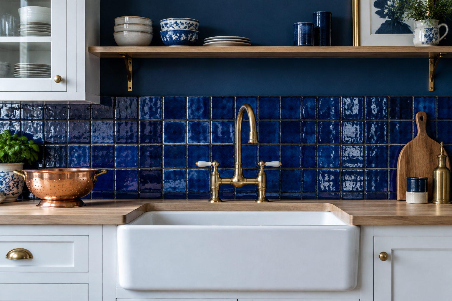
Vertical Stacked Kit-Kat Tile
Kit-kat tiles are thin fingers of ceramic laid in a tight vertical stack. The effect is ribbed, calm, and very current.
Vertical lines stretch the wall upwards and make low ceilings feel taller. Sage, bone, and soft grey are the safest shades.
Choose a tile with a slight glaze variation for depth. Straight stacking needs careful setting out from the centre line.
This is one of the most affordable ways to look designed. It also works well around awkward window reveals.
MATERIAL Kit-kat ceramic · PAIRS WITH cream cabinets and unlacquered brass
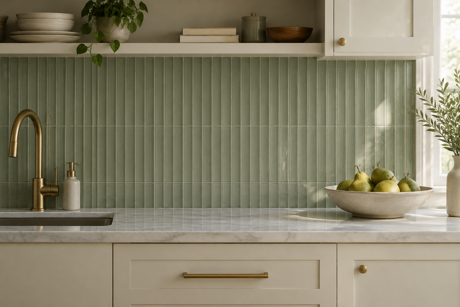
Slab Backsplash with Waterfall Wrap
A waterfall wrap carries the same stone from worktop to wall to side panel. The kitchen then reads as one carved block.
Quartzite and marble give the most dramatic result. A simple square edge keeps the detail modern.
Ask your fabricator to template on site after the cabinets are fixed. Small errors in the corner show badly on a wrap.
This is the most architectural statement on the list. It works best in open-plan rooms where the island is visible.
MATERIAL Quartzite slab · PAIRS WITH deep walnut cabinets and black steel pendants
Colour and Pattern That Stay Fresh
Colour is the fastest way to give a kitchen a personality. Pattern adds movement without adding a single piece of furniture.
Pick one bold element and keep everything else quiet. That is the rule that keeps a patterned wall from ageing badly.
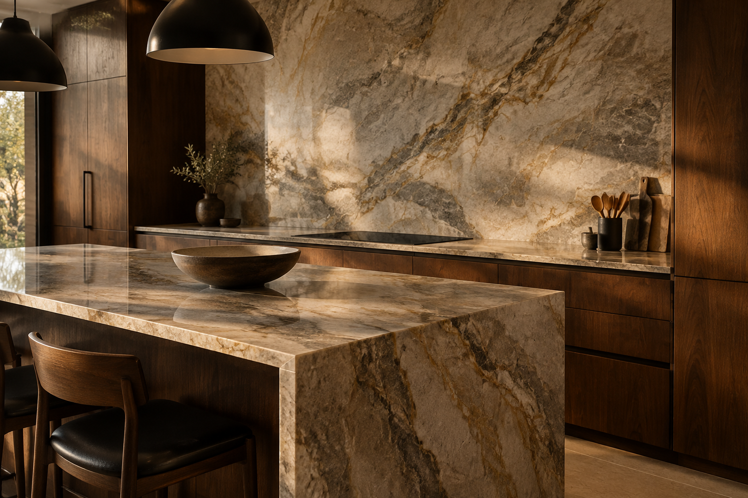
Emerald Green Zellige
Zellige tiles are handmade in Morocco and glazed unevenly by hand. That is why each one reflects light differently.
Emerald green is the shade that turns a plain kitchen into a jewel box. Brass and warm oak bring out its depth.
Use a thick pale grout and accept the uneven edges as part of the charm. Perfection defeats the point here.
Zellige needs sealing because the glaze is porous at the edges. Budget for extra material to allow for cuts.
MATERIAL Handmade zellige · PAIRS WITH warm oak cabinets and brass taps
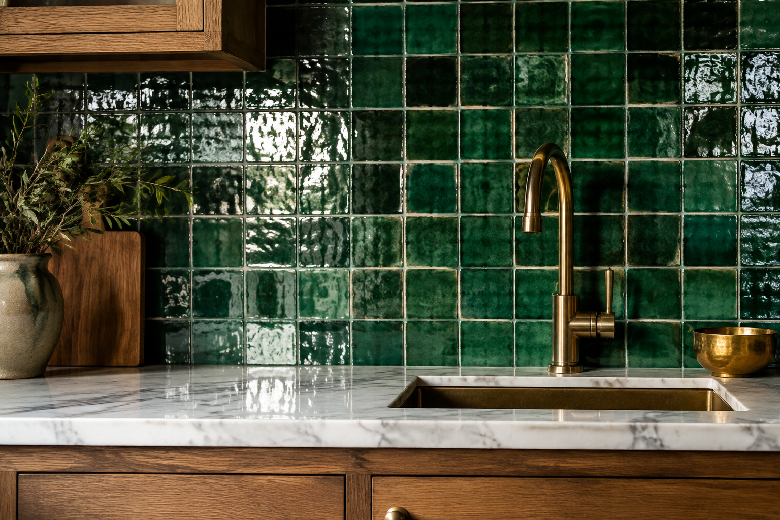
Cobalt Blue Handmade Tile
Cobalt blue tile brings instant confidence to a kitchen wall. It looks especially rich against plain white cabinetry.
Choose handmade tile with a glossy, slightly irregular glaze. That variation stops the blue from looking flat.
Use a dark navy grout so the grid fades into the colour. Brass taps and copper pots complete the palette.
Blue reads cool, so add warm wood somewhere in the room. A butcher-block counter does the job perfectly.
MATERIAL Glazed handmade ceramic · PAIRS WITH white painted cabinets and brass bridge taps
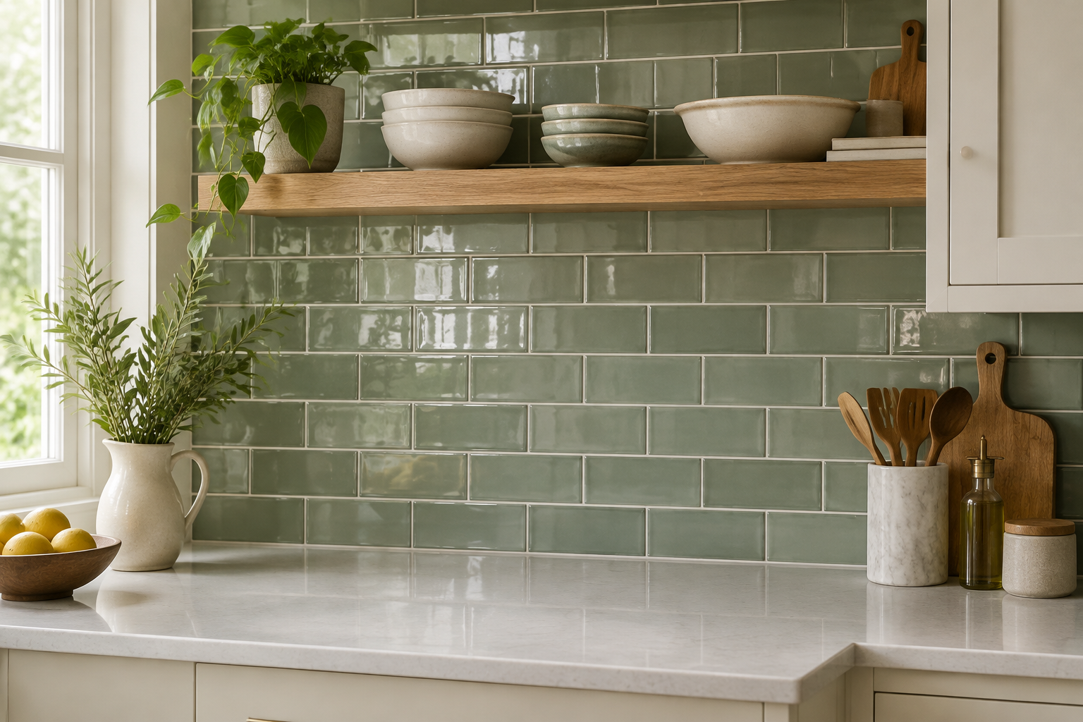
Muted Sage Green Subway Tile
Sage green subway tile is the calmest way to add colour. It feels natural, soft, and easy to live with.
Pair it with warm white cabinets and pale quartz for a fresh look. Brass hardware keeps the scheme from feeling cold.
A gloss finish works in smaller kitchens because it bounces light. Matte suits larger rooms with plenty of daylight.
This colour hides cooking splashes better than white. It is a practical choice that still looks considered.
MATERIAL Glazed ceramic · PAIRS WITH warm white cabinets and pale quartz
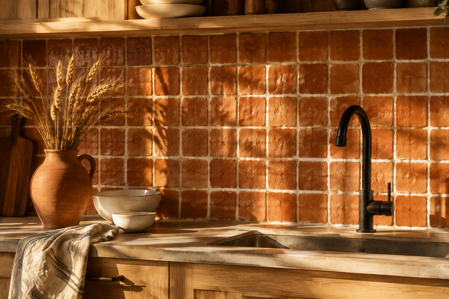
Terracotta Zellige
Terracotta zellige glows in late afternoon light like sun-baked clay. It brings a warmth that cool tiles simply cannot.
Pair it with pale oak, cream plaster, and black iron fittings. Add linen and ceramic for a Mediterranean mood.
Use a cream grout with a generous joint to celebrate the handmade edges. Keep the countertop pale and quiet.
This wall looks best in rooms that get real sunlight. In a dark kitchen, warm lighting can recreate that glow.
MATERIAL Handmade clay zellige · PAIRS WITH pale oak, cream plaster, and black iron
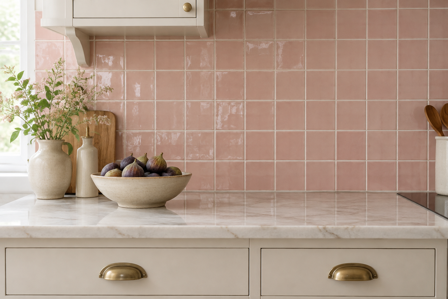
Blush Pink Glazed Tile
Blush pink is a softer route to colour than most people expect. In a satin glaze it reads warm rather than sweet.
Pair it with cream cabinets and brushed brass for a gentle, grown-up look. Pale marble adds a cool counterpoint.
Choose a straight grid so the colour stays the focus. Keep the grout white so the pattern feels crisp.
This shade suits period homes and small city kitchens. It also photographs beautifully in natural light.
MATERIAL Satin-glazed ceramic · PAIRS WITH cream cabinets and brushed brass cup pulls
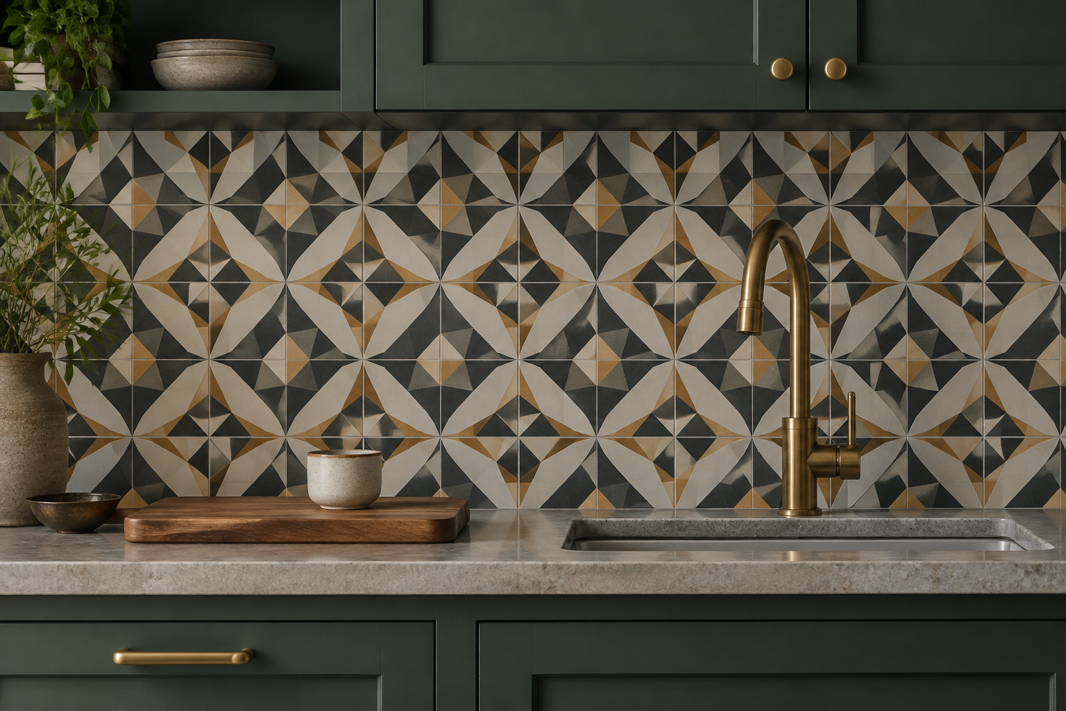
Encaustic Cement Pattern Tile
Encaustic tiles carry their pattern through the full body of the tile. The colour will not wear off the surface.
Choose one motif and let it repeat across the whole splash wall. Geometric patterns in charcoal and cream feel timeless.
Seal the tiles because cement is porous and stains easily. Use a matte sealer to keep the finish natural.
This is the most decorative option for a modest budget. It suits cottage kitchens and bold modern rooms alike.
MATERIAL Encaustic cement · PAIRS WITH deep green cabinets and stone counters
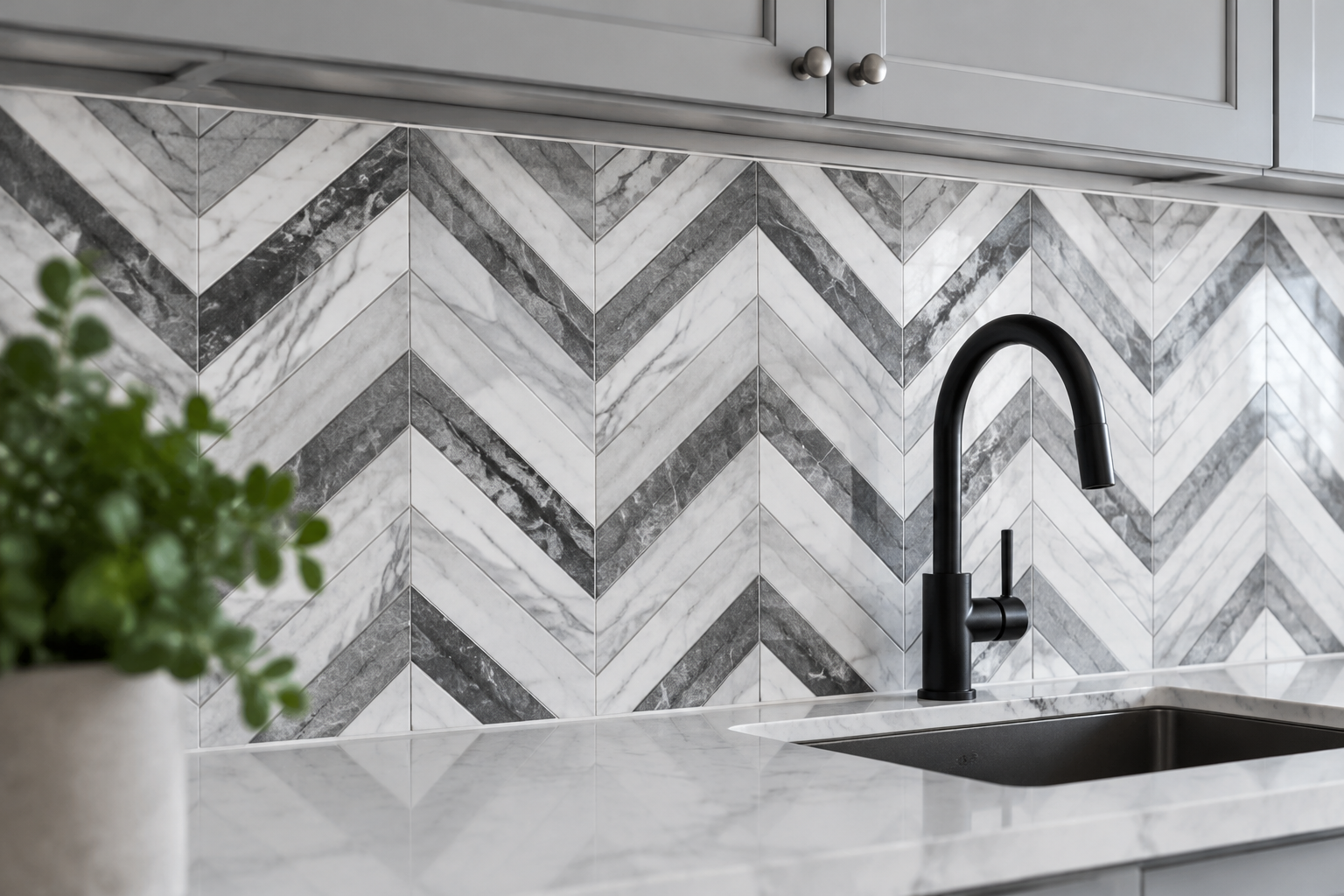
Bold Chevron Marble Mosaic
A chevron mosaic turns marble into a graphic zigzag band. The geometry gives the wall energy without adding colour.
Grey and white marble is the safest pairing for resale value. Nero marble with gold veining is the dramatic alternative.
Keep the countertop plain so the pattern stays the star. Simple slab-front cabinets are the right partner.
Chevron needs precise setting out, so hire an experienced tiler. A wobbly centre line ruins the entire wall.
MATERIAL Polished marble mosaic · PAIRS WITH pale grey slab cabinets and black steel
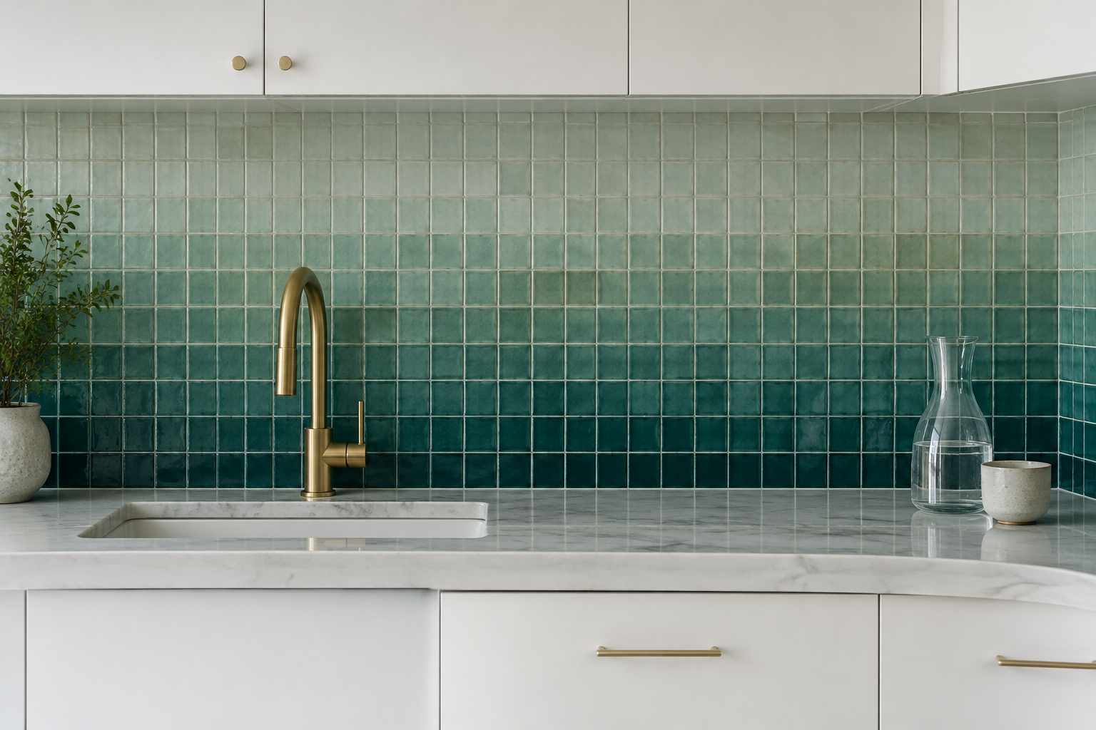
Two-Tone Ombré Gradient Tile
An ombré wall shifts colour from deep at the base to pale at the top. It looks like a painted gradient, but it is real tile.
Teal fading to eucalyptus is the most popular pairing this year. Blue fading to bone works well in coastal kitchens.
Plan the fade over at least six rows so the transition reads smoothly. Order a little extra in every shade.
This is a clever way to hide a dark lower wall behind cabinets. The light top half keeps the room feeling open.
MATERIAL Glazed ceramic · PAIRS WITH white slimline cabinets and brass taps
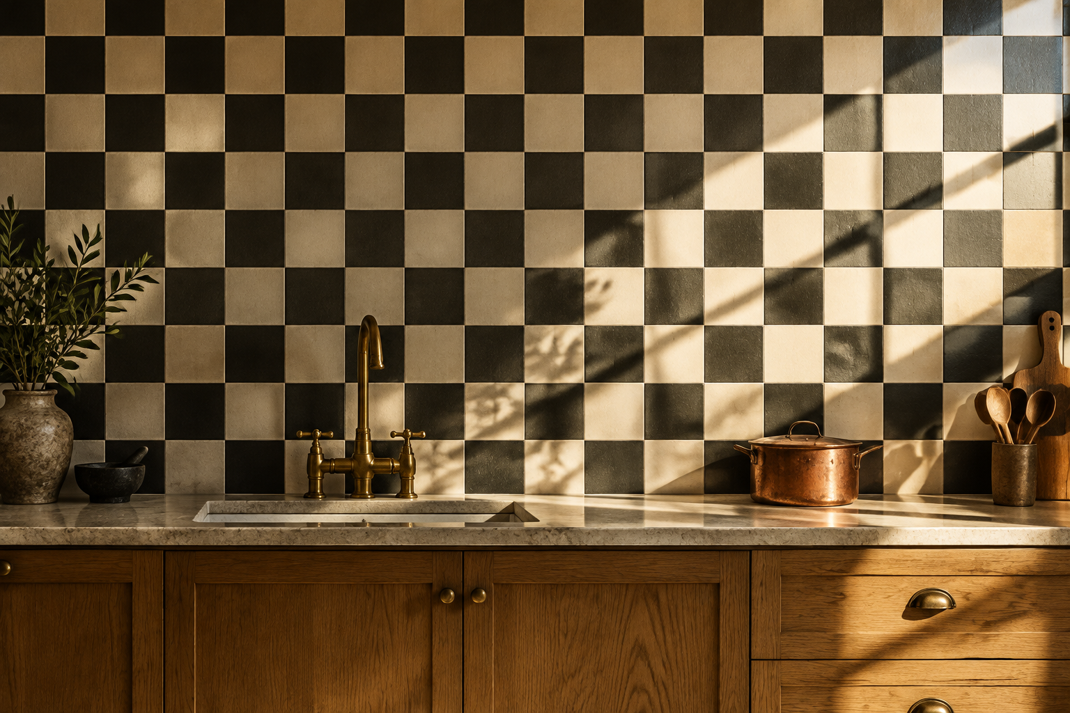
Checkerboard Tile That Climbs the Wall
Checkerboard is no longer just a floor pattern. Running it up the whole wall gives a kitchen real graphic punch.
Black and cream is the classic version and the easiest to live with. Warm brown and bone feels softer and more current.
Keep the counter and cabinets plain so the pattern leads. Choose a tile no larger than twenty centimetres square.
A full height pattern needs a perfectly level first row. Get that right and the rest of the wall follows easily.
MATERIAL Glazed ceramic · PAIRS WITH warm oak cabinets and vintage brass taps
Natural and Organic Textures
Stone, clay, timber, and pebble all carry the hand of the maker. These surfaces warm a room in a way paint simply cannot.
Most of them need sealing, and that small duty is the price of real material. It is a fair trade for a wall that improves with age.
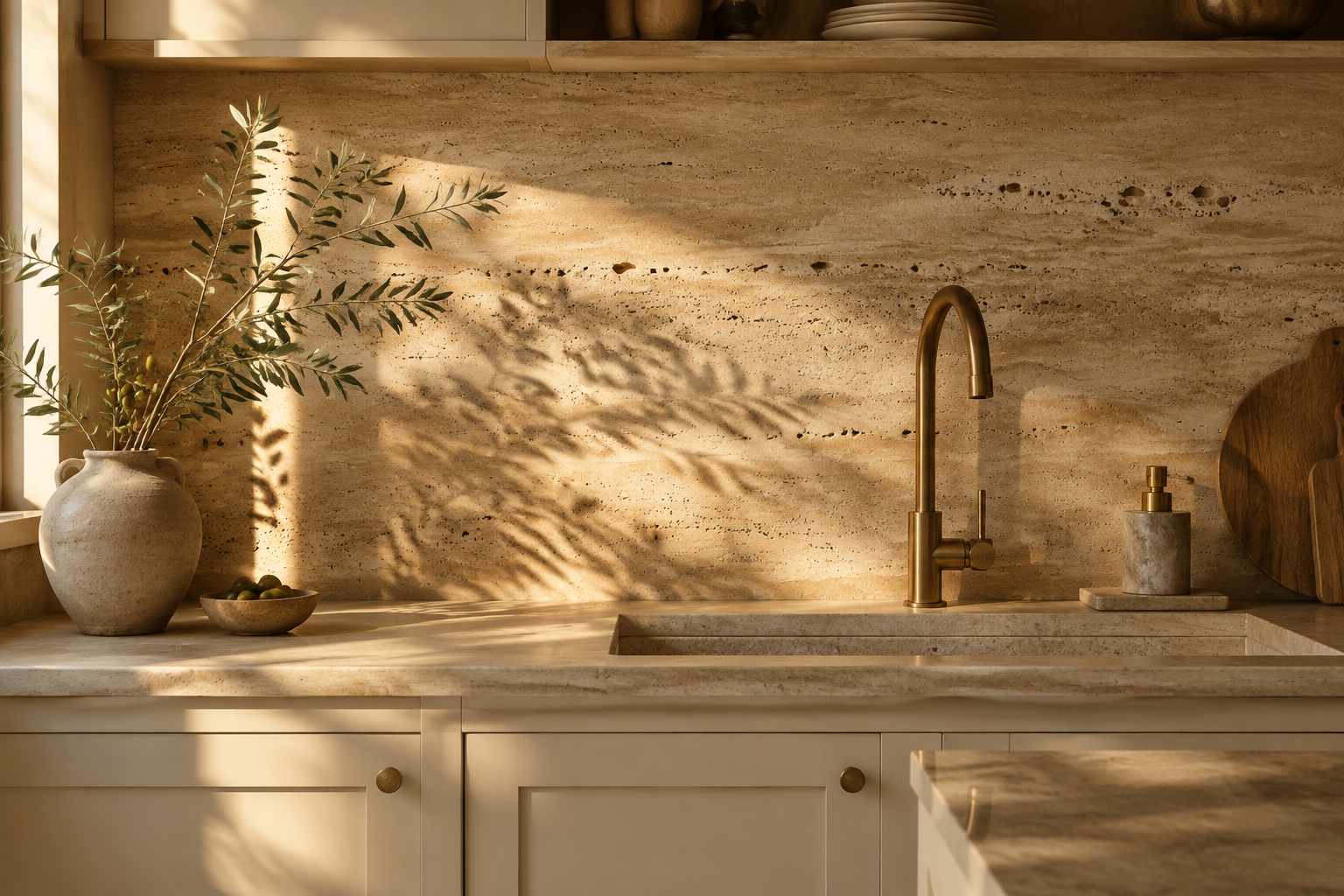
Unfilled Travertine Slab
Unfilled travertine keeps its natural pores and fine horizontal banding. It looks like stone that remembers where it came from.
Warm biscuit tones suit cream, clay, and olive cabinetry. Brass fittings make the surface glow in evening light.
Fill the pores only if the wall sits directly behind a hob. Otherwise let the texture stand as it is.
Seal it twice in the first year and once a year after that. This is a warm, forgiving choice for family kitchens.
MATERIAL Unfilled travertine · PAIRS WITH cream or clay cabinets and brass taps
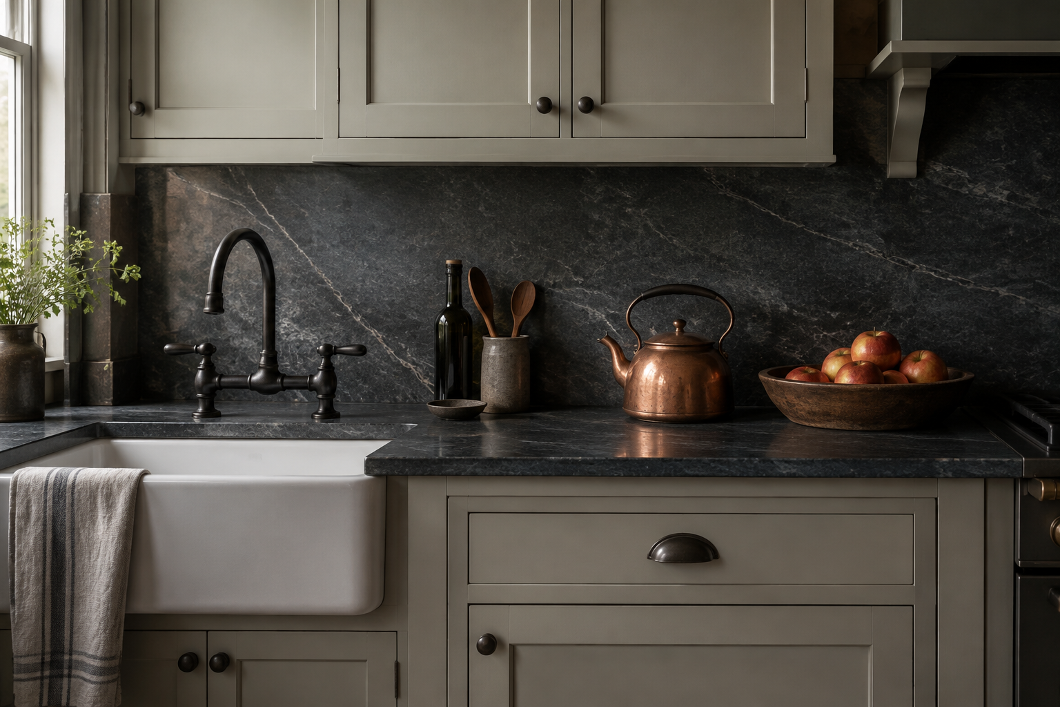
Soapstone Slab with Soft Patina
Soapstone is soft, dense, and quietly beautiful. Over time it develops a gentle patina that cannot be faked.
Deep charcoal grey with soft white veins suits farmhouse and heritage kitchens. Painted shaker cabinets are the natural partner.
It is non-porous, so it resists stains better than marble. Oiling brings out the colour and deepens the grey.
Expect small scratches with heavy use, and welcome them. This material is meant to age with the house.
MATERIAL Soapstone · PAIRS WITH putty shaker cabinets and black iron taps
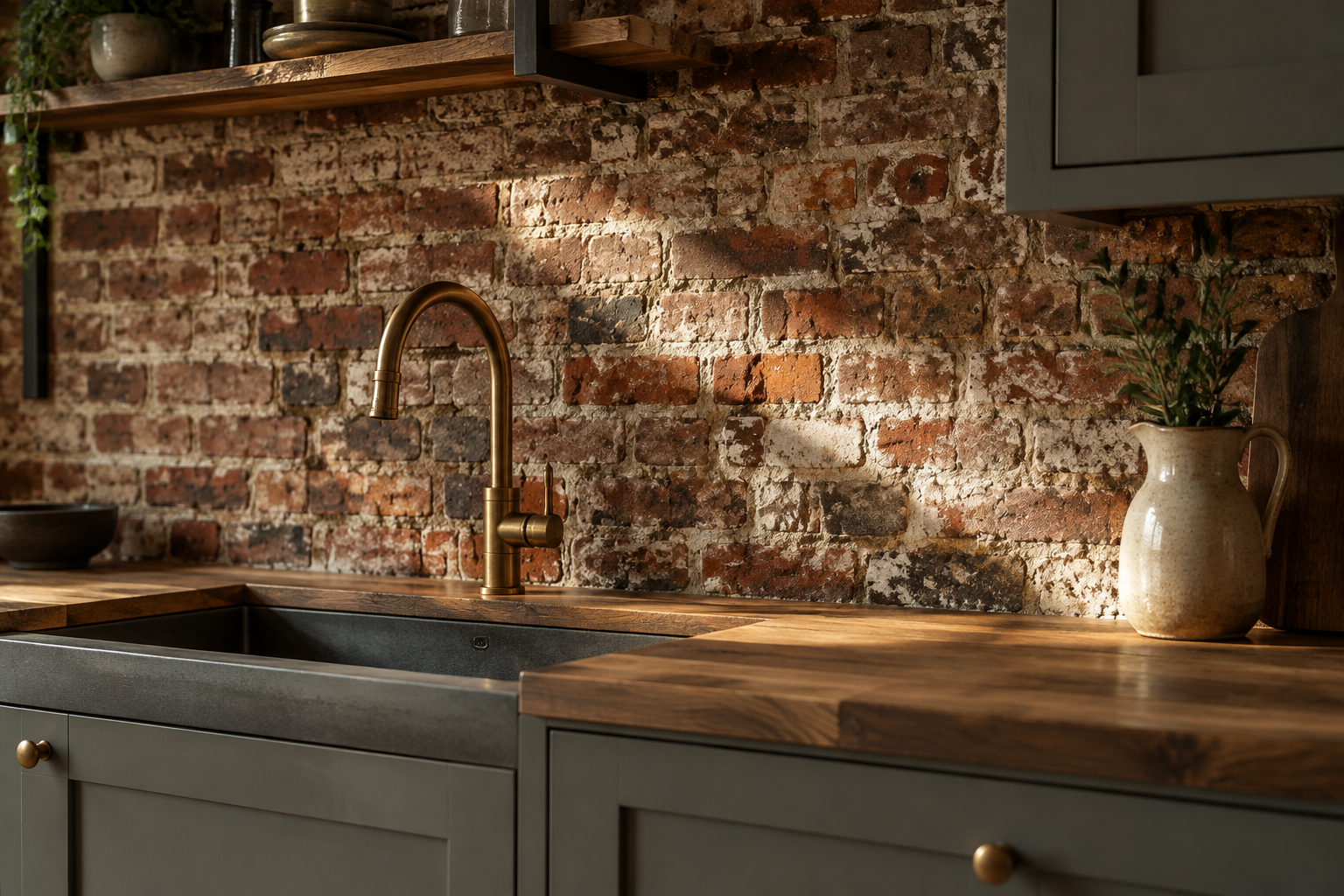
Reclaimed Brick Veneer
Reclaimed brick brings texture, history, and warmth in one move. Chipped corners and lime mortar make it feel authentic.
Cut brick slips are the practical version for a kitchen wall. They give the look without the depth of full bricks.
Pair red brick with matte grey cabinets and black steel details. Add a wooden counter to soften the industrial edge.
Seal the brick because it is dusty and porous. This wall suits loft conversions and converted barns best.
MATERIAL Brick slips · PAIRS WITH matte grey cabinets and black steel details
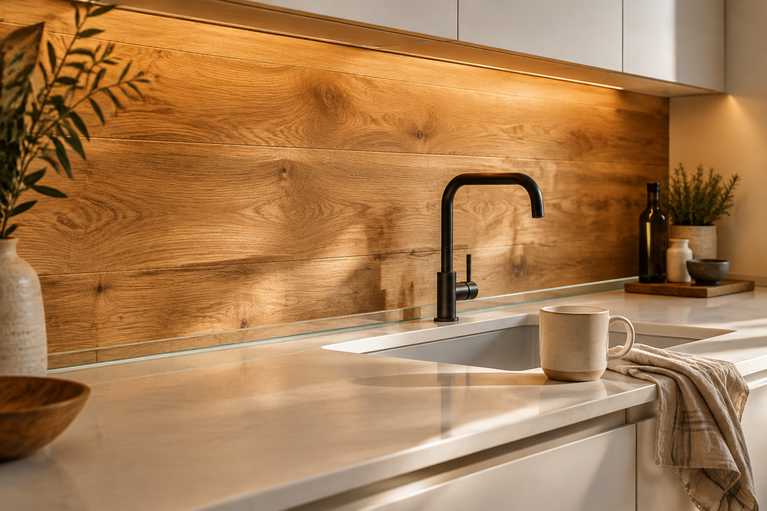
Warm Oak Plank Backsplash
Timber on the wall adds the warmth that stone and tile cannot. It makes a kitchen feel like a room, not a workshop.
Use oiled oak with visible grain and run the planks horizontally. A slim glass upstand protects the wood from splashes.
Keep the cabinets plain so the grain stays the feature. Black taps and white stone give the scheme balance.
Oak needs re-oiling every year or two behind a sink. This is the softest, warmest option on the list.
MATERIAL Oiled oak · PAIRS WITH white cabinets and black slim taps
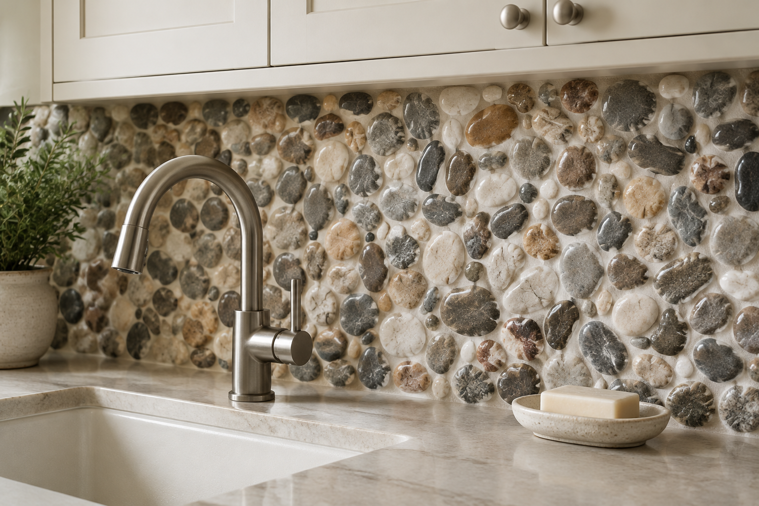
River Pebble Stone Mosaic
River pebble mosaic is made from rounded stones cut flat and set in grout. The wall ends up looking like a dry riverbed.
Mix grey, brown, and ivory stones for a natural surface that never repeats. Warm cabinetry keeps the look calm.
The rounded shapes hide splashes and soften a hard-edged room. Use a pale grout so the stones stay distinct.
This finish suits spa-like kitchens and adjoining bathrooms. It also works well on curved or awkward walls.
MATERIAL River pebble mosaic · PAIRS WITH cream cabinets and brushed nickel
Fluted Travertine Behind the Range
A fluted travertine panel behind the range becomes the sculpture of the room. Deep ribs throw strong shadows in raking light.
Keep the rest of the wall plain so the feature stays powerful. A brass or plaster hood completes the composition.
Raw, unfilled travertine gives the most texture and warmth. Filled stone reads cleaner but loses some character.
This is a high-impact upgrade for a small area. It costs far less than a full slab wall and looks richer.
MATERIAL Fluted travertine · PAIRS WITH pale oak cabinets and an aged brass hood
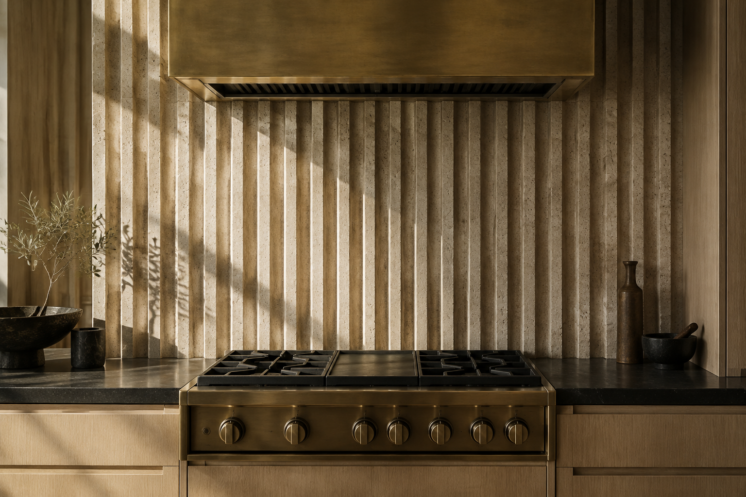
Backlit Translucent Onyx
Backlit onyx glows from hidden LED panels behind the stone. The mineral veining lights up like stained glass.
Amber, honey, and rose tones work best because they transmit light. Cool greys tend to look flat when lit.
Use a dimmable driver so the wall can be a nightlight or a statement. Keep the surrounding cabinetry dark and simple.
This is the most theatrical idea on the list. It suits bars, butler’s pantries, and statement islands.
MATERIAL Backlit onyx · PAIRS WITH dark walnut cabinets and matte black counters
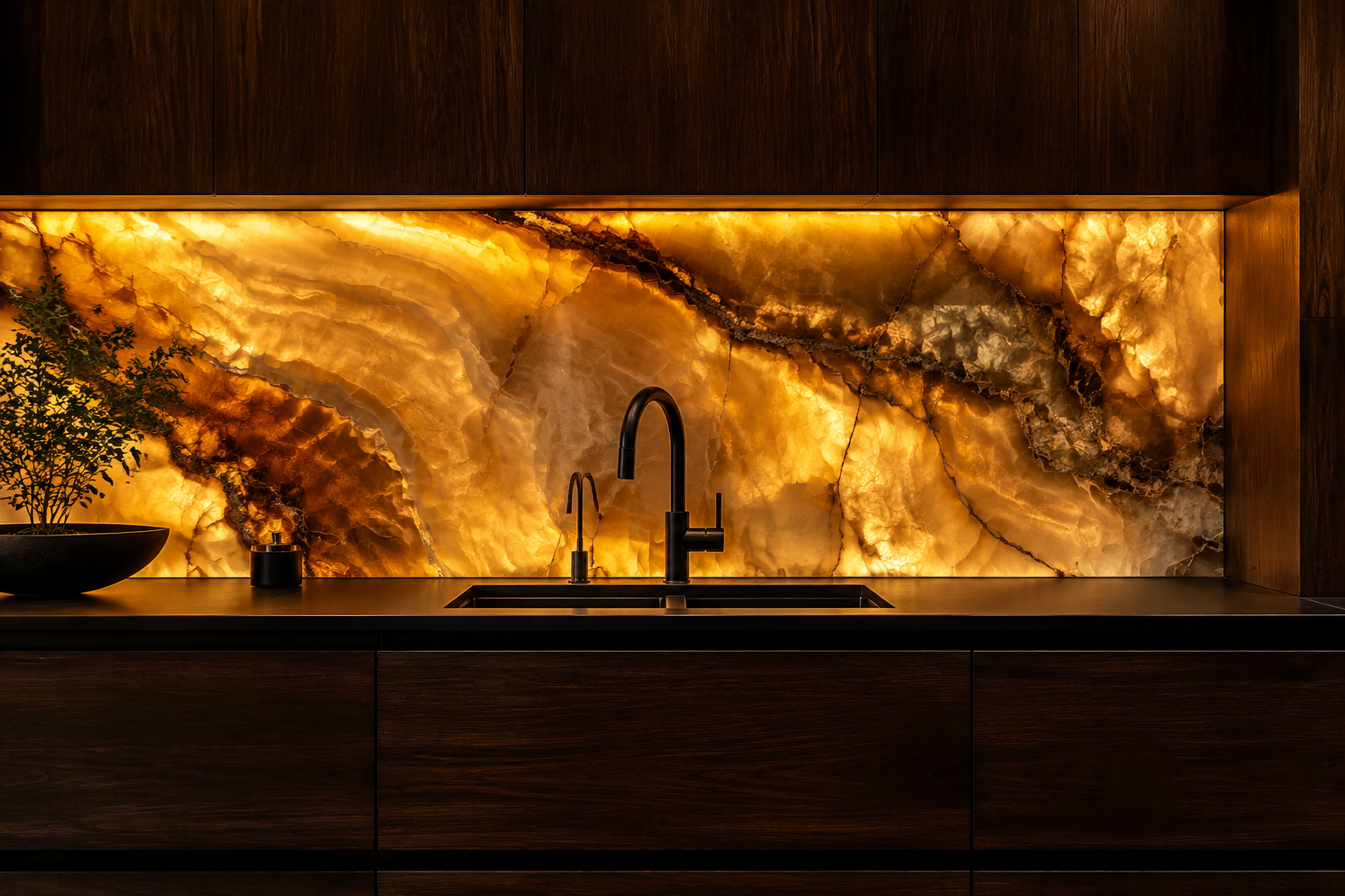
Limewash Plaster with a Stone Ledge
Limewash plaster gives a cloudy, chalky wall with soft hand-applied movement. It looks painted but feels far richer.
Oatmeal, bone, and pale clay are the most versatile shades. A floating limestone ledge adds a practical shelf.
The finish can be sealed for washability behind a hob. Ask for three coats so the movement builds up gradually.
This is the quietest luxury option on the list. It suits old houses where a perfect grid would feel too new.
MATERIAL Limewash plaster · PAIRS WITH warm oak cabinets and limestone shelving
Statement and Luxury Materials
Some walls are meant to be the whole conversation. Book-matched stone, mirrored glass, and metal bring exactly that level of drama.
Use them on a small area and let the rest of the kitchen step back. A single luxurious panel beats a busy room every time.
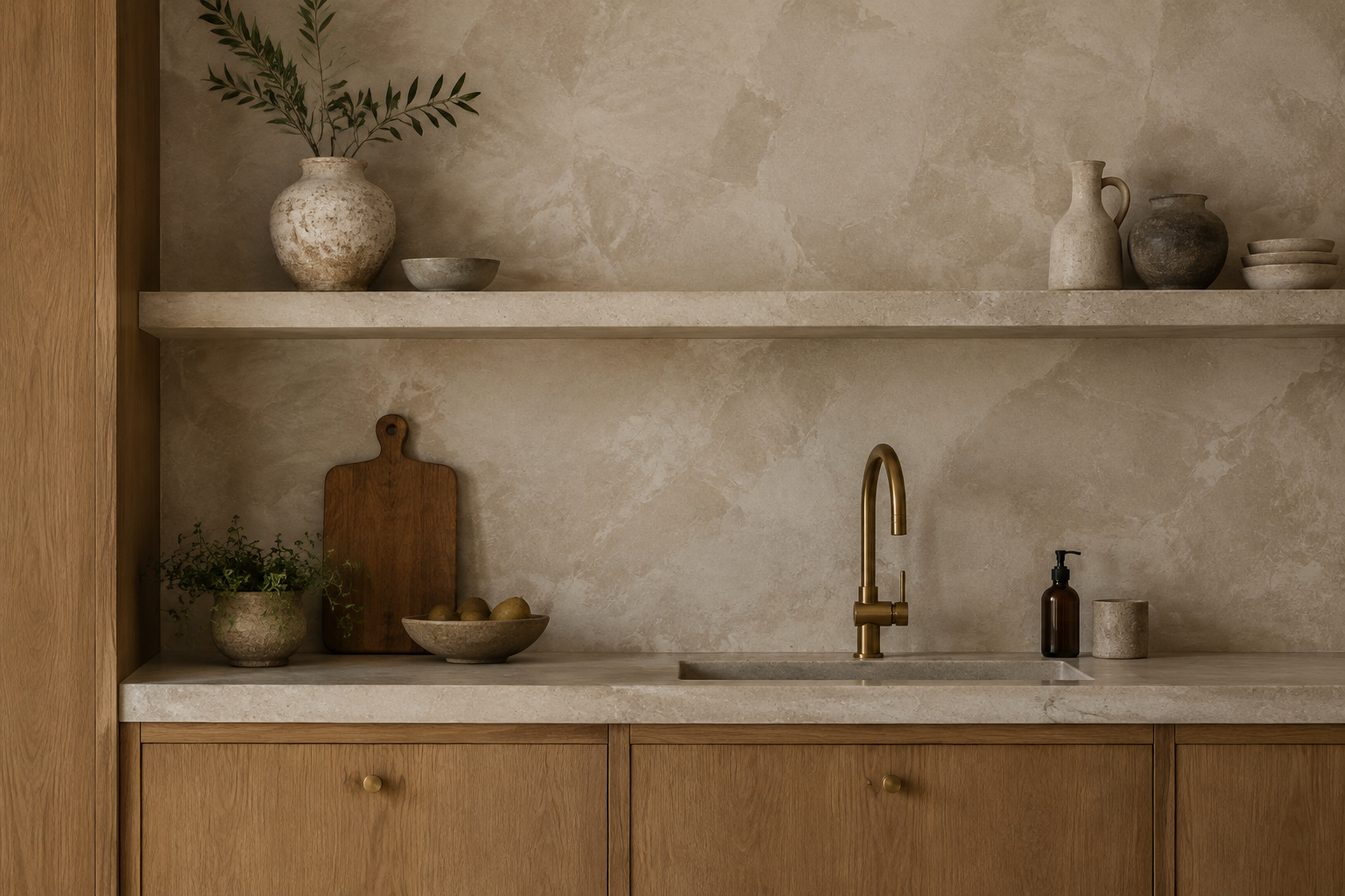
Antique Mirror Tile
Antique mirror tile has softly foxed silvering and a mottled vintage finish. It reflects light without looking brand new.
Choose rectangular panels with a plain bevel for a clean look. Warm bulbs and brass fittings bring out the shimmer.
Mirror doubles the apparent size of a narrow galley kitchen. It also bounces daylight into darker corners.
Clean with a non-ammonia glass spray to protect the silvering. Avoid placing it opposite a window that gets full sun.
MATERIAL Antiqued mirror glass · PAIRS WITH cream cabinets and warm brass fittings
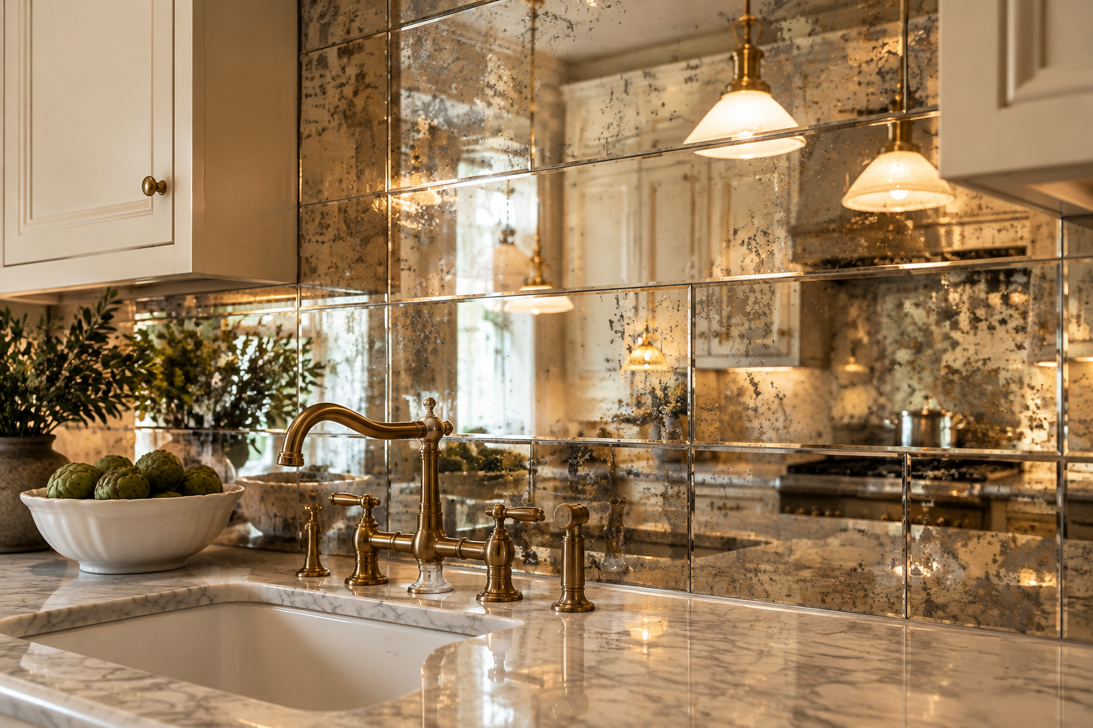
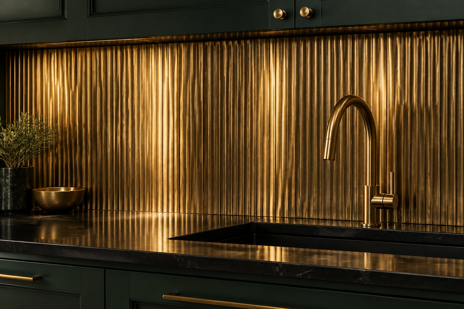
Antique Brass Fluted Metal Panel
A fluted brass panel adds a warm metallic sheen that changes through the day. The ribs catch light in fine vertical lines.
Antique brass is less shiny than polished, so it feels calmer. It pairs beautifully with deep green or ink blue cabinets.
A living finish will patina slightly over the years. That slow change is part of the appeal.
Panels are cut to size and fixed over a flat substrate. Keep the counter dark so the metal stays the star.
MATERIAL Antique brass · PAIRS WITH deep green or ink blue cabinets
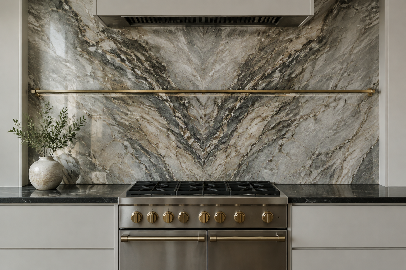
Dramatic Book-Matched Quartzite
Quartzite gives you marble drama with far more strength. Book-matching turns the veining into a symmetrical landscape.
Grey, taupe, and gold veins are the most popular combination. Pale handleless cabinets let the stone speak.
Always view the actual slabs before you commit. Every block of quartzite looks different from the next.
This is the statement wall for a forever home. It is expensive, but it needs no other decoration.
MATERIAL Book-matched quartzite · PAIRS WITH pale handleless cabinets and brass rail
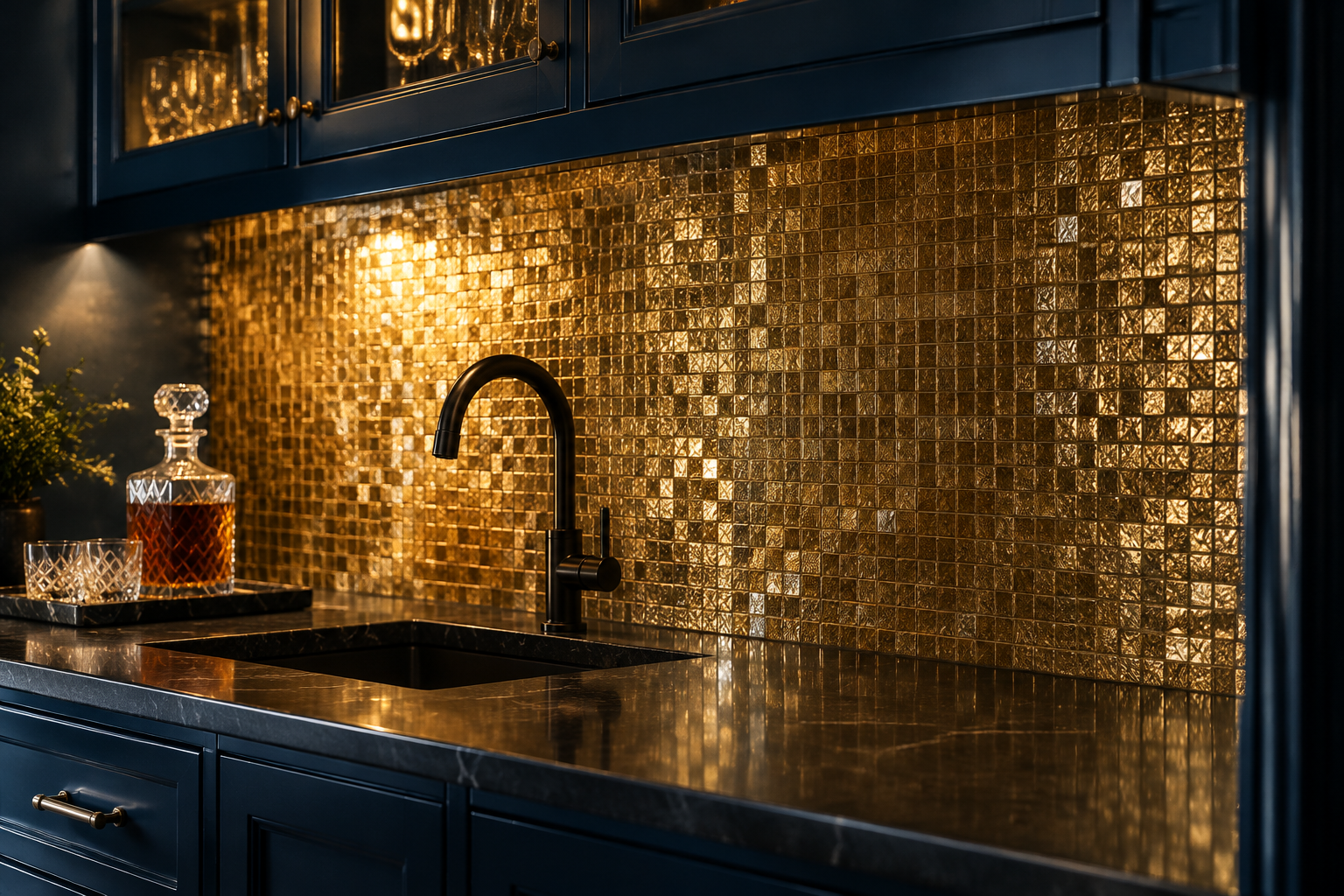
Gold Leaf Glass Mosaic
Gold leaf mosaic is made from tiny glass tiles backed with real metal leaf. The wall shimmers as you walk past.
Champagne and warm gold tones suit dark navy or black cabinetry. Keep the lighting low and warm in the evening.
Choose a small tile size so the shimmer feels like texture, not glitter. A dark grout makes the gold read richer.
This is the most glamorous option for a small wall. It works brilliantly behind a bar or a butler’s sink.
MATERIAL Gold leaf glass mosaic · PAIRS WITH midnight blue cabinets and black taps
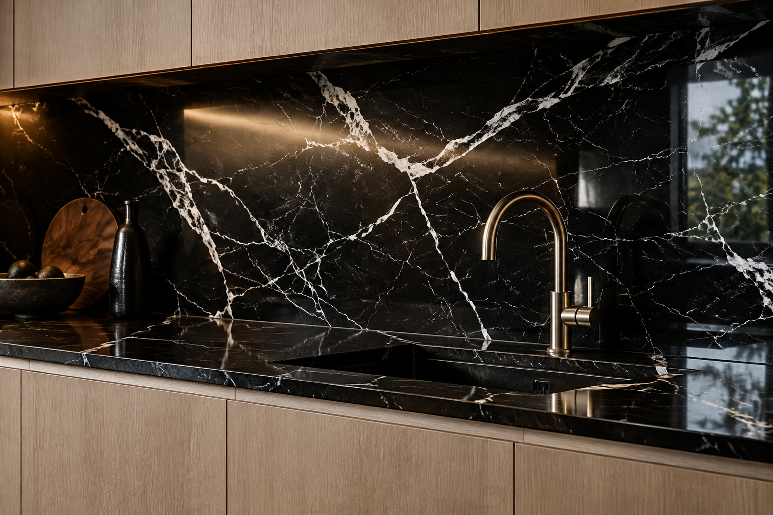
Nero Marquina Black Marble
Nero Marquina is black marble with bold white lightning veins. It is graphic, dramatic, and instantly luxurious.
Pair it with pale oak cabinets for a warm, balanced contrast. Brushed brass fittings add a soft glow.
A polished finish gives the deepest black and the strongest reflections. Honed reads quieter and hides marks better.
Seal it regularly because marble is softer than quartz. Avoid acidic cleaners on the polished surface.
MATERIAL Polished black marble · PAIRS WITH pale oak cabinets and brushed brass
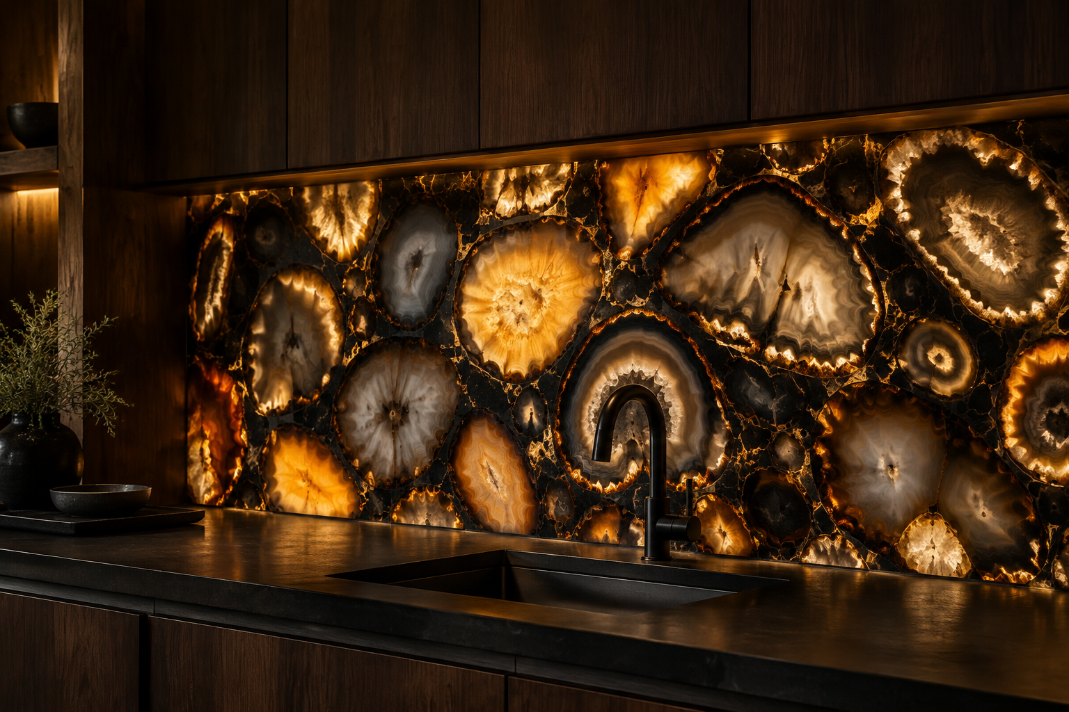
Agate Slice Inlay Feature
An agate inlay panel sets thin slices of translucent stone into a dark backing. Each slice glows with natural banding.
Edge lighting makes the agate look lit from inside the stone. Every panel is genuinely one of a kind.
Keep the rest of the kitchen simple so the panel reads as art. Dark cabinets and matte counters support it well.
This is a collector’s choice rather than a budget option. Expect a long lead time and a specialist fabricator.
MATERIAL Agate inlaid in stone · PAIRS WITH dark walnut cabinets and matte counters
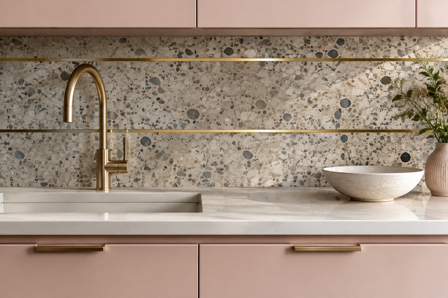
Terrazzo Slab with Brass Inlay
Terrazzo brings colour and playfulness in tiny aggregate flecks. Brass inlay strips then turn it into something tailored.
Warm grey and blush chips are the most versatile mix. Brass lines catch the light and pull the eye across the wall.
Slab terrazzo has far fewer joints than the tile version. That makes it easier to clean and more seamless to look at.
This finish suits modern family kitchens and creative studios. It also hides splashes remarkably well.
MATERIAL Terrazzo · PAIRS WITH blush cabinets and warm brass
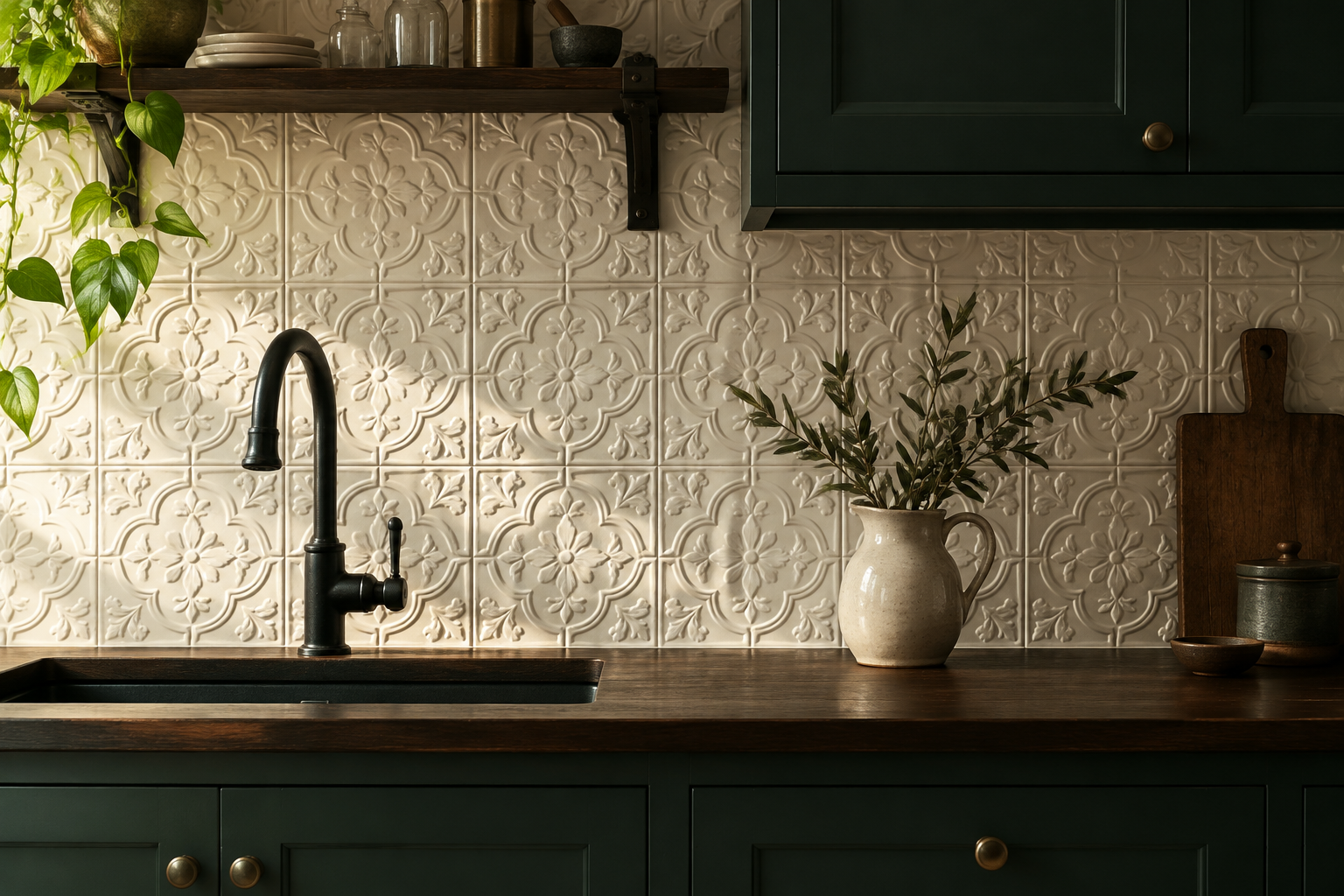
Pressed Tin Ceiling Tile
Pressed tin tiles bring ornate relief and old-world charm to a kitchen wall. Painted white, they read as quiet texture.
The embossed pattern throws soft shadows under warm light. Deep green or navy cabinets make the white pop.
Tin tiles are light, affordable, and quick to install. They also hide an imperfect wall behind them.
This is a strong choice for period homes and cottage kitchens. Keep the counter simple so the pattern stays restful.
MATERIAL Pressed tin · PAIRS WITH deep green cabinets and dark wood counters
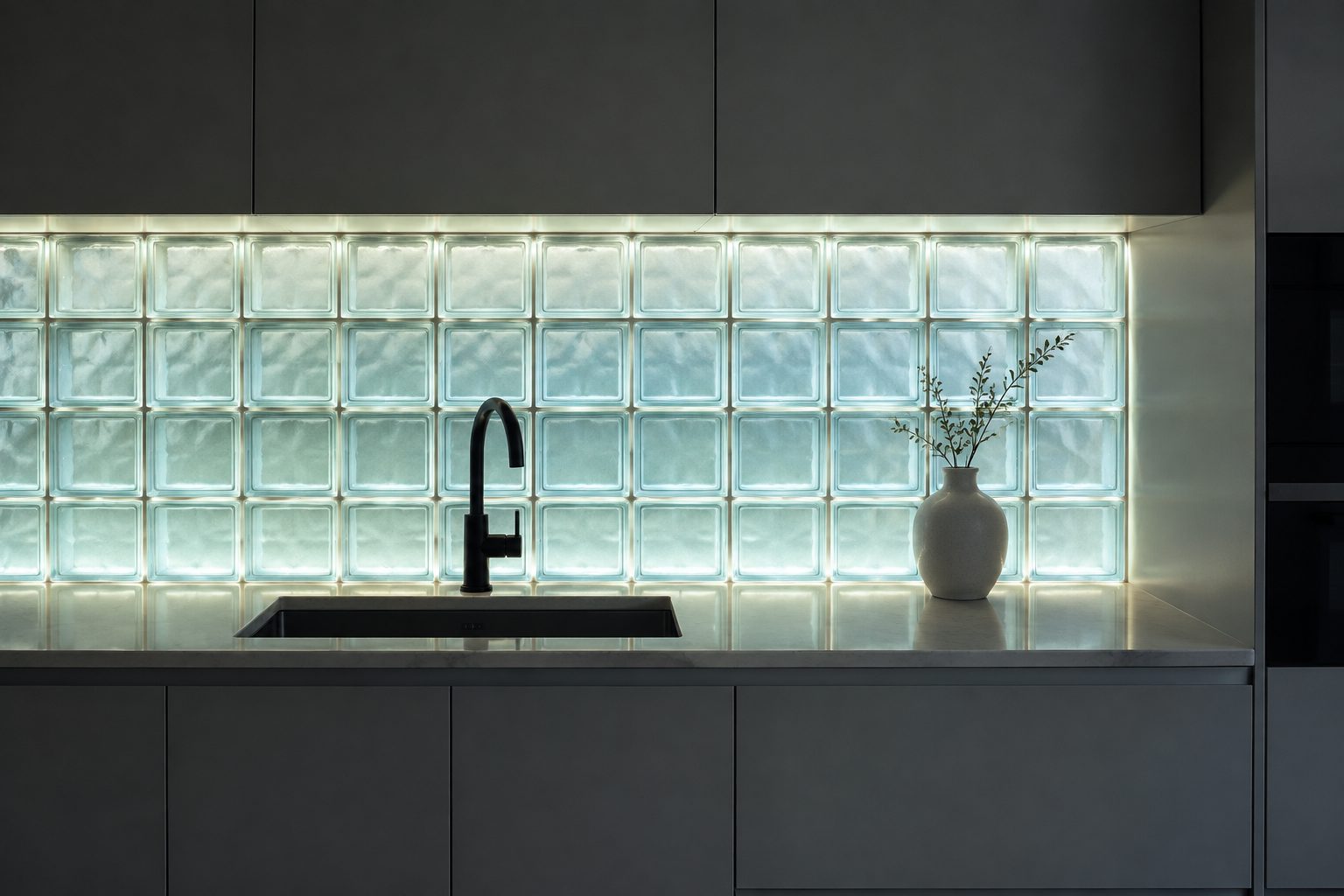
Glass Block with Backlighting
Glass block walls glow softly when lit from behind. The effect is architectural, calm, and slightly futuristic.
Pale aqua or clear blocks suit cool palettes and modern rooms. Warm white LEDs keep the light from feeling clinical.
Glass block suits walls that need privacy and light at the same time. It works well beside a shared or borrowed wall.
Plan the electrical supply before the blocks are laid. Once built, the wall is very hard to change.
MATERIAL Glass block · PAIRS WITH matte grey cabinets and black taps
Textural and Artisanal Craft
Texture is the one thing a photograph cannot fully capture. You have to run your hand along these walls to understand them.
Directional light is what makes texture work, so plan a shelf light or a pendant before you choose. Without side light the surface goes flat.
Handmade Wavy Edge Tile
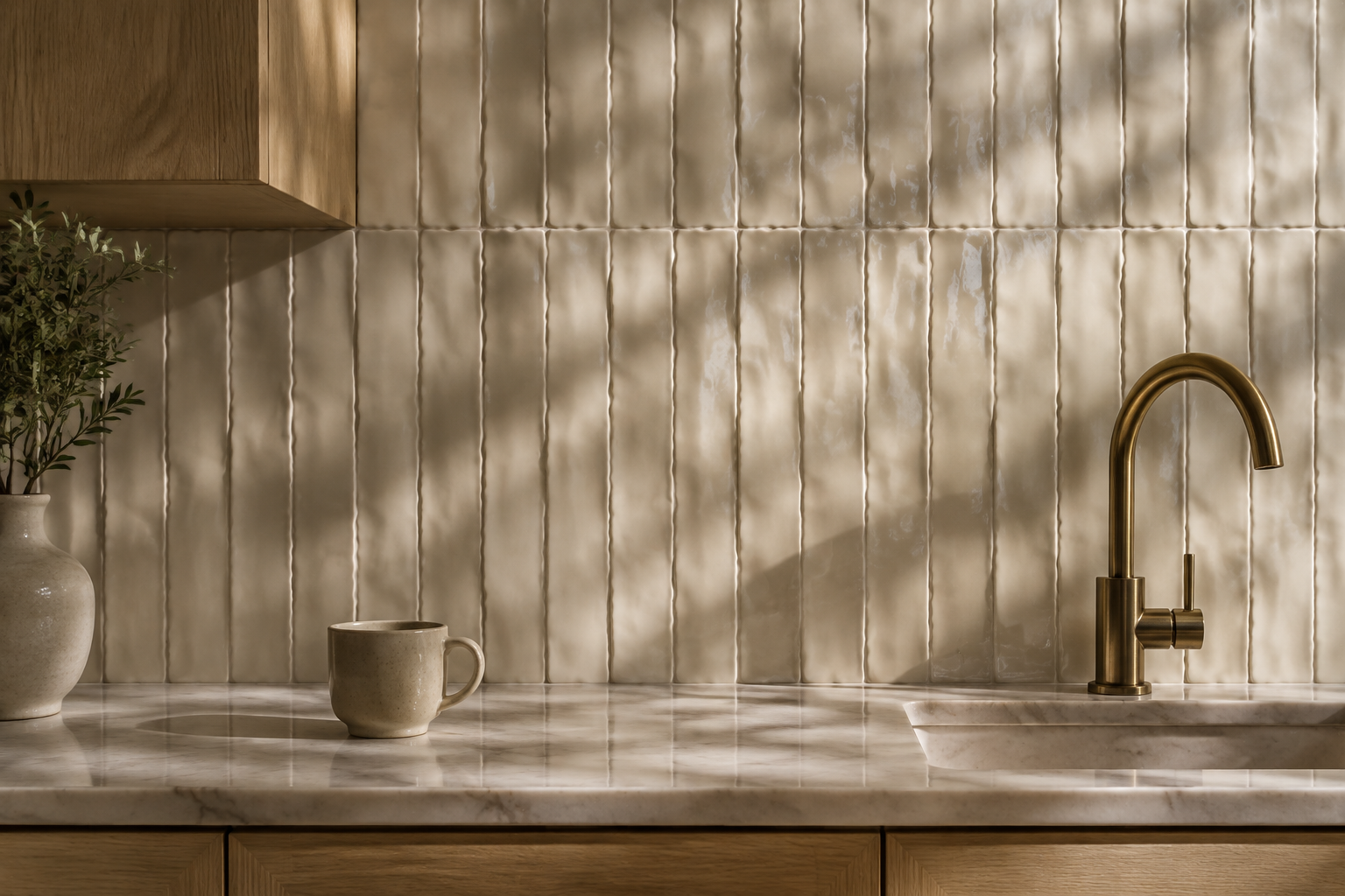
Wavy edge tiles have a soft undulating profile that breaks up a flat wall. Light runs along each curve like a drawn line.
Vertical laying emphasises the movement and adds height. Ivory, bone, and pale clay are the most elegant shades.
Wide grout joints celebrate the handmade edges rather than hiding them. Choose a grout close to the tile colour.
This finish suits calm kitchens built from natural materials. Pair it with oak, linen, and a single brass fitting.
MATERIAL Handmade ceramic · PAIRS WITH pale oak cabinets and one brass detail
Moroccan Bejmat Earth Tile
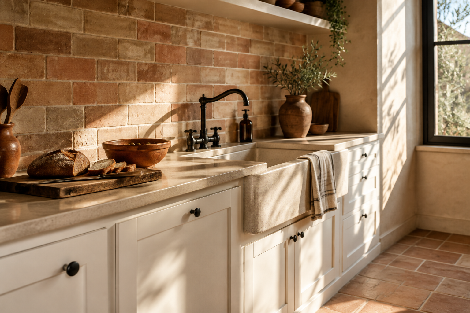
Bejmat tiles are hand-formed clay, laid in a staggered running pattern. The surface is earthy, matte, and full of character.
Sand and clay tones warm a kitchen instantly. Black iron fittings and terracotta bowls complete the mood.
The wide grout lines are part of the design, so keep them consistent. Seal the clay before it meets cooking oil.
This wall suits rustic and Mediterranean kitchens. It also ages gracefully, softening rather than wearing out.
MATERIAL Handmade clay bejmat · PAIRS WITH white cabinets, black iron, and terracotta
Ribbed Ceramic with Deep Relief
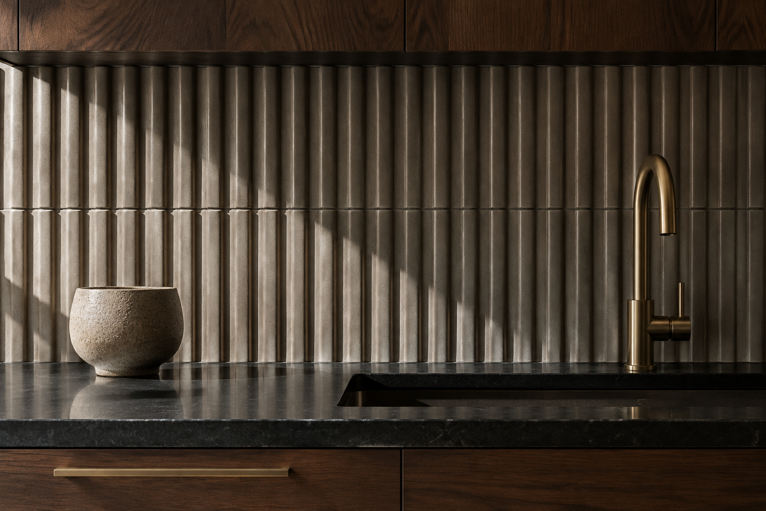
Deep ribbed ceramic creates strong sculptural shadow lines across the wall. The texture reads from across the room.
Putty grey and warm white are the most versatile colours. Dark walnut cabinets make the relief stand out.
Directional lighting is essential, so plan a shelf light above. Without side light the ribs flatten out.
This is the boldest textural choice for a small budget. It needs very little else in the room to look finished.
MATERIAL Deep-relief ceramic · PAIRS WITH dark walnut cabinets and a shelf light
3D Geometric Cement Relief Tile
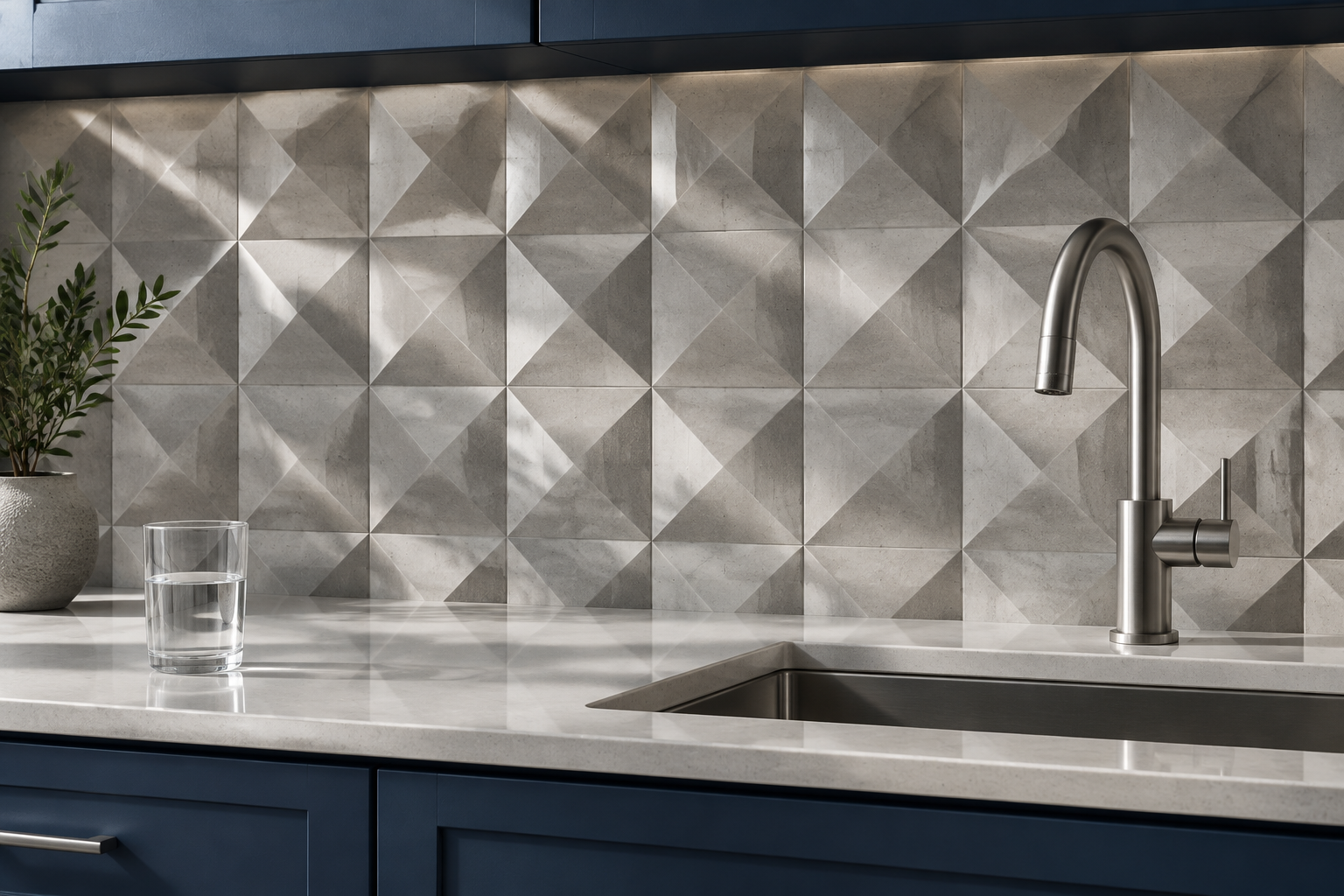
Three-dimensional cement tiles use raised facets to create a pattern that keeps changing. Each angle catches the light differently.
Pale grey keeps the effect subtle and architectural. Navy cabinets turn it into a graphic feature wall.
These tiles are heavy, so check that the wall can carry the load. A specialist adhesive is essential for a lasting job.
The result looks like carved stone at a fraction of the price. Keep the rest of the kitchen quiet and simple.
MATERIAL 3D cement tile · PAIRS WITH navy cabinets and pale quartz
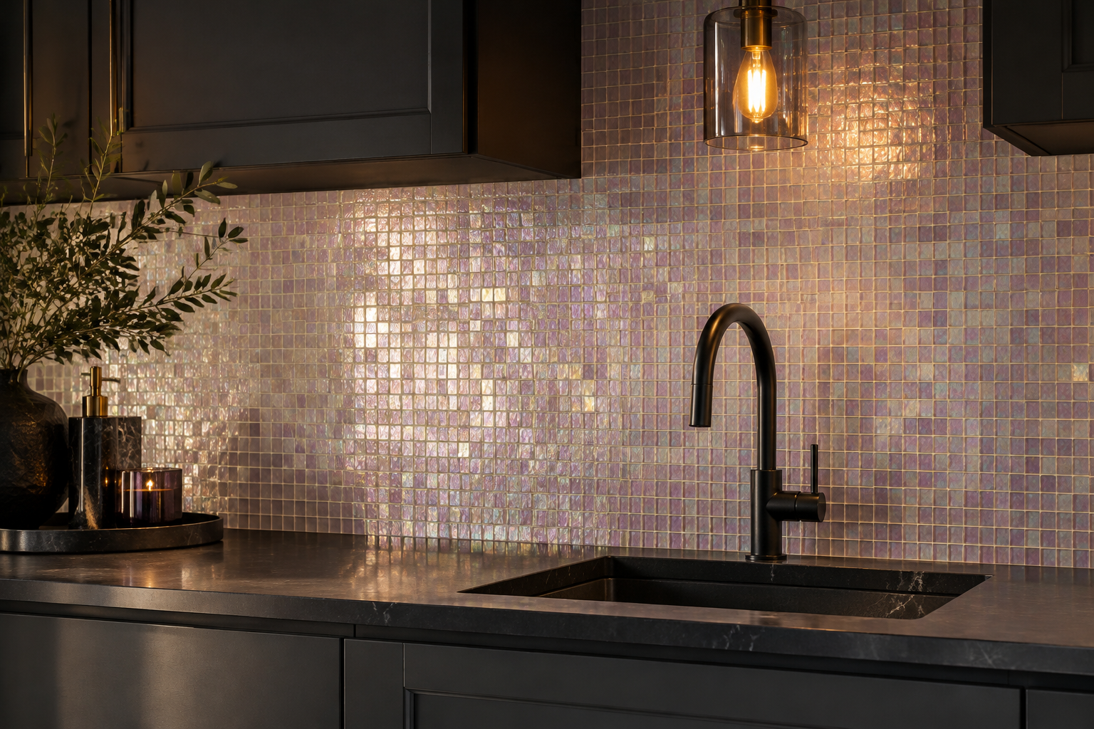
Iridescent Glass Mosaic
Iridescent glass mosaic shifts colour as light moves across it. Pearl and lilac tones feel soft rather than flashy.
Pair it with charcoal cabinets and matte black fittings. Warm evening light brings out the shimmer best.
Small tiles let the wall curve gently around corners. That makes it useful in older, uneven kitchens.
Clean with a soft cloth to protect the iridescent coating. Avoid abrasive pads on the glass surface.
MATERIAL Iridescent glass mosaic · PAIRS WITH charcoal cabinets and matte black fittings
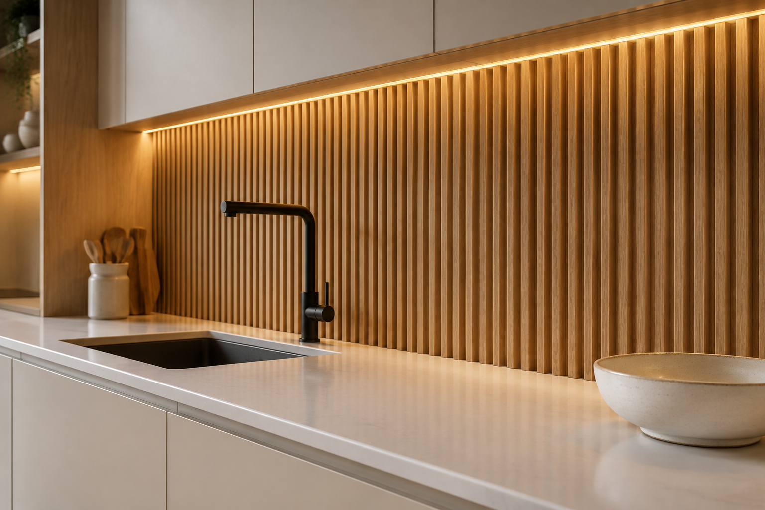
Slatted Oak Panel with Brass Reveal
Vertical oak battens give a wall rhythm and warmth in equal measure. A brass reveal at the top adds a fine line of light.
Space the battens evenly and keep the gaps open for shadow. This is warmer than panelling and easier to install.
Seal the timber so splashes do not raise the grain. A slim glass upstand protects the base of the wall.
This suits modern rustic kitchens and open-plan living spaces. It softens the hardest, most technical room in the house.
MATERIAL Slatted oak · PAIRS WITH pale cabinets and black slim taps
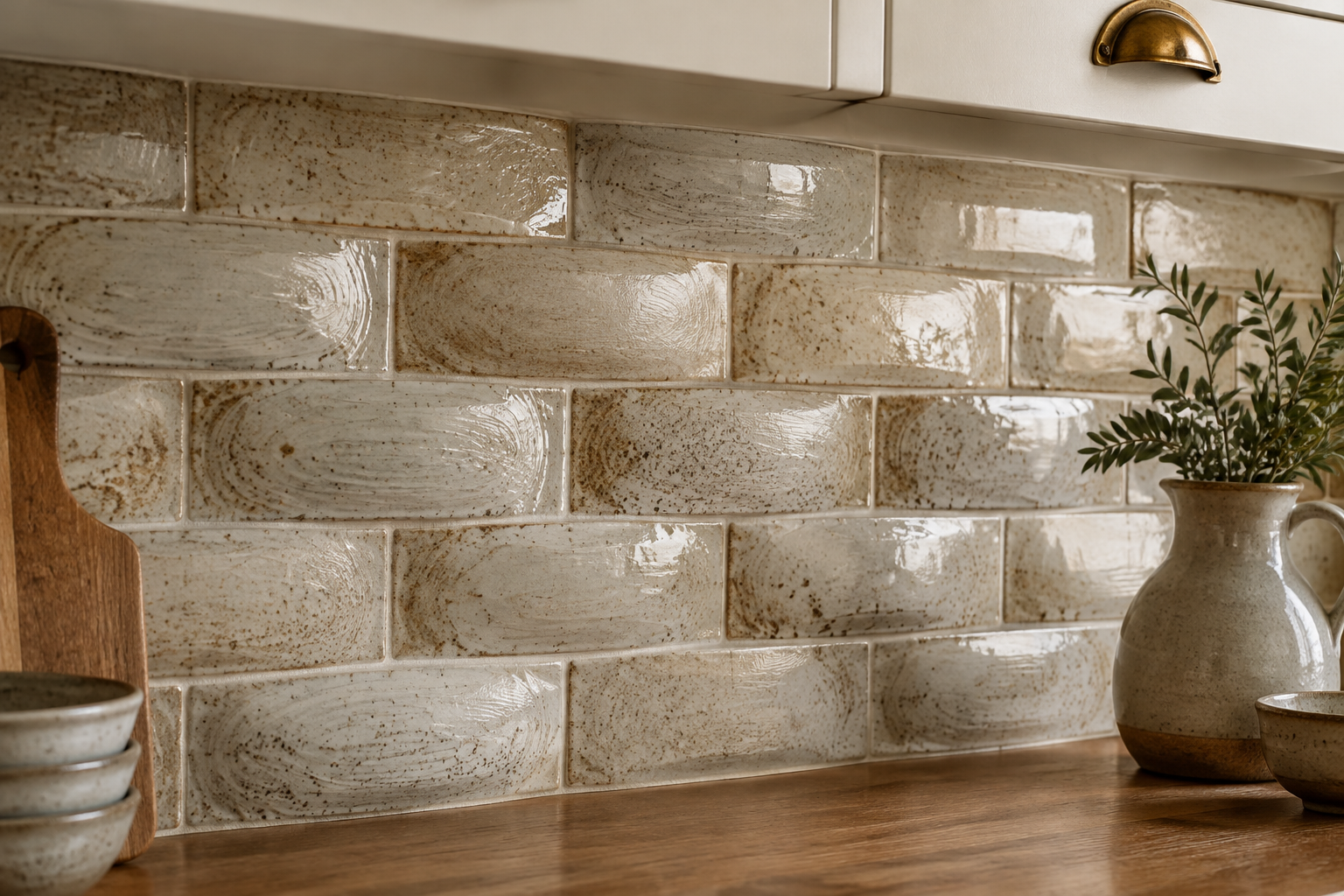
Hand-Thrown Studio Pottery Tile
Studio pottery tiles are made one at a time by hand. Each surface is softly domed and slightly different.
A speckled oatmeal glaze gives a natural, unpolished look. Warm white cabinets and brass keep the scheme gentle.
Lay them offset so the irregularity reads as craft, not error. Use a pale grout and accept the variation.
This wall suits anyone who loves ceramics as an art form. It rewards slow looking rather than quick scanning.
MATERIAL Speckled glazed ceramic · PAIRS WITH warm white cabinets and brass cup pulls
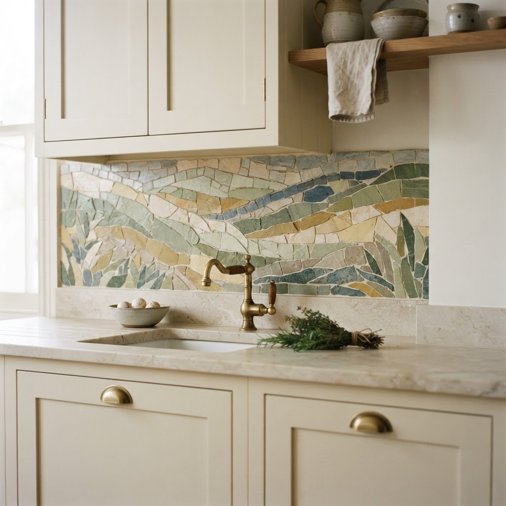
Abstract Landscape Mosaic Mural
A mosaic mural turns the backsplash into a piece of art. Abstract hills in muted greens and ochre feel calm, not busy.
Commission it to fit the wall exactly, including window reveals. Hand-cut tesserae give a texture no print can copy.
Keep every other surface plain so the mural stays the focus. Cream cabinets and pale stone work best.
This is the most personal option on the list. Expect a long lead time and a specialist installer.
MATERIAL Hand-cut mosaic · PAIRS WITH cream cabinets and pale stone counters
Smart and Practical Panels
Function can look designed when it is handled with care. These panels solve daily problems and still hold their own visually.
They are also the easiest group to install, which makes them ideal for rentals and fast makeovers.
Peel-and-Stick Removable Panel
Peel-and-stick tile panels install in an afternoon with no grout. They are ideal for rentals and quick refreshes.
Modern versions look far better than the old plastic sheets. Choose a matte finish and a plain geometric pattern.
Clean and degrease the wall first or the adhesive will fail. Avoid placing them directly behind a high-heat hob.
This is the cheapest way to change a kitchen completely. It is also easy to remove when you move out.
MATERIAL Adhesive tile panel · PAIRS WITH rental white cabinets and a simple chrome tap
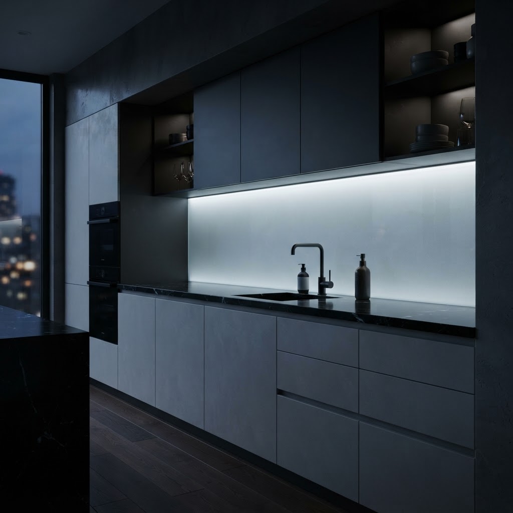
Edge-Lit Acrylic Panel
An edge-lit acrylic panel glows from a hidden LED strip along one side. Light spreads evenly across the frosted surface.
It gives a soft, modern wash of light with no visible fixtures. Dimming lets it work as a nightlight too.
Acrylic is light, tough, and simple to wipe clean. Keep it away from direct heat sources.
This suits modern apartments and small kitchens. It is the cleanest way to add light without adding clutter.
MATERIAL Frosted acrylic with LED edge · PAIRS WITH handleless matte grey cabinets and black taps
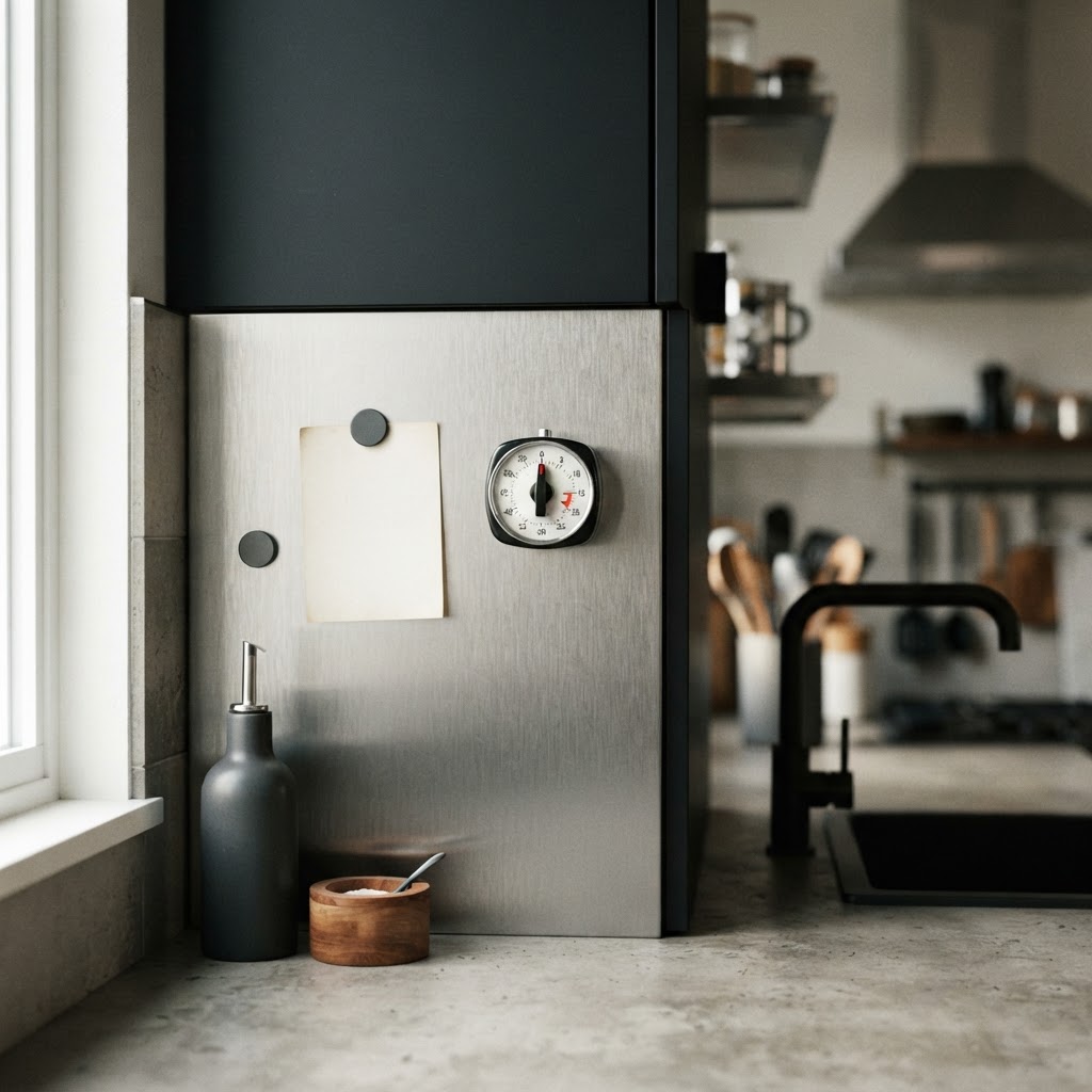
Magnetic Stainless Steel Panel
A magnetic stainless panel turns the wall into a working surface. Notes, timers, and recipes stay exactly where you left them.
Brushed steel hides fingerprints better than polished steel. It also suits industrial and professional-style kitchens.
Choose a satin grain and align it vertically for a clean look. A steel upstand keeps the base watertight.
This is the most practical wall on the list for busy cooks. It works hard and still looks sharp.
MATERIAL Brushed stainless steel · PAIRS WITH matte black cabinets and a concrete-look counter
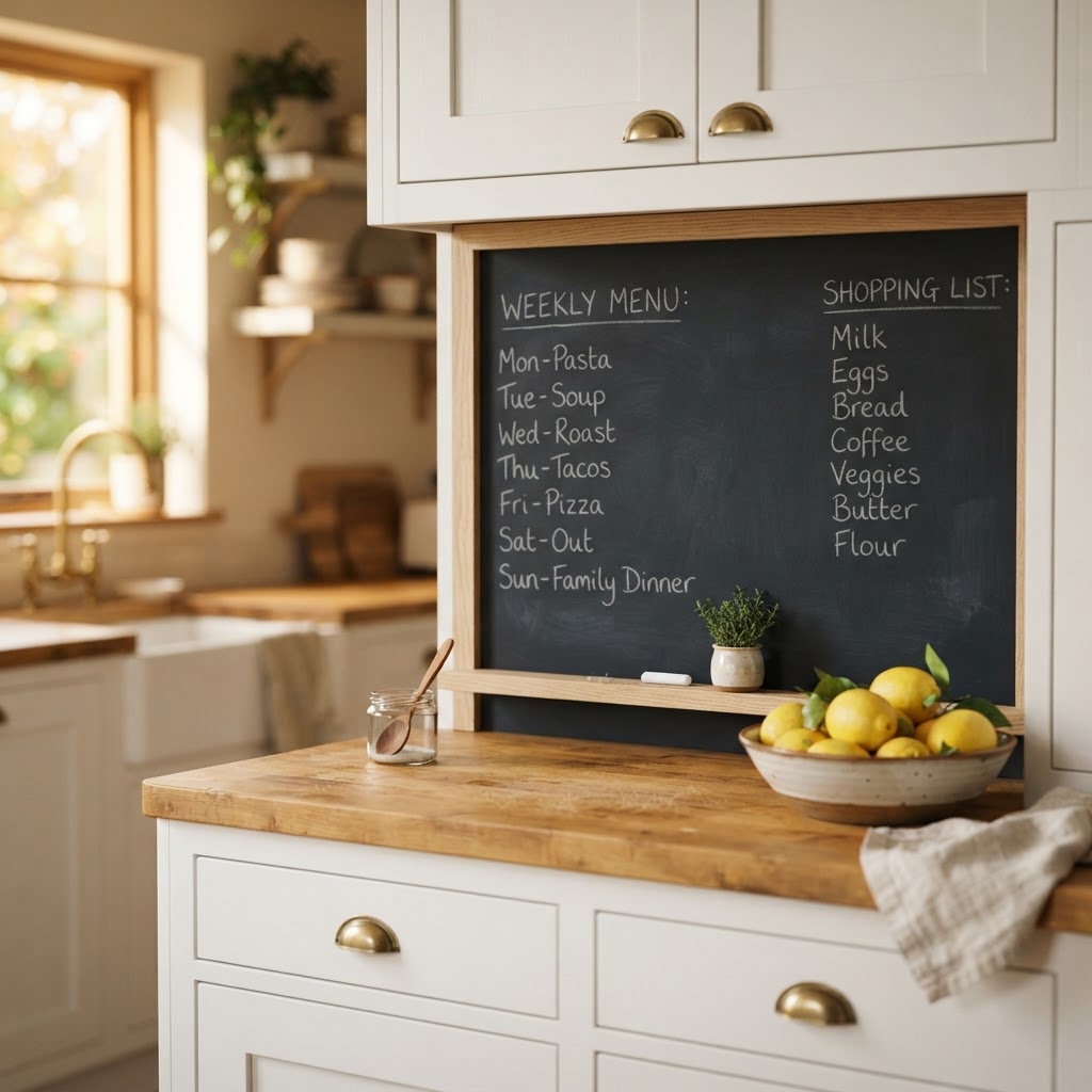
Chalkboard Menu Panel
A chalkboard panel gives the kitchen a place for lists, menus, and reminders. Framed in oak, it looks intentional rather than improvised.
Deep charcoal board with slim pale timber trim suits most schemes. Warm light softens the matte surface.
Seal the board yearly if it sits near steam or splashes. Keep the counter simple so the panel reads as a feature.
This suits family kitchens and open-plan dining spaces. It is charming, useful, and cheap to install.
MATERIAL Chalkboard with oak trim · PAIRS WITH white cabinets and a butcher-block counter
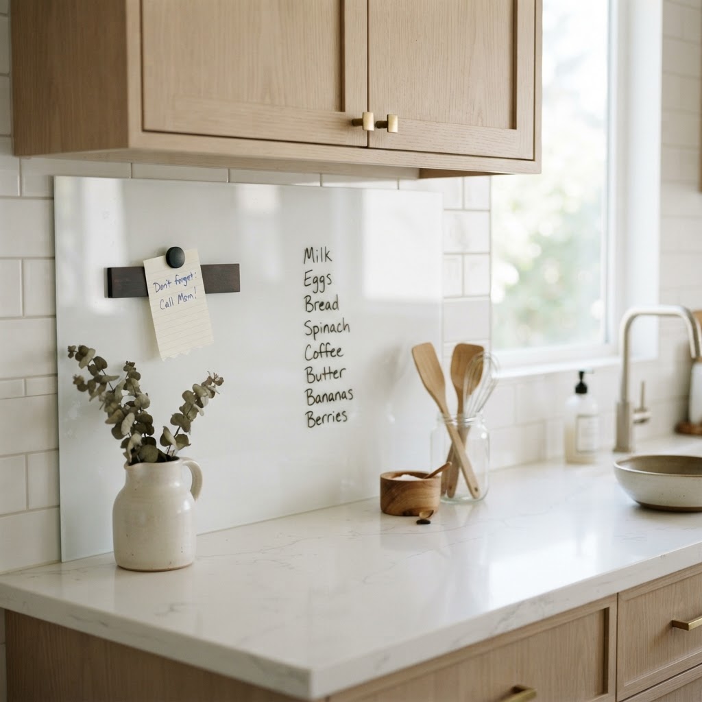
Glossy Dry-Erase Whiteboard Panel
A full-width whiteboard panel keeps the wall bright and completely writable. Lists wipe away in one stroke.
Gloss white reflects light and makes small kitchens feel larger. Pale oak cabinets keep it from looking clinical.
Choose a panel with a magnetic backing strip for notes. Clean with a dry-erase spray, not an abrasive pad.
This suits home offices that double as kitchens. It is the most useful wall for anyone who plans meals.
MATERIAL Gloss laminate · PAIRS WITH pale oak cabinets and white quartz
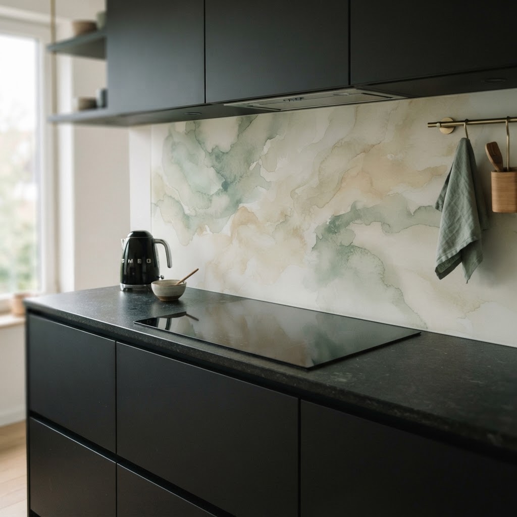
Printed Glass Splashback
A printed glass splashback puts colour and pattern behind the hob in one panel. It is heat resistant and wipes clean instantly.
Soft watercolour patterns in sage and sand feel calm and modern. Crisp graphics suit bolder kitchens.
Glass must be templated after the counter is fitted. Measure twice, because the panel cannot be trimmed on site.
This is the easiest way to add art to a working wall. It also protects the wall from steam and grease completely.
MATERIAL Back-painted glass · PAIRS WITH matte black cabinets and dark stone counters
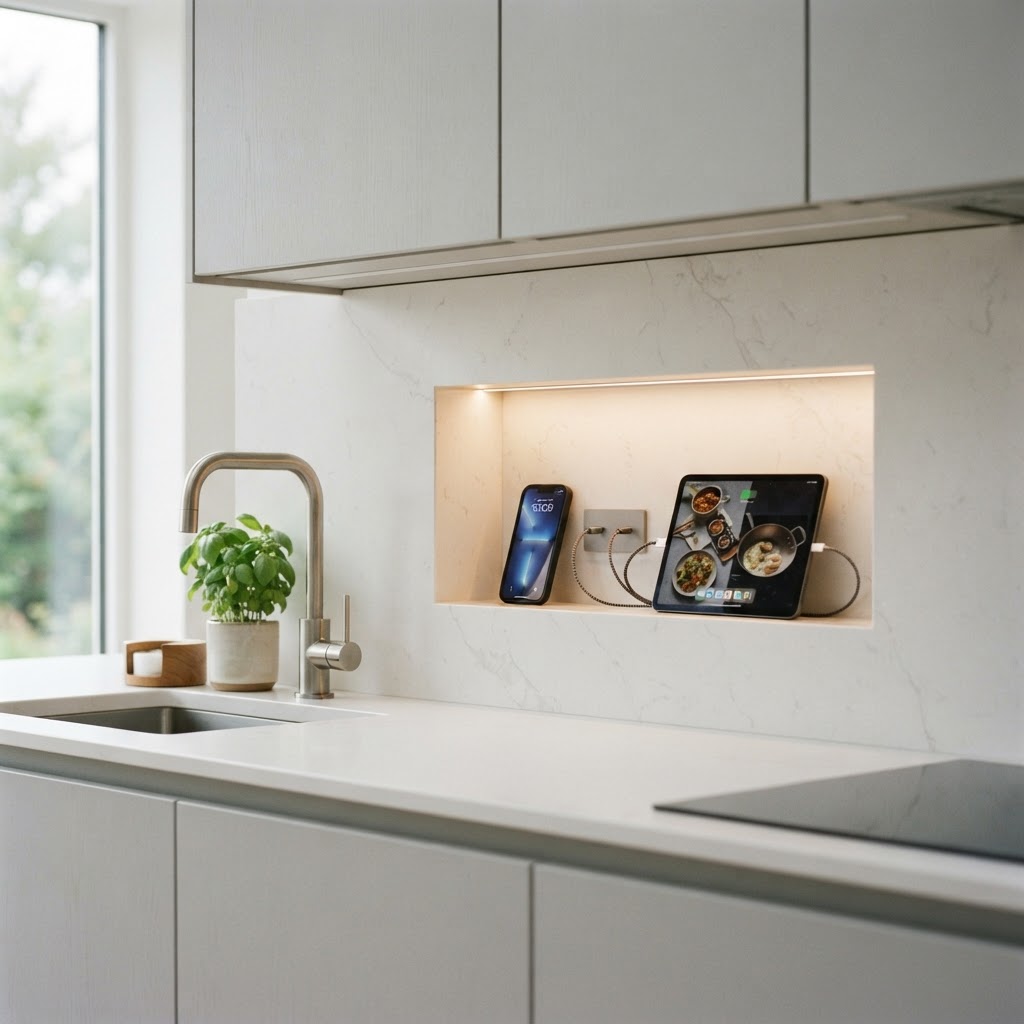
Quartz Slab with Integrated Charging Niche
A recessed niche in the slab keeps phones and tablets off the counter. Hidden charging points sit inside the stone.
The niche is cut by the fabricator before installation. Add a small shelf light so the recess reads clearly.
Quartz is non-porous, so it suits this kind of precision detail. Keep the cabinet fronts handleless for a clean line.
This is the most future-facing idea on the list. It solves a modern problem without adding visible clutter.
MATERIAL Quartz slab · PAIRS WITH handleless pale cabinets and brushed steel
How to Choose a Backsplash Without Regret
- Start with the cabinets, not the tile. The wall has to work with the colour that already fills the room.
- Decide the height before you shop. A short splash is cheaper, but a full-height wall makes the room feel bigger.
- Budget for grout, trim, sealing, and labour, not just the tile. Those four items often add thirty percent to the material cost.
- Look at your samples in daylight and again at night. A stone that looks warm at noon can look grey under a cool bulb.
- Then live with the sample for a week before you commit. Two days is not enough to know if a pattern will tire you out.
Grout and Trim Details That Finish the Job
Grout is the quietest design decision and one of the most visible. A grout two shades darker than the tile makes the grid read; a matching grout makes the wall look solid.
Narrow joints suit large slabs and modern grids. Wider joints belong with handmade tile, where the gap is part of the charm.
Trim finishes the top edge and stops the wall looking cut off. Brass, blackened steel, and stone pencil trims are the three that always work.
Seal porous materials before the first cook, not after the first stain. Epoxy grout is worth the extra cost in a busy family kitchen.
Final Thoughts
The best backsplash is the one that solves your room, not the one that trends hardest. Material, light, and cleaning routine matter more than the photograph.
Choose one idea from this list, ask for a real sample, and check it against your cabinets. That simple step is what separates a finished kitchen from a decorated one.
Material Cheat Sheet
Use this table when you compare quotes. The care column matters as much as the price.
| Material | Best for | Care |
|---|---|---|
| Ceramic and porcelain tile | Everyday kitchens, tight budgets, bold pattern | Wipe down; seal grout once a year |
| Marble and limestone | Luxury slabs, book-matched features | Seal twice a year; avoid acids |
| Quartz and quartzite | Hard-working statement walls | Soap and water; no scouring pads |
| Zellige and handmade clay | Colour, texture, and craft detail | Seal glaze edges; gentle cleaner |
| Glass, mirror, and metal | Light, glamour, and small dark rooms | Non-ammonia glass spray, soft cloth |
| Timber and plaster | Warm, quiet, natural schemes | Re-oil or re-seal every year |