

60 Kitchen Window Curtain Ideas: Café, Valance & Roman Shade Inspiration
Kitchen Window Curtain Ideas That Actually Work
The kitchen window is the hardest window in the house to dress.
It has to give you light for cooking. It also has to give you privacy from the street, and it sits right behind a sink, a hob or a worktop that splashes.
That is the real reason so many kitchens end up with bare glass and a cheap blind that was never chosen on purpose.
Below are 60 kitchen window curtain ideas, grouped by style and photographed in real kitchens.
Every idea lists the light it filters and the fabric weight, so you can shop by how the window needs to behave and not just how it looks.
Use the index to jump to the look you like. Then read the buying guide underneath before you order fabric.
How to Choose the Right Kitchen Curtain
Five decisions settle almost every kitchen window. Work through them in order and the choice becomes obvious.
1. Measure the window, not the old curtain
Measure the opening itself and then measure the wall around it.
For a café curtain, note the height from the sill to the halfway point and add 5 cm for the pocket and hem.
For full-length panels, measure from the rod down to the floor, then take off 1 cm so the fabric skims instead of dragging.
2. Match the fabric to the room
Kitchens throw steam, grease and strong sun at anything hanging in them.
Cotton and linen handle all three. They wash well and fade slowly.
Burlap, jute and raw canvas look wonderful, but keep them away from the hob.
Avoid heavy velvet or dry-clean-only fabric near a cooker. It traps cooking smells and is almost impossible to refresh.
3. Choose a length that clears the sink
Anything that hangs below the sill will get splashed.
A café curtain that finishes about 15 cm above the sill stays dry and still hides the street.
If you want full coverage, use a roman shade that lifts completely clear of the tap.
4. Pick hardware you can fit yourself
A tension rod needs no drilling, which makes it perfect for renters and tiled reveals.
A slim brass or matte black rod looks more finished, and clip rings let you slide the curtain open in one movement.
For heavy linen, use a bracket-mounted rod. A tension rod will slip under the weight.
5. Use colour to make the window look expensive
Start with the darkest colour in the room and go two shades lighter.
Sage, oatmeal, warm grey and bone are the safest kitchen neutrals.
One pattern is enough. Put it on the curtain and keep everything else plain.
If the window faces west, a warm tone stops the afternoon sun from turning the room yellow.
Café Curtains
Café curtains cover the bottom half of the window only. They are the most practical style for a kitchen and the easiest to install, because a slim tension rod is all you need.
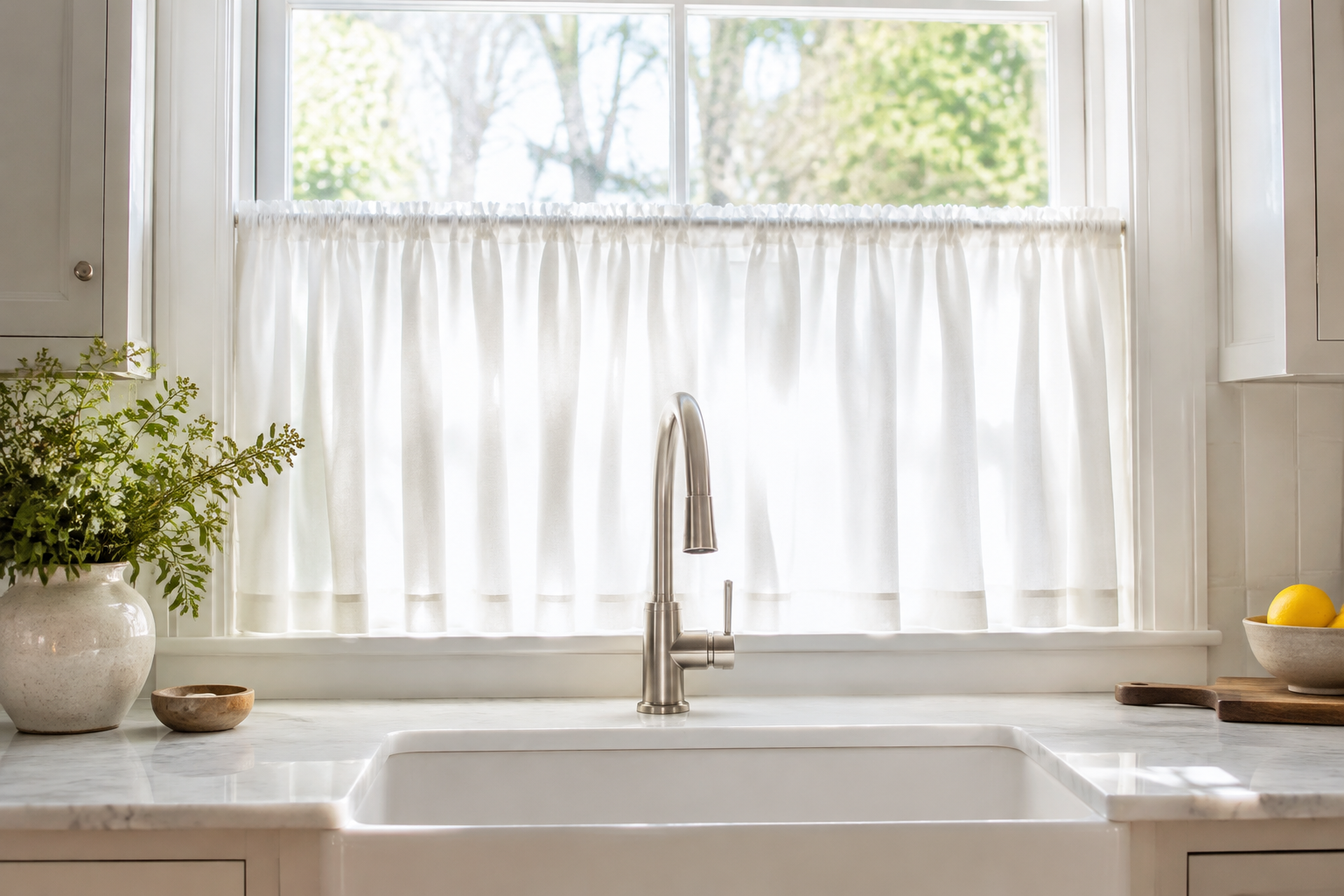
Classic White Cotton Café Curtains
A plain white cotton tier is the most useful curtain in the kitchen. It covers the bottom half of the window and leaves the top clear for light and air.
The fabric is usually a mid-weight cotton with a simple rod pocket. It hangs in soft, even folds and never looks fussy.
Wash it every few months on a cool cycle. White cotton hides nothing, but it also brightens the whole room.
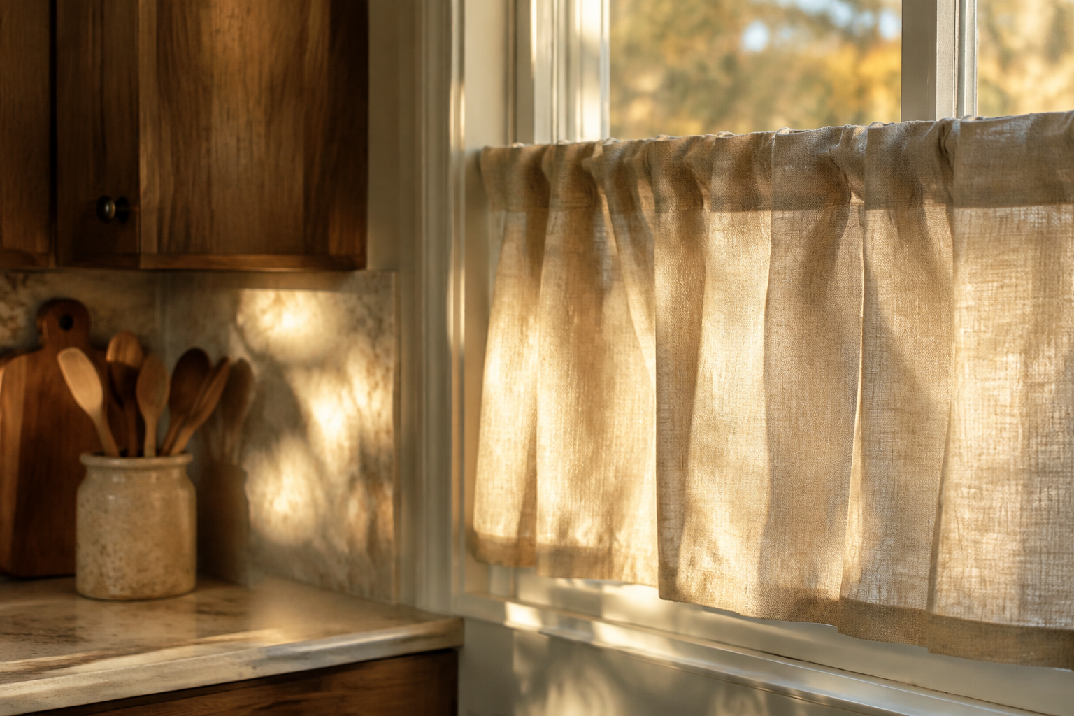
Soft Oatmeal Linen Café Curtains
Oatmeal linen gives you the same coverage as white cotton with far more texture. You can see the weave, and the colour shifts through the day.
Linen creases, and that is exactly the point. The soft crumples stop the window looking flat and formal.
Pair it with oak cabinets and stone worktops. Warm neutrals always flatter natural wood.
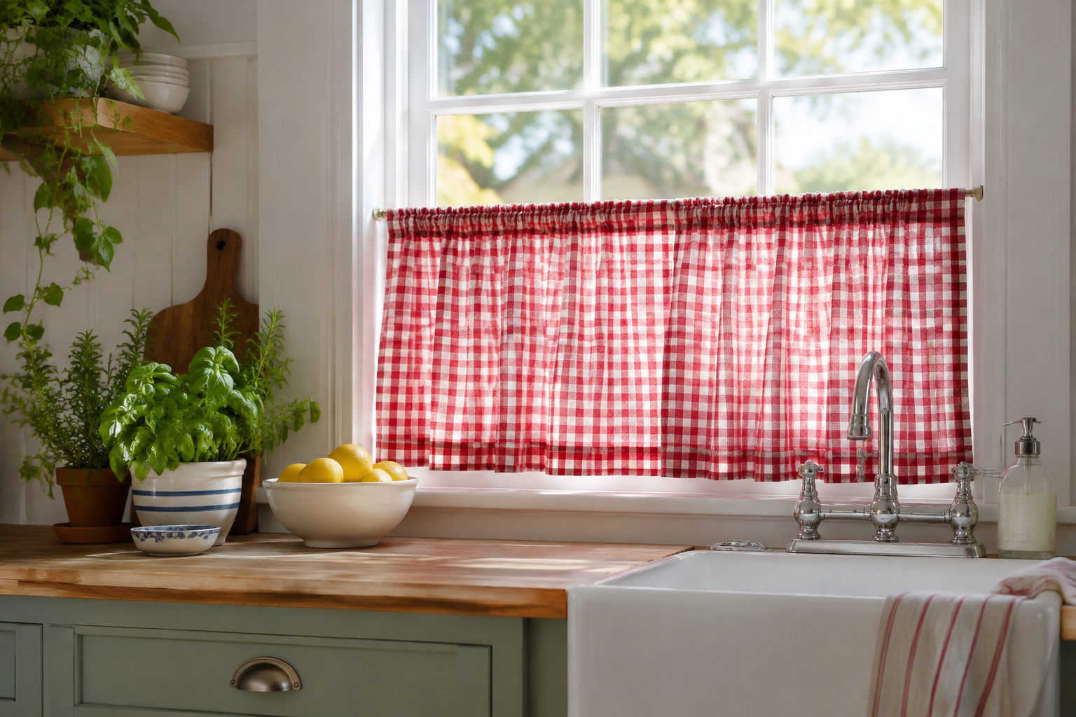
Red Gingham Café Curtains
Gingham is the friendliest pattern in a kitchen. The small check adds colour without making the room feel busy.
Keep the check small on narrow windows and larger on wide ones. Scale is everything with a print.
Cottage and farmhouse kitchens suit red, while pale blue reads cooler and calmer.
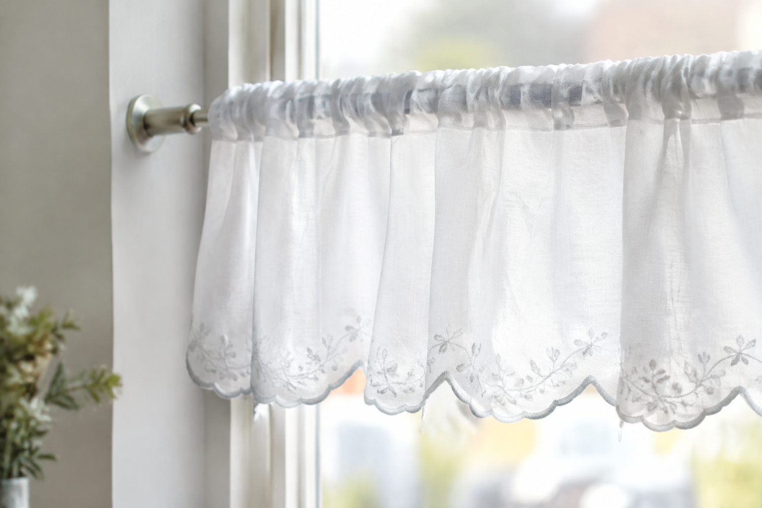
Scalloped-Hem Café Curtains
A scalloped hem turns a plain café curtain into something special. The curve is usually embroidered or bound in the same thread.
It works best on a small window that would otherwise look plain. The curved edge softens a hard window frame.
Choose a scallop depth of 3 to 5 cm. Anything bigger starts to look like a valance.
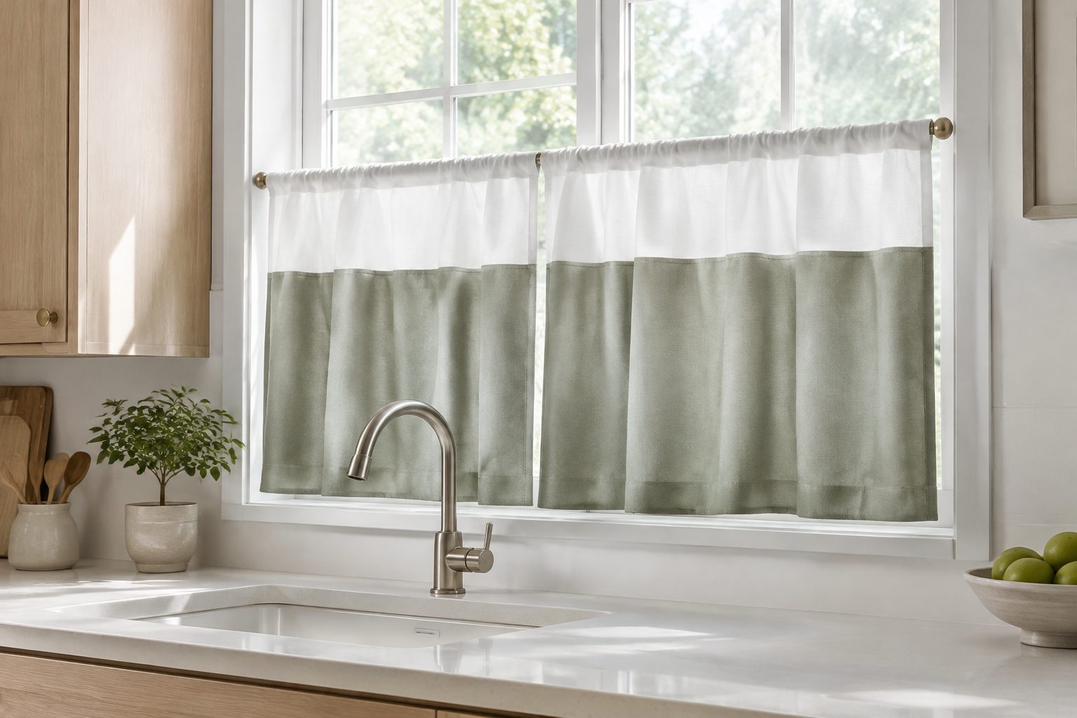
Two-Tone Café Curtains
Two-tone café curtains split the tier into a white band on top and a colour below. The contrast adds height without changing the window.
Use a soft colour under the band, such as sage, chambray or clay. It grounds the window against the worktop.
This is a simple idea to copy at home. Sew a wide band onto a plain white tier.
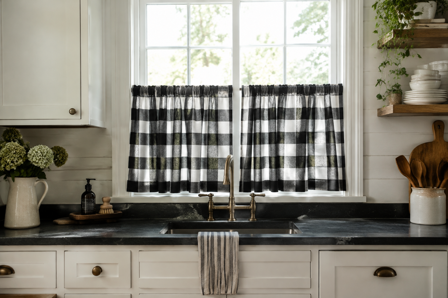
Black and White Buffalo Check Café Curtains
A buffalo check is a bold plaid in two colours. In a kitchen it works best on the lower half of the window only.
Keep everything else plain so the pattern can lead. White cabinets and dark worktops are the perfect backdrop.
Buffalo check is heavier than gingham and reads more graphic. Use it when you want the window to be the focal point.
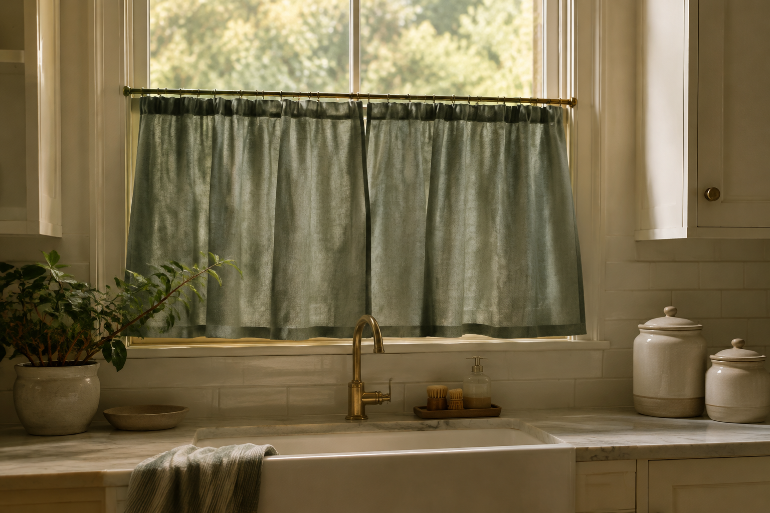
Sage Green Café Curtains
Sage is the quietest green on the paint chart. On a kitchen window it reads as a neutral rather than a colour.
It pairs with white tiles, brass hardware and pale wood. It also softens a very bright, very white kitchen.
Choose a cotton or linen blend so the dye stays soft. Flat greens in thin fabric look harsh.
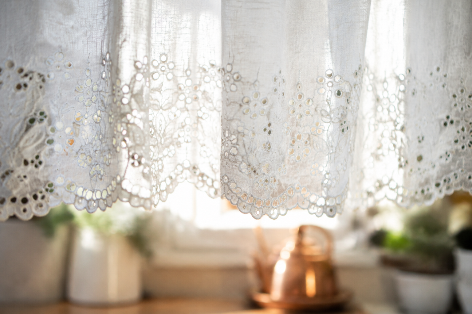
White Eyelet Café Curtains
Eyelet is cotton with small embroidered holes punched through it. The pattern is geometric, but the effect is soft and romantic.
Daylight passes through the holes and glows. In the evening the same holes read as a subtle pattern.
Eyelet suits cottage and vintage kitchens. Keep the rest of the window plain so it does not compete.
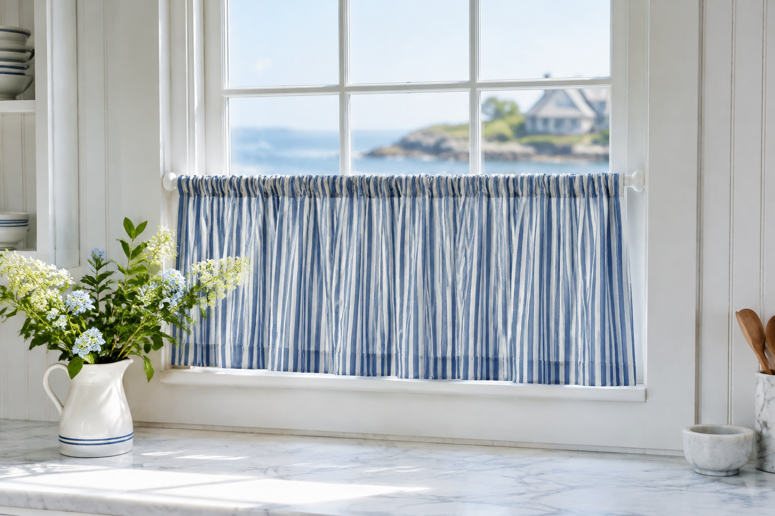
Blue Ticking Stripe Café Curtains
Ticking stripe is a narrow, evenly spaced stripe on a white ground. It is one of the oldest patterns in home textiles.
Run the stripe vertically on a tall window and horizontally on a wide one. Direction changes the whole shape.
Navy and white is the classic version. Pale blue feels fresher and more coastal.
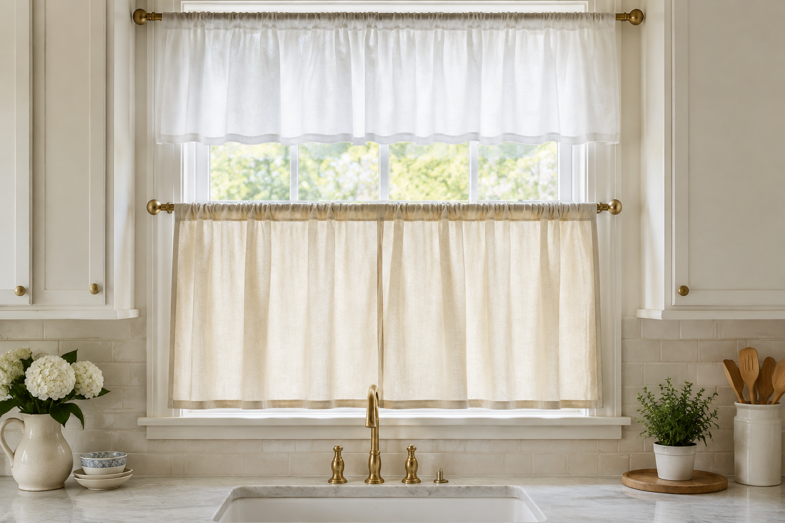
Double-Rod Café Curtains
Two rods let you hang a short valance above a longer tier. The top section hides the rod and the bottom section gives privacy.
Set the rods roughly 10 cm apart. Any closer and the two layers fight each other.
You can open just the lower tier on a warm day. The view stays clear while the top stays covered.
Valances and Top Treatments
A valance runs across the top of the window. It hides the rod, adds structure, and leaves most of the glass clear for light.
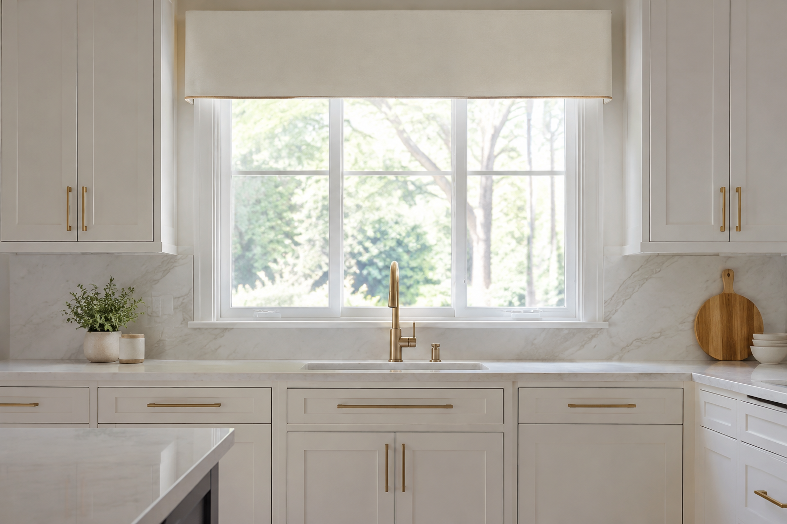
Tailored Flat Valance
A flat valance is a straight band of fabric across the top of the window. It is the most modern valance shape there is.
Add a slim contrast piping along the bottom edge. It gives the plain band a crisp finish.
Choose a drop of 25 to 35 cm. Longer than that and it starts to cut off the light.
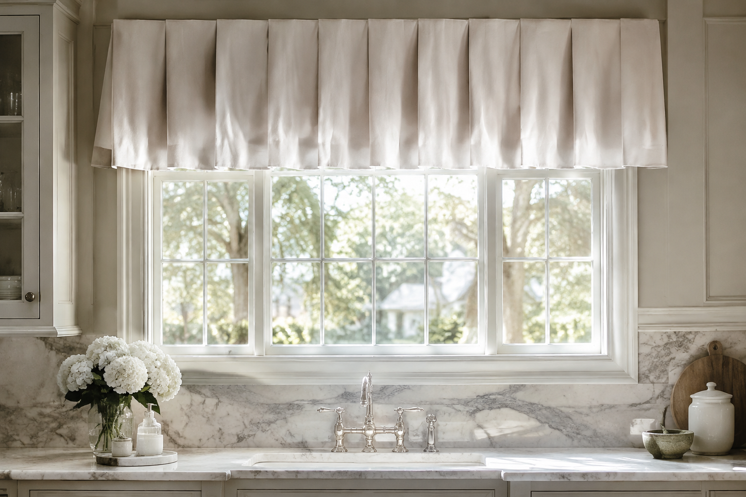
Box-Pleat Valance
Box pleats are flat folds pressed into the fabric at regular intervals. Each pleat throws a sharp vertical shadow.
The structure adds height to a short window. It also hides an ugly curtain rod completely.
Keep the pleats evenly spaced. Odd numbers generally look calmer than even ones.
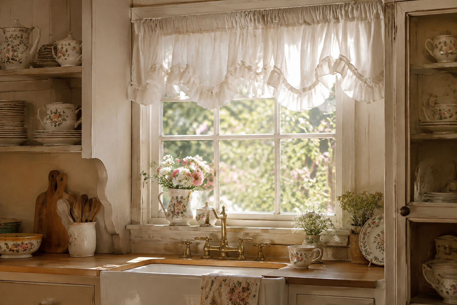
Ruffled Gathered Valance
A ruffled valance is gathered along the rod so the fabric falls into soft waves. The bottom edge usually carries a frill.
It suits cottage, shabby chic and vintage kitchens. It softens windows that feel too square.
Avoid heavy fabric here. The ruffle needs a light cotton to keep its softness.
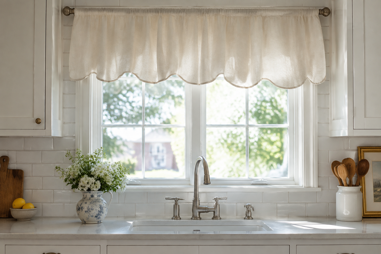
Scalloped Valance
A scalloped valance has a curved wave along its bottom edge. The curve is usually bound in the same or a contrast colour.
It reads as traditional but stays neat. A single row of large scallops looks better than several tiny ones.
Pair it with a plain café tier below for a complete traditional window.
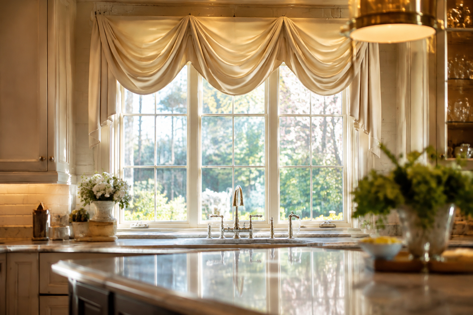
Soft Swag Valance
A swag valance drapes in a gentle curve across the window. The fabric is softly folded rather than pleated.
It brings a formal, almost hotel feeling to a kitchen. Use it only on larger windows so it does not crowd the room.
Silk blends and lined cottons hold the curve best. Unlined fabric tends to droop.
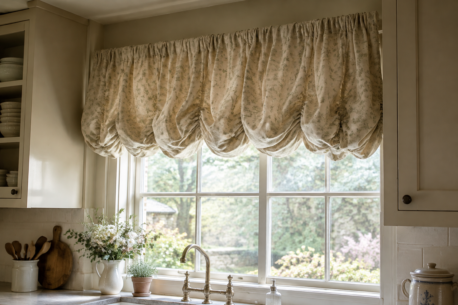
Balloon Valance
A balloon valance is gathered top and bottom so the middle puffs out. The shape is rounded and generous.
It suits country kitchens and small windows that need volume. It looks best at around 35 to 45 cm deep.
Keep the fabric light. A heavy balloon valance turns into a solid block of colour.
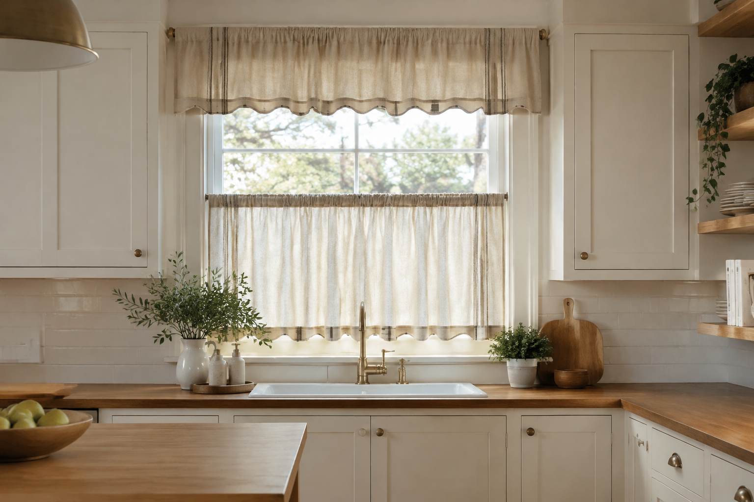
Layered Valance Over Café Curtains
A valance on top of a café tier gives you two levels of coverage. The top hides the rod and the bottom hides the street.
Use the same fabric for both layers so the window reads as one piece. Mixing patterns here rarely works.
This is the classic treatment for a traditional kitchen sink window.
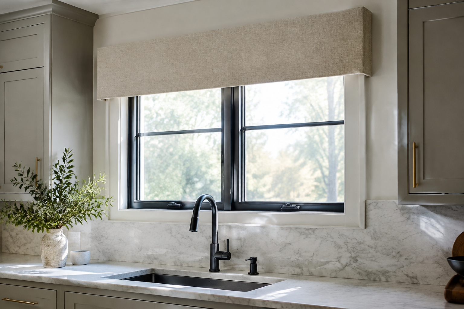
Upholstered Cornice Board Valance
A cornice board is a padded box that sits above the window. The fabric is stretched flat so the shape stays crisp.
It is the most architectural option on this list. Nothing else hides a rod so completely.
Padded cornices suit modern kitchens. Keep the fabric plain and the shape simple.
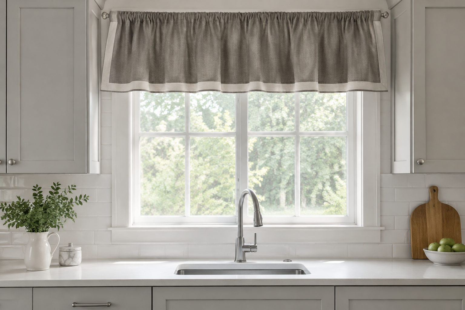
Trimmed Rod-Pocket Valance
This is a plain valance with a narrow trim along the bottom. The trim can be ribbon, braid or a contrast fabric.
It is the cheapest way to make a plain valance look designed. A band of 2 to 4 cm is enough.
Match the trim to your cabinet handles. Small repeats make a room feel considered.
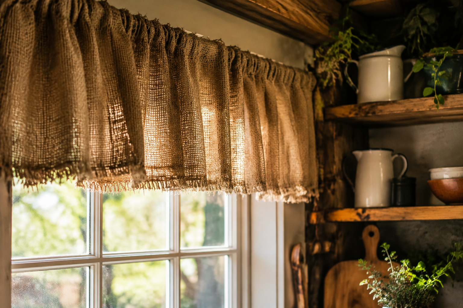
Burlap Farmhouse Valance
Burlap is a rough woven jute fabric with a natural beige colour. It brings instant texture to a farmhouse window.
The open weave lets some light through the fabric itself. That softens the top of the window without blocking the view.
Keep burlap away from the hob. The fibres hold cooking smells and are hard to wash.
Roman Shades
A roman shade lifts rather than swings. Nothing hangs over the sink, and the glass stays completely clear when the shade is raised.
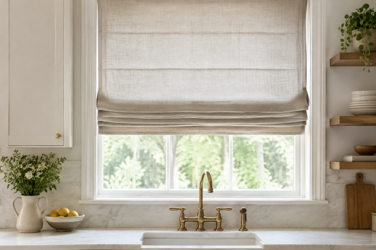
Natural Linen Roman Shade
A roman shade folds into neat horizontal pleats as it lifts. In linen it looks soft but stays architectural.
It is the best choice for a window above a sink. Nothing hangs down into the washing-up area.
Mounted inside the frame, a linen roman shade disappears into a small kitchen.
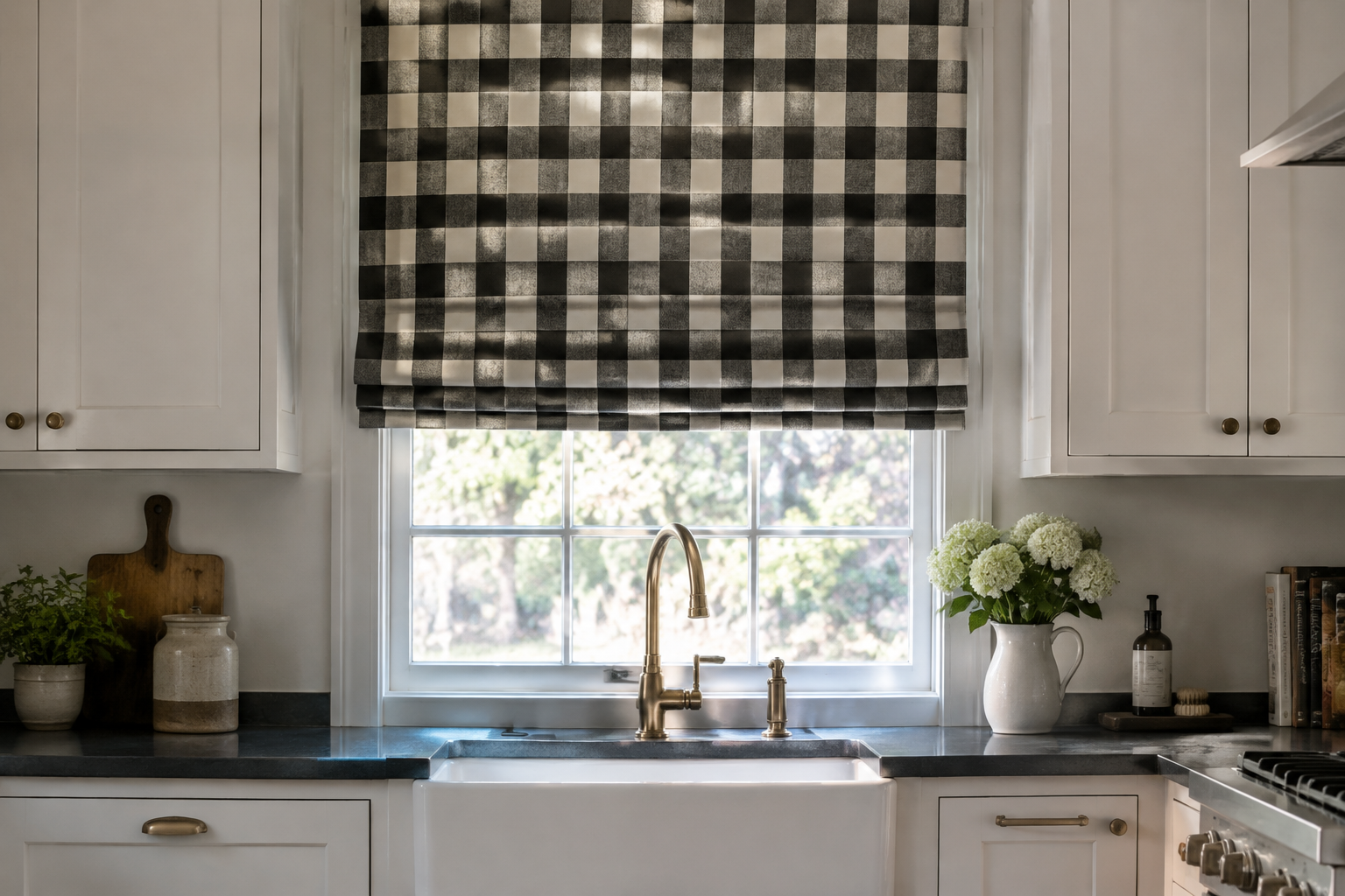
Buffalo Check Roman Shade
The same bold plaid that works on a café tier also works on a shade. The horizontal folds break up the pattern in a good way.
A raised shade shows stacked checks at the top and open glass below. That half-and-half look is very modern farmhouse.
Keep the rest of the kitchen plain. A plaid shade is already the loudest thing in the room.
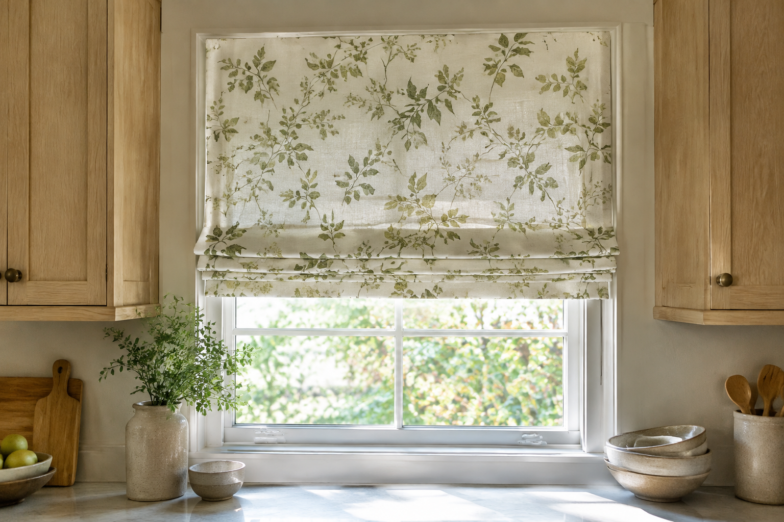
Botanical Floral Roman Shade
A soft floral print on a roman shade brings the garden inside. Small motifs look calmer than large blooms.
The folds cut through the pattern, so even a busy print feels controlled.
Green and cream is the safest palette for a kitchen. It works with wood, white and stone.
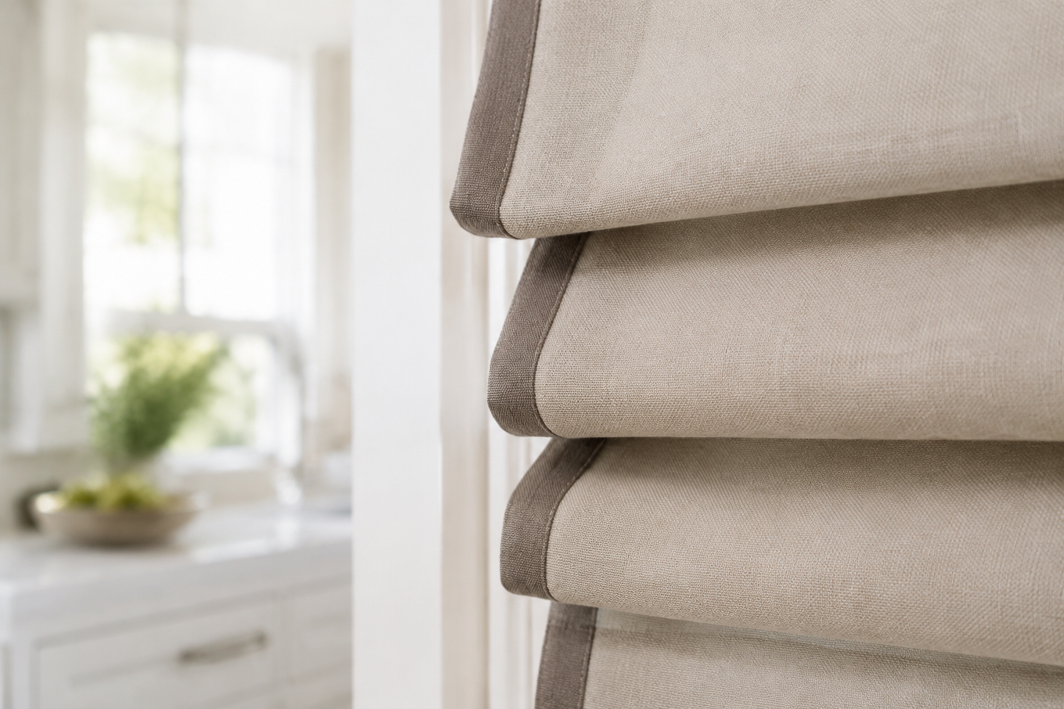
Roman Shade with Banded Trim
A contrasting band along each fold turns a plain shade into a tailored one. The trim echoes the fold lines.
Use a darker tone for the band than the main fabric. That is what creates the crisp edge.
This detail works best on a plain fabric. Do not add trim to a print.
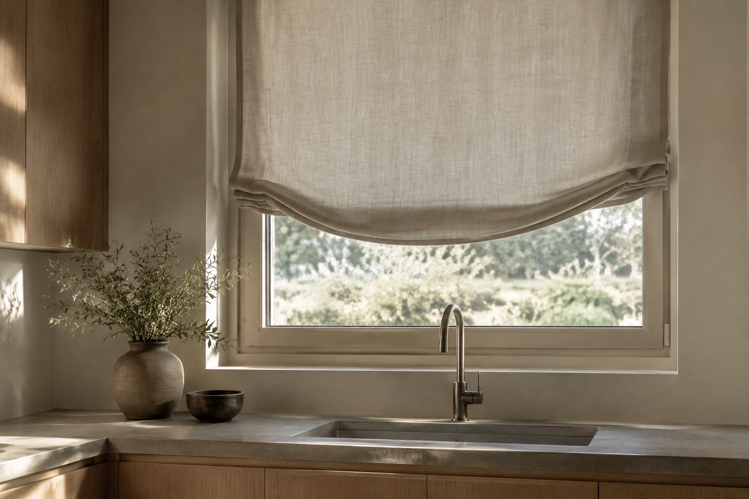
Relaxed Roman Shade
A relaxed roman shade has a soft scooped curve at the bottom instead of a straight edge. The shape is gentler and less formal.
It suits kitchens with soft styling and natural fabrics. It also hides a slightly uneven window.
Choose a light linen or cotton so the curve drapes properly.
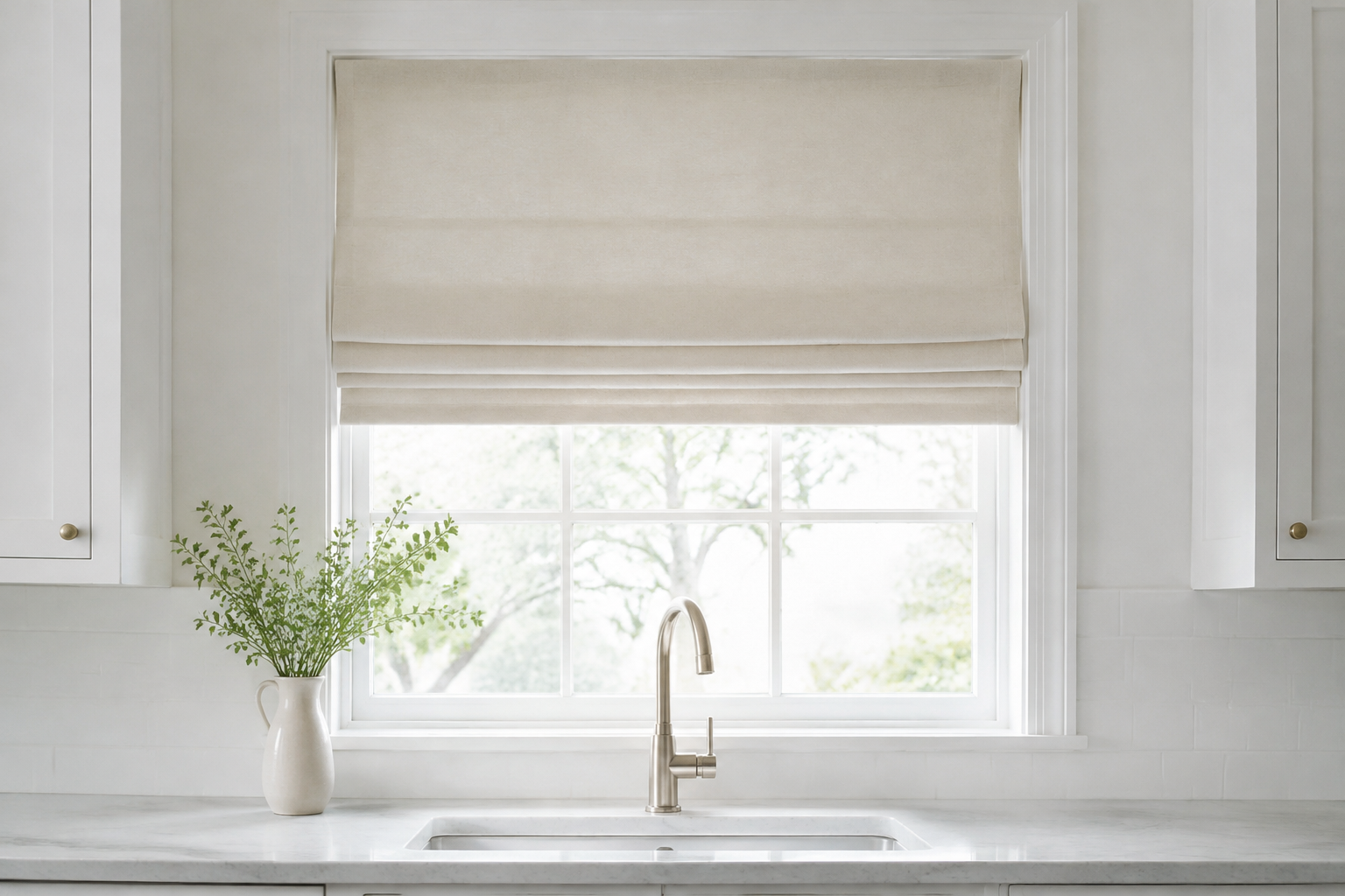
Flat Natural Cotton Roman Shade
A flat roman shade has smooth, even folds and no visible seams. It is the most minimal shade shape.
In unbleached cotton it almost disappears against a white wall. That is exactly why designers use it.
Mount it inside the window reveal for a clean, built-in look.
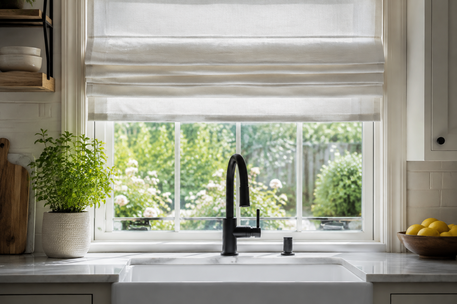
Half-Raised Roman Shade
Leaving a roman shade half raised is a styling choice as much as a practical one. It blocks the view from the street while letting in daylight.
The stacked folds at the top become a decorative band. Choose a fabric you actually want to look at.
This is the easiest way to control privacy above a sink without losing light.
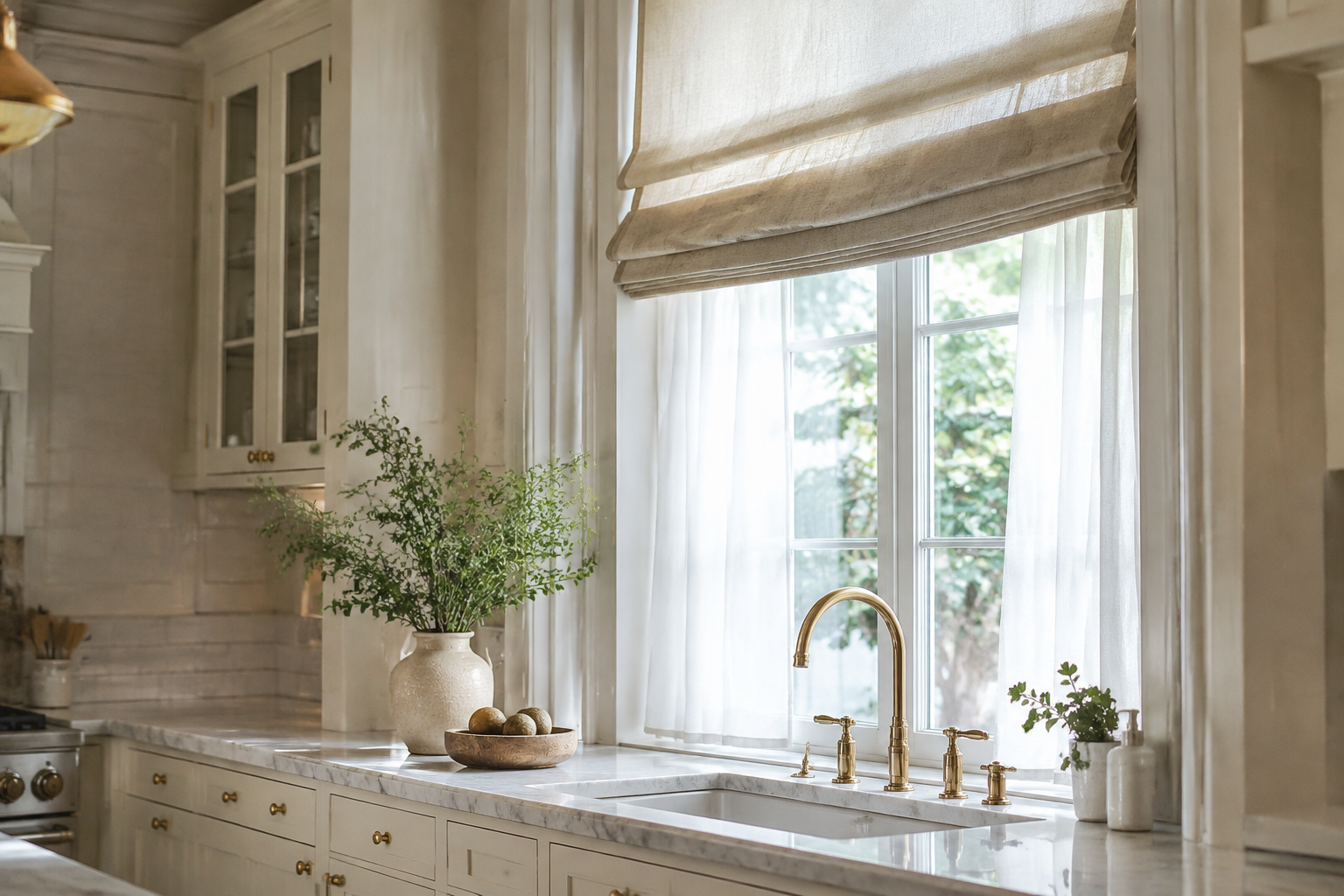
Roman Shade Layered Over Sheers
A raised roman shade with a sheer panel behind it gives you two textures in one window. The shade adds weight and the sheer adds softness.
Use the sheer for daytime privacy and drop the shade for the evening.
Keep both layers in the same colour family. The window will look taller and calmer.
Sheers and Light Control
Sheers soften glare without blocking daylight. Use them alone for gentle privacy, or layered with a heavier treatment for evening.
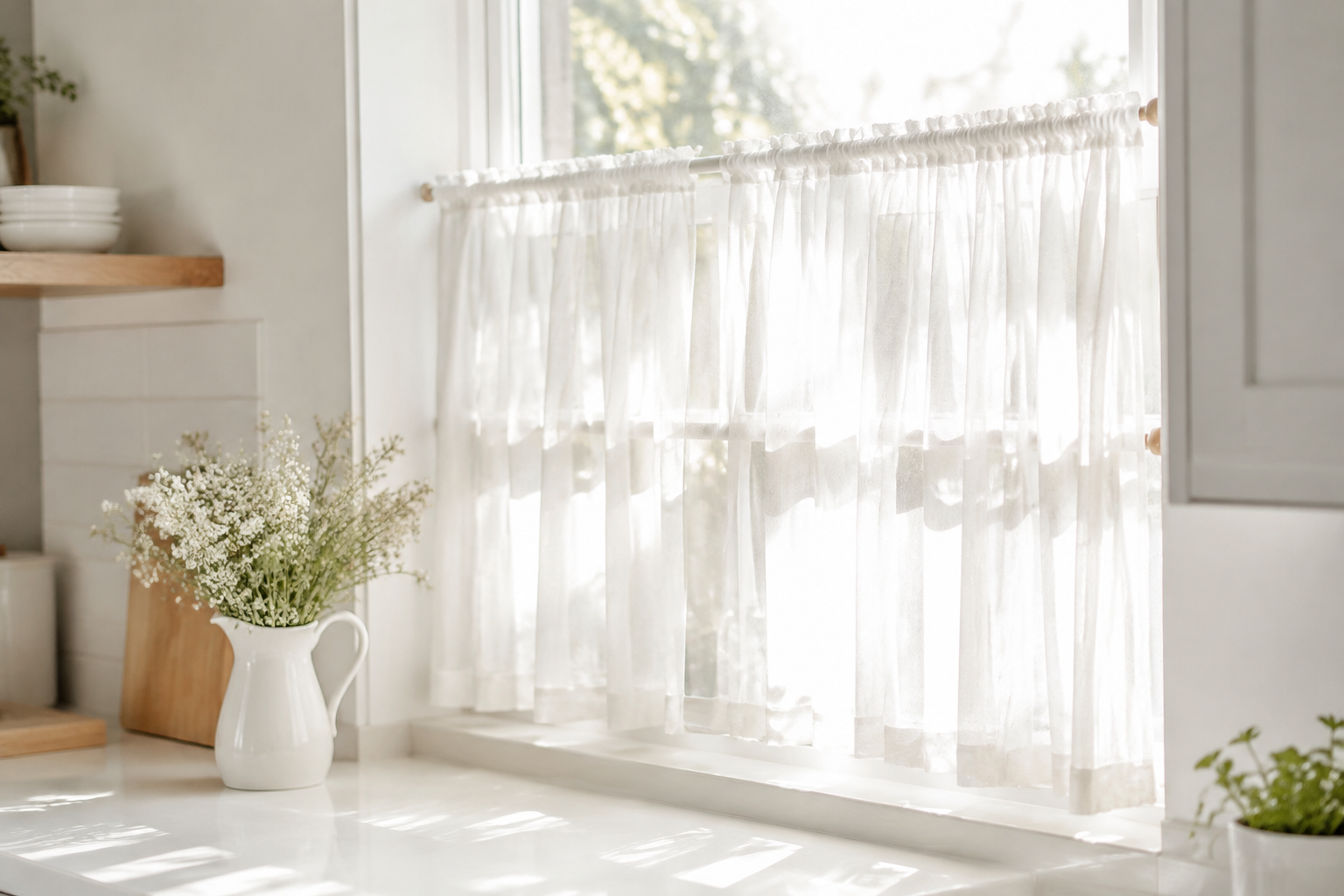
Sheer White Kitchen Tiers
Sheer tiers are the lightest way to cover a kitchen window. The fabric softens glare without cutting out daylight.
They are made for the bottom half of the window, exactly where a café curtain sits.
Wash them often. Sheer white fabric shows kitchen grease faster than anything else.
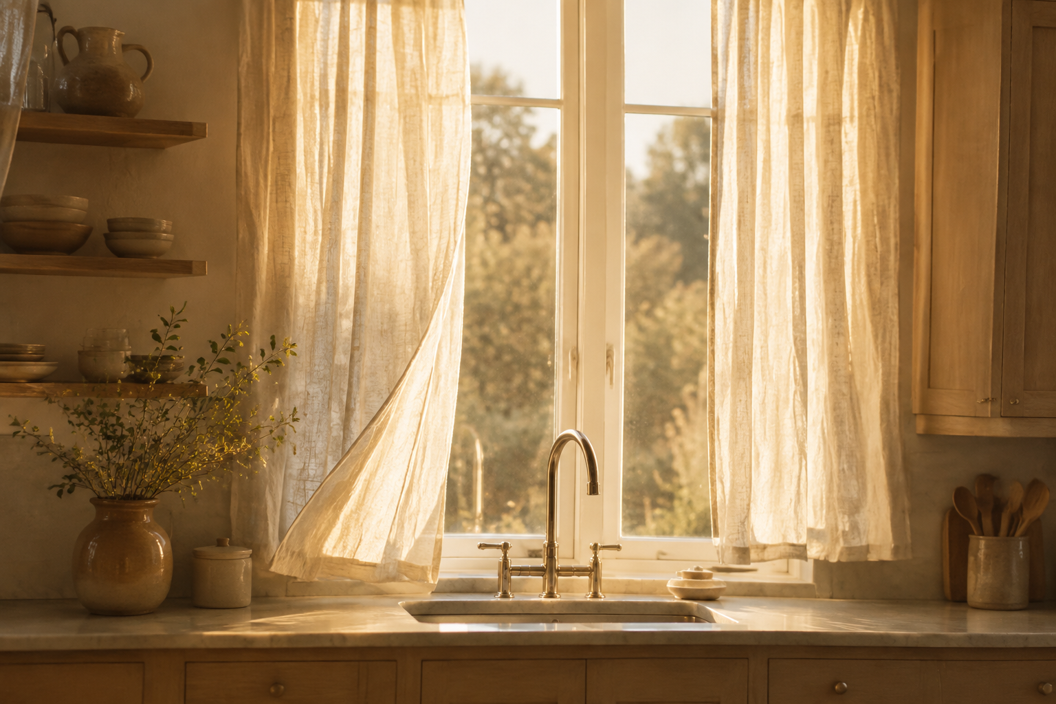
Wispy Linen Sheer Panels
Semi-sheer linen panels sit on either side of the window rather than across it. The middle stays open.
The fabric catches the light and moves with any draught. That soft movement is the whole point.
Choose a panel width of about one and a half times the rod length for good folds.
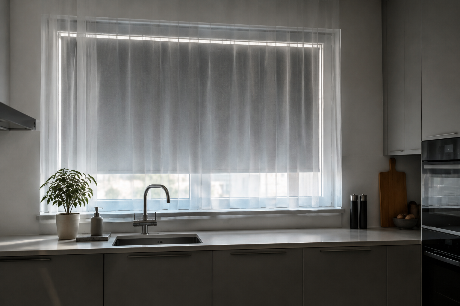
Sheer Panel Over a Blackout Shade
Layering a sheer in front of a blackout roller solves the two biggest kitchen problems. Daytime glare and evening privacy.
Keep the roller hidden behind the sheer during the day and drop it at dusk.
This pairing suits west-facing kitchens that get hot afternoon sun.
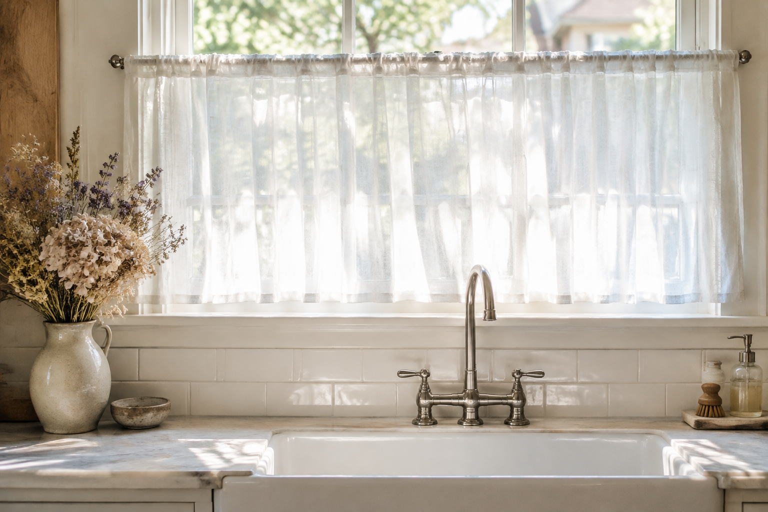
Sheer Café Curtains Over a Sink
A sheer café tier above the sink keeps the street out of view without darkening the room. It is the softest privacy solution there is.
Hang it on a slim tension rod inside the window reveal. No drilling and no brackets.
Keep the drop short so the hem stays clear of splashes.
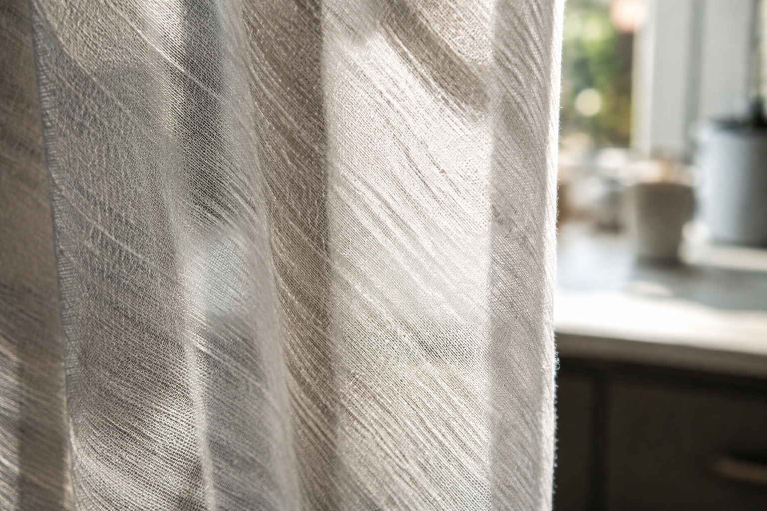
Textured Voile Sheers
Voile with a visible slub or woven texture looks far more expensive than plain voile. The texture catches the light.
The weave also hides creases and small marks better than a smooth fabric.
Use it wherever you want light but do not want the window to look empty.
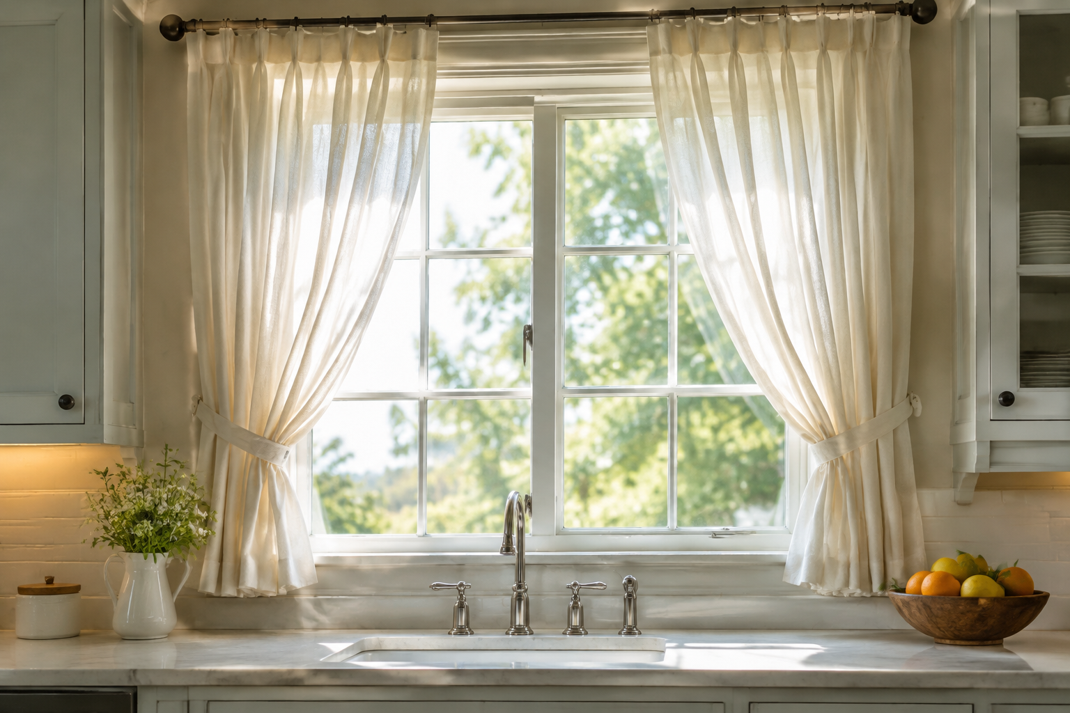
Semi-Sheer Panels with Tiebacks
Tiebacks pull a soft panel to one side and hold it there. The window stays open in the middle and framed at the edges.
Cotton tiebacks in the same fabric look the most finished. Ribbon works too.
This suits a wide kitchen window that is too big for a single tier.
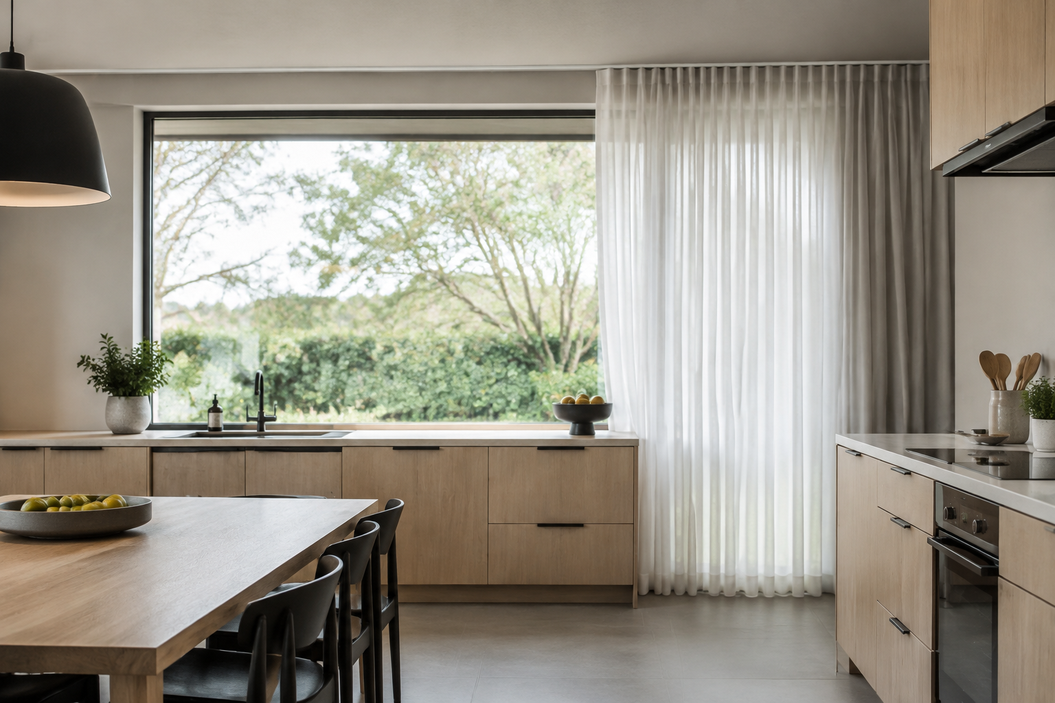
Sliding Sheer Panels on a Track
A ceiling track lets sheer panels slide right across a wide opening. They stack tightly to one side when open.
It is the cleanest option for a kitchen-diner with doors to the garden.
Choose a slim track that matches the ceiling colour. The hardware should disappear.
Natural Fibre and Farmhouse
Jute, burlap, linen and canvas bring texture and warmth. These are the fabrics that suit country, coastal and rustic kitchens.
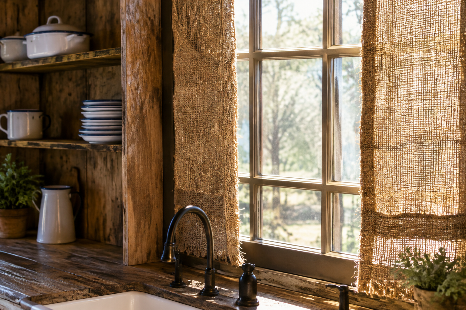
Burlap Panels
Burlap panels bring rough, honest texture to a farmhouse kitchen. The weave is wide and the colour is naturally warm.
Use them as side panels rather than full coverage. Burlap is too heavy to draw across a bright window.
Line them if you want a neater edge. Unlined burlap frays and stretches.
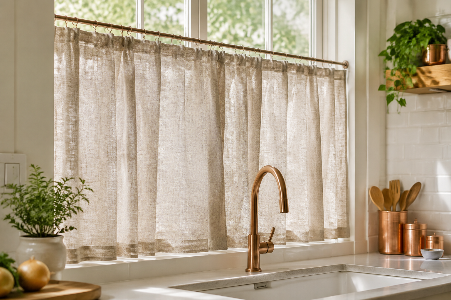
Jute and Cotton Blend Panels
A jute and cotton blend is softer than pure burlap and much easier to live with. The colour stays naturally oatmeal.
The chunky weave reads as texture from across the room and as craft up close.
Pair it with copper, white tile and pale wood. Natural fibres warm up cool kitchens.
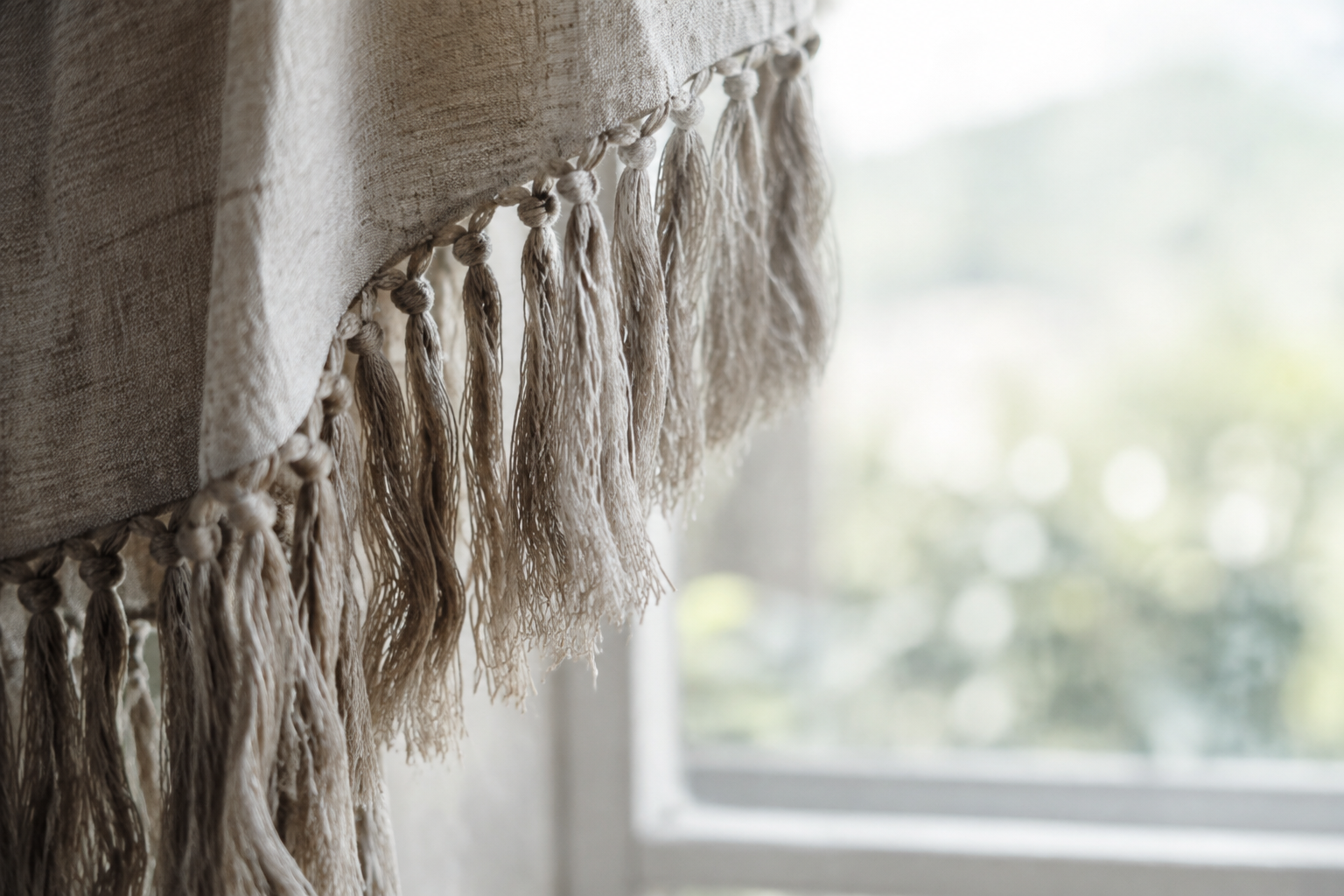
Fringed Rough Linen Curtains
A long hand-knotted fringe along the inner edge is a designer detail you can buy off the shelf. It adds movement to a plain panel.
Fringe works best on heavier linen that can carry the weight. Light fabric lets it droop.
Keep the fringe in the same colour as the fabric for a subtle look.
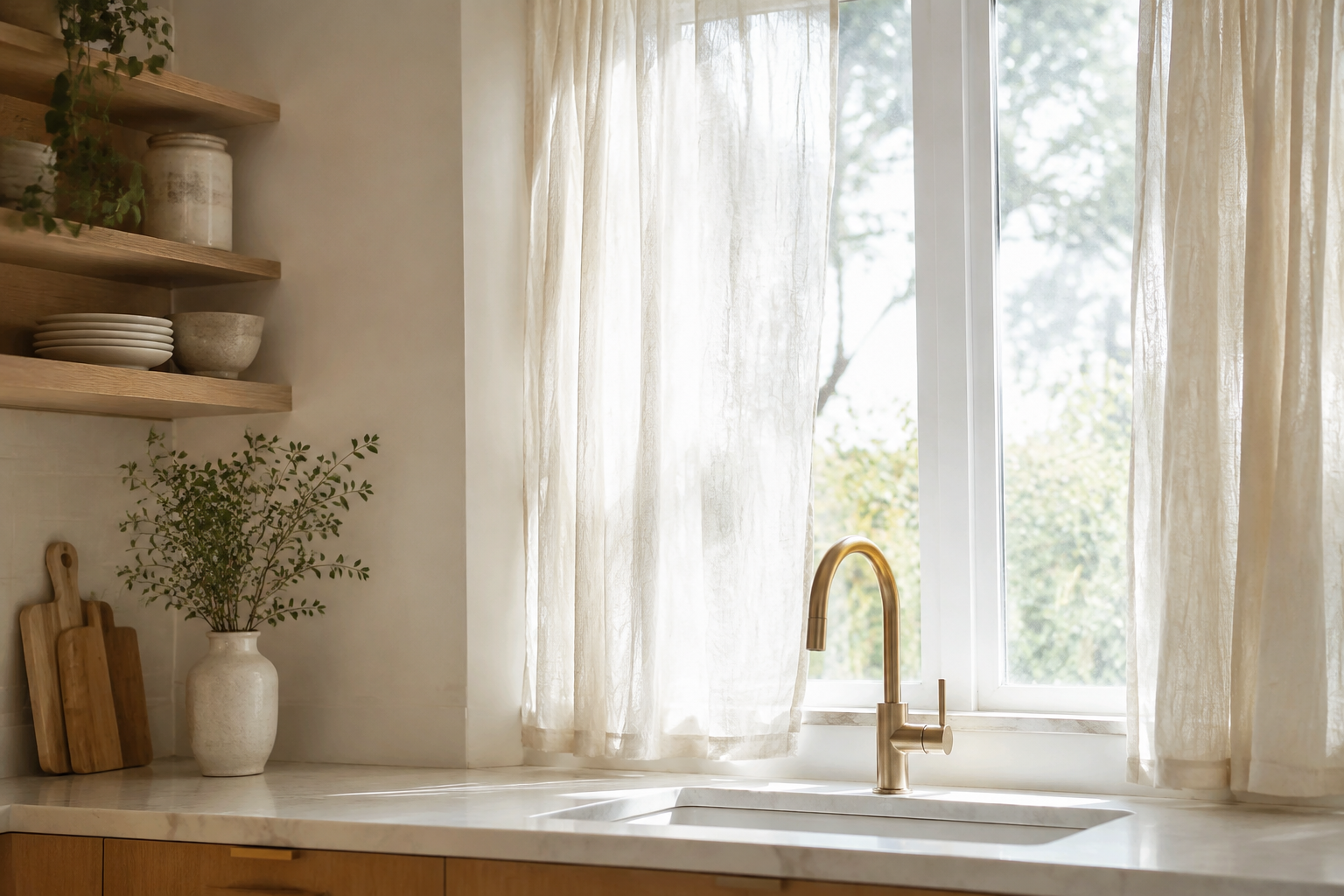
Cotton Muslin Curtains
Muslin is a loose, airy cotton that hangs in soft crinkles. It looks relaxed and slightly undone.
The fabric is light enough to wash at home and cheap enough to replace.
It suits bright, minimal kitchens where a crisp curtain would look too formal.
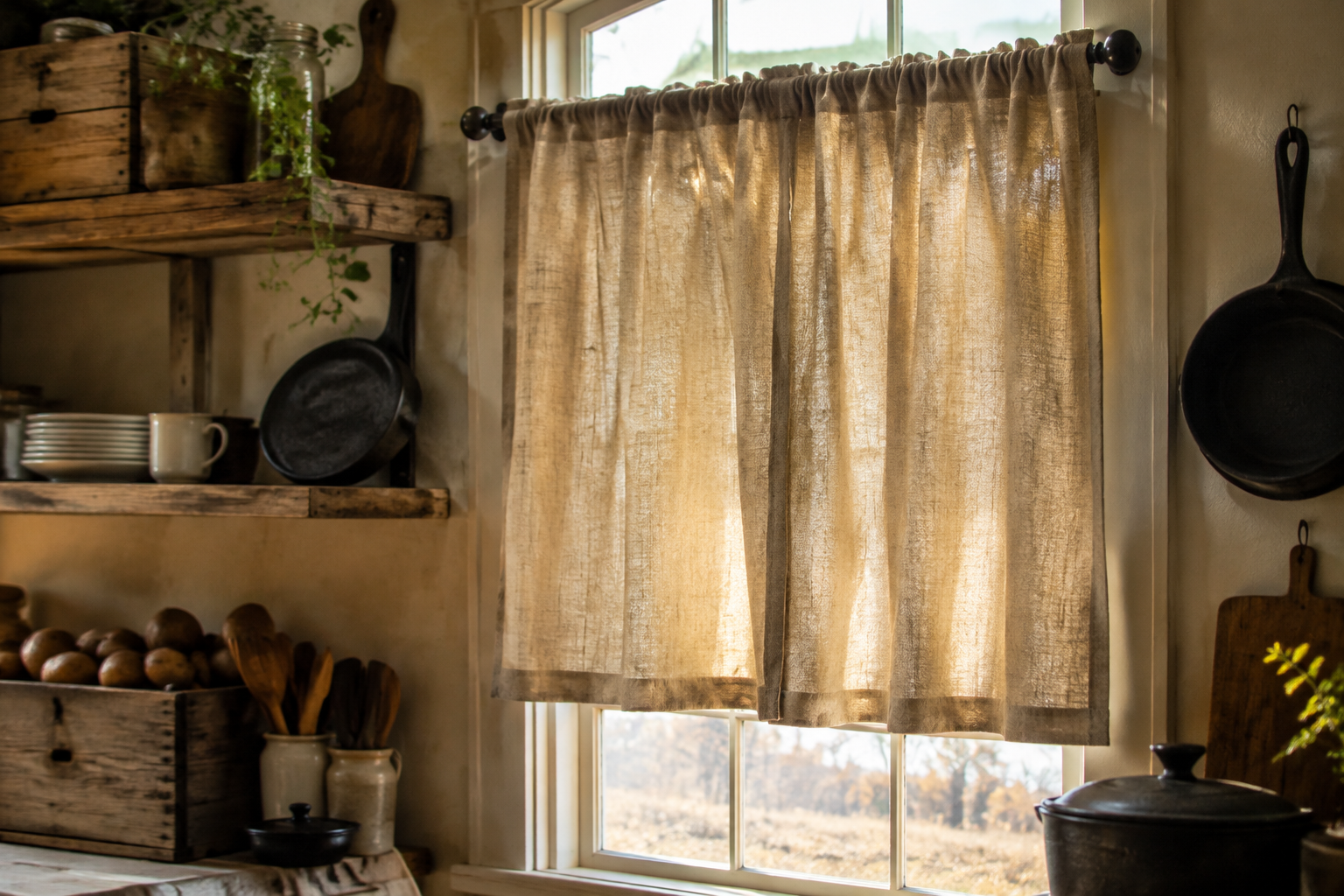
Canvas Drop Cloth Curtains
A canvas drop cloth is a rough cotton sheet sold for painting. Hung at a window it becomes a rustic curtain for very little money.
Wash it first to soften the fabric and shrink it. Then add a rod pocket or clip rings.
The wide weave and natural beige tone suit farmhouse and industrial kitchens.
Modern and Minimal
Clean lines, restrained colour and hardware you barely notice. These treatments suit contemporary kitchens and small galley layouts.
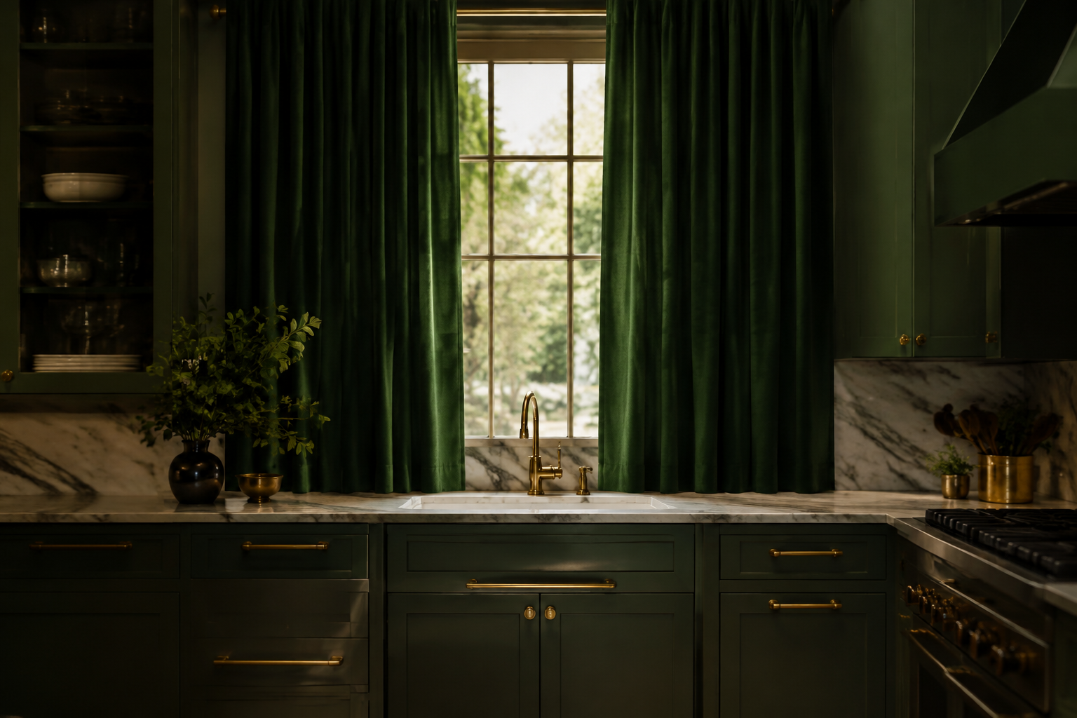
Deep Green Cotton Panels
A deep forest green panel adds weight and colour to a plain kitchen. The matte finish keeps it from looking shiny or cheap.
Use two panels rather than one so the window keeps its shape. Green needs space around it.
It pairs beautifully with marble, brass and warm wood.
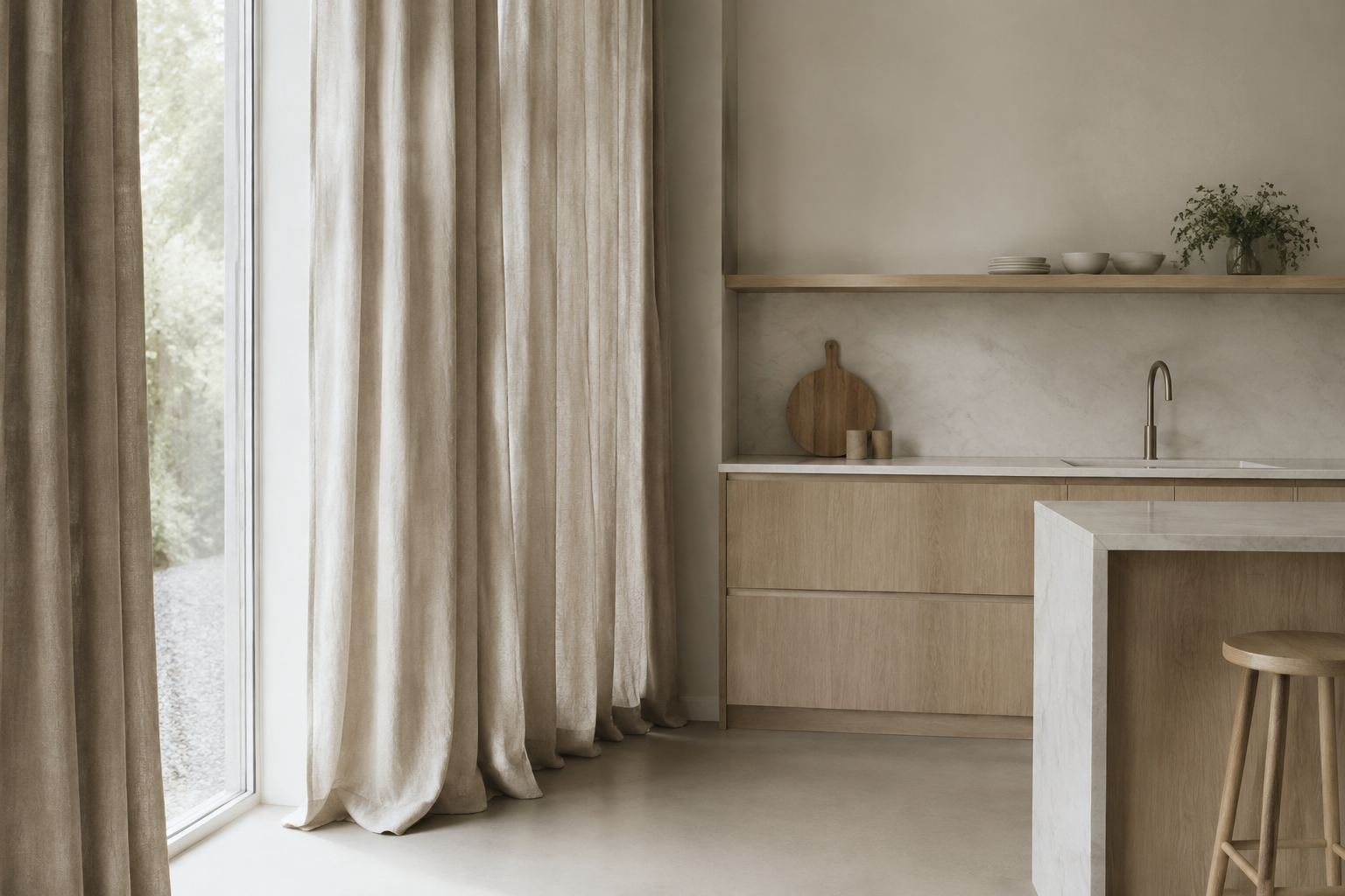
Floor-Length Neutral Linen Panels
Hanging panels from the ceiling to the floor makes a kitchen window look twice as tall. The long vertical folds do the work.
Choose a neutral such as oatmeal, bone or warm grey. The colour should not compete with the room.
Leave the hem just touching the floor. Pooling fabric collects kitchen dust.
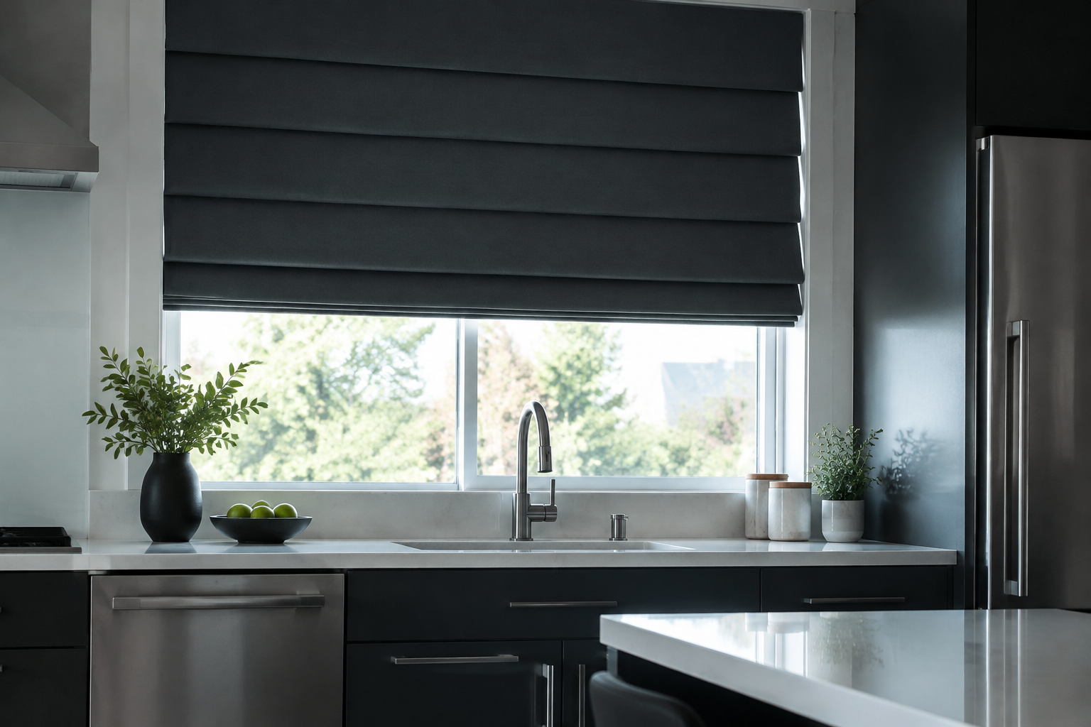
Charcoal Roman Shade
A charcoal shade is the crispest way to cover a modern kitchen window. The dark tone gives the wall a graphic edge.
Keep the folds smooth and mount it inside the frame. Charcoal shows every wrinkle.
Pair it with white worktops and stainless steel for maximum contrast.
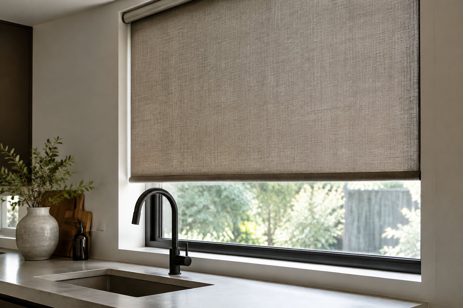
Textured Roller Shade
A woven roller shade is a blind rather than a curtain, but it does the same job. The fabric rolls up into a neat tube.
It takes up almost no space and never blocks the sink. That is why designers use it in small kitchens.
Choose a basket weave or linen-look fabric rather than a flat vinyl.
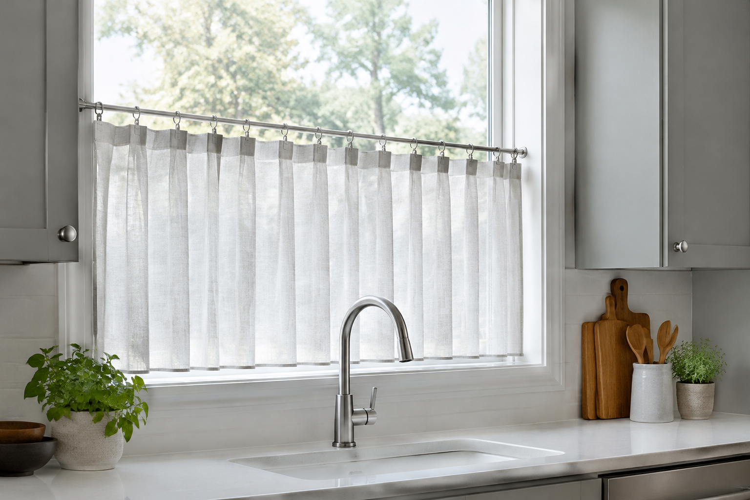
Café Curtains on Clip Rings
Clip rings turn a plain café curtain into something more considered. Each ring grips the fabric and slides along a slim rod.
Space the rings evenly for calm folds. Uneven spacing is the first thing the eye notices.
Matte nickel or brushed brass hardware suits almost every kitchen.
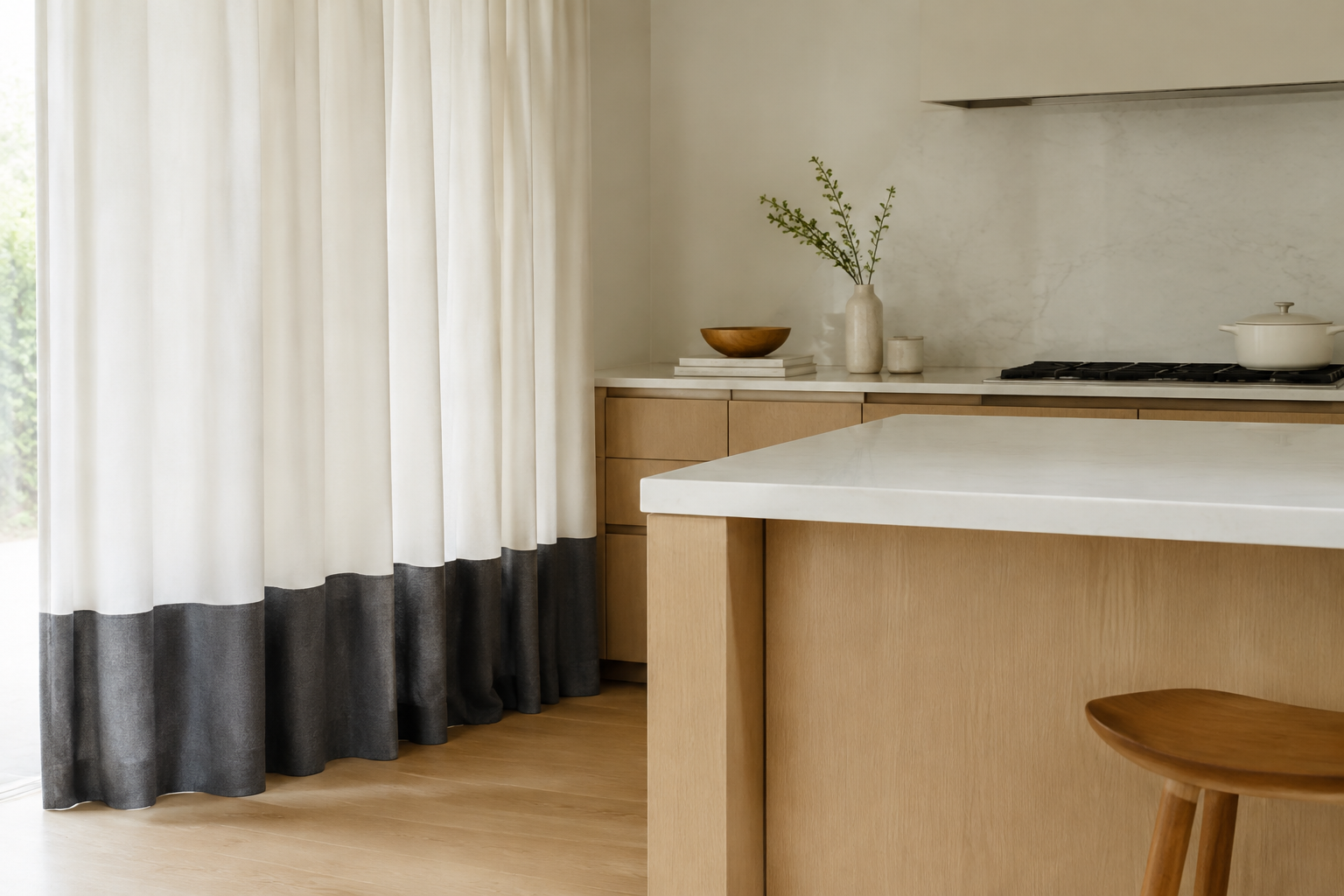
Banded-Hem Curtains
A single band of colour along the bottom hem is a quiet, modern detail. It draws the eye down and makes the window look taller.
Keep the band around 10 to 15 cm deep. Any wider and it becomes a stripe.
Use the same colour as your cabinet handles or your splashback.
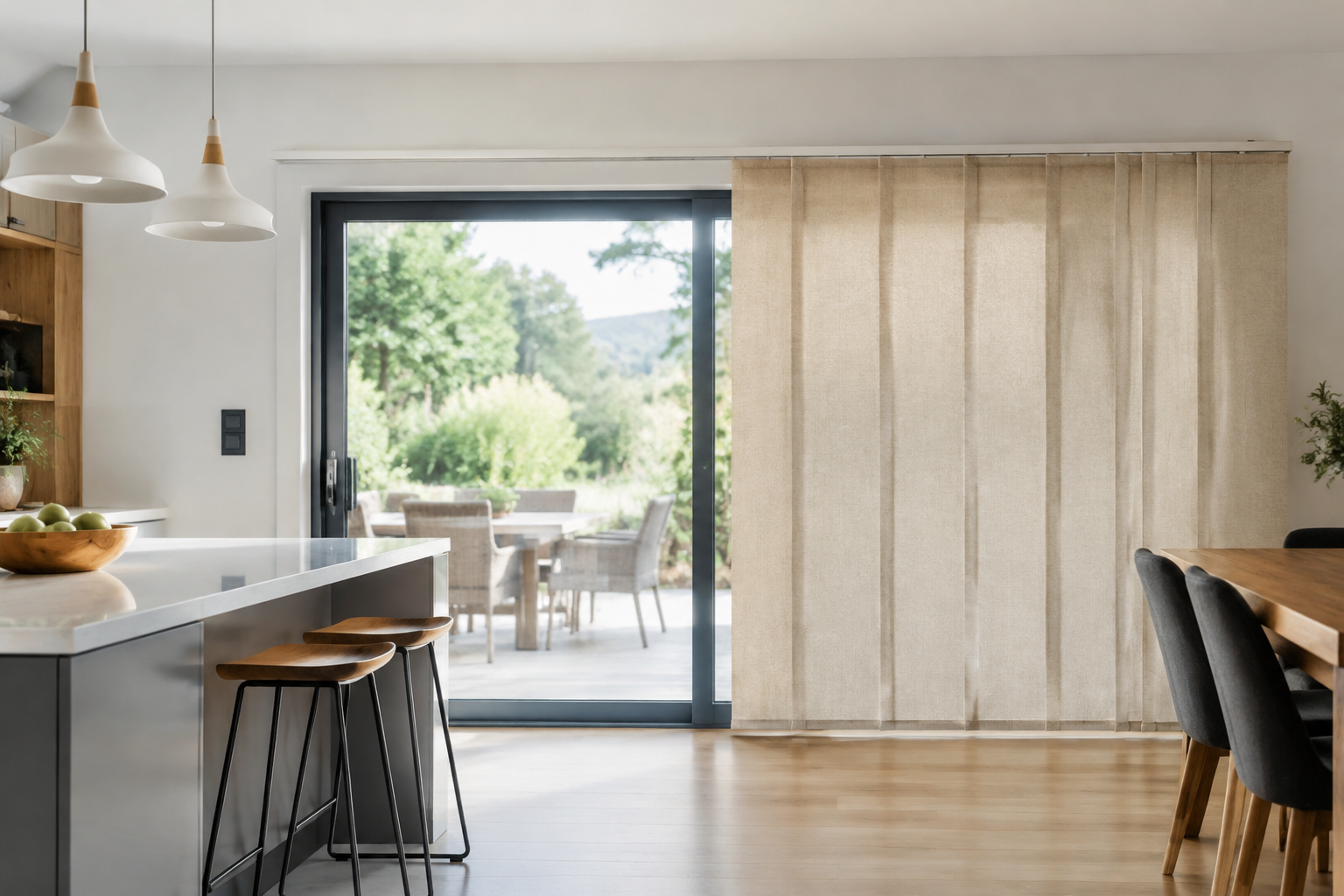
Sliding Panel Track Blinds
Panel track blinds are wide fabric panels that slide sideways on a track. They suit patio doors and wide kitchen openings.
They stack tightly when open, so the view stays completely clear.
Choose wide panels for a calm look and narrow panels for a tailored one.
Hardware That Makes It Work
The rod decides how a curtain hangs and how easily it opens. These three fittings cover almost every kitchen window.
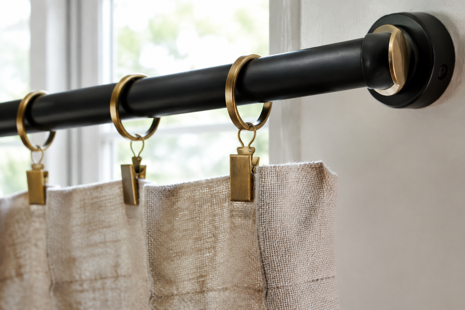
Matte Black Rod with Clip Rings
A matte black rod is the most versatile piece of curtain hardware in a kitchen. It suits both traditional and modern rooms.
Use clip rings rather than a rod pocket. You can then slide the curtain open without touching the fabric.
Black hardware looks best against white walls and pale timber.
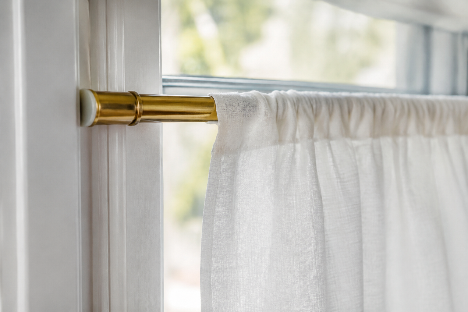
Slim Brass Tension Rod
A tension rod presses against the sides of the window reveal and needs no drilling. Brass adds a warm finish to a plain window.
It is the best choice for rented kitchens and tiled reveals. Nothing is damaged and nothing is permanent.
Keep the curtain light. A tension rod will slip under a heavy panel.
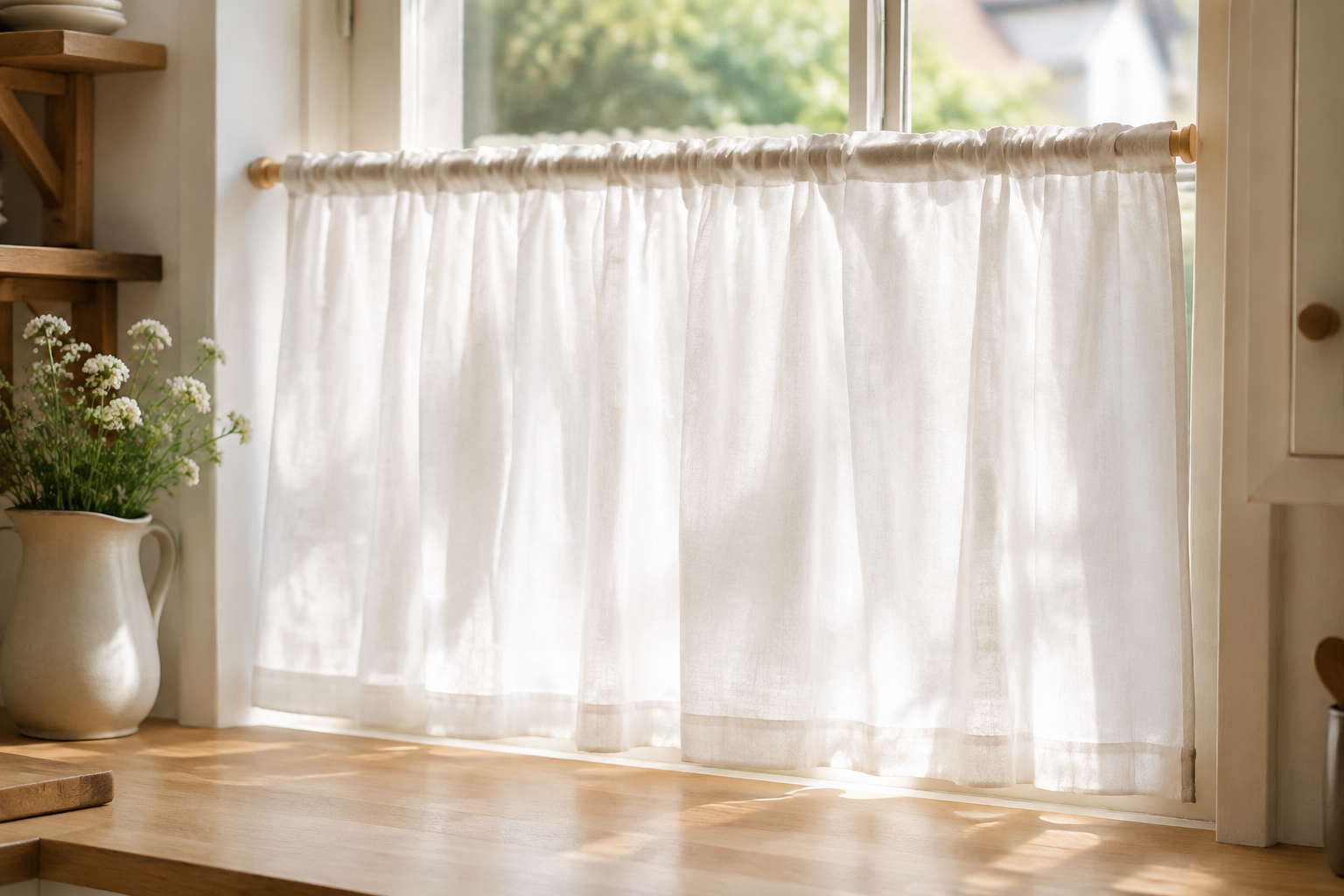
Pocket-Rod Café Curtains
A rod pocket is a sewn channel at the top of the curtain that the rod slides through. It is the simplest heading there is.
The fabric gathers naturally into soft folds when you push it along the rod.
It suits light fabrics and windows you rarely open. The curtain cannot slide freely.
Farmhouse and Pattern Ideas
Prints, ruffles and checks. These are the ideas that bring colour and personality to a plain kitchen window.
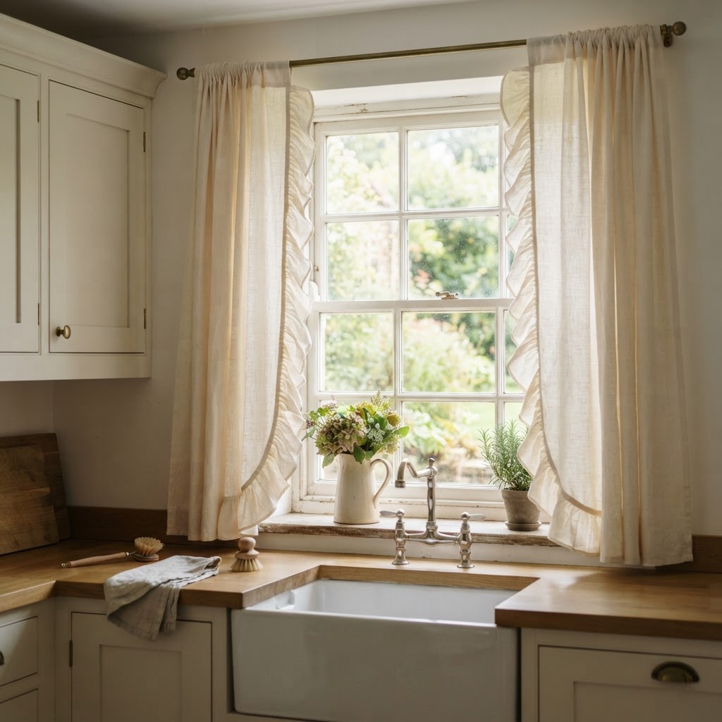
Ruffle-Trim Farmhouse Curtains
A wide ruffle along the inner edge of a cream panel is a classic farmhouse detail. The gathered frill softens an otherwise plain window.
Keep the ruffle roughly a fifth of the panel width. Bigger frills start to look like costume.
Cream and oatmeal are the colours that work best here. Bright white feels too sharp.
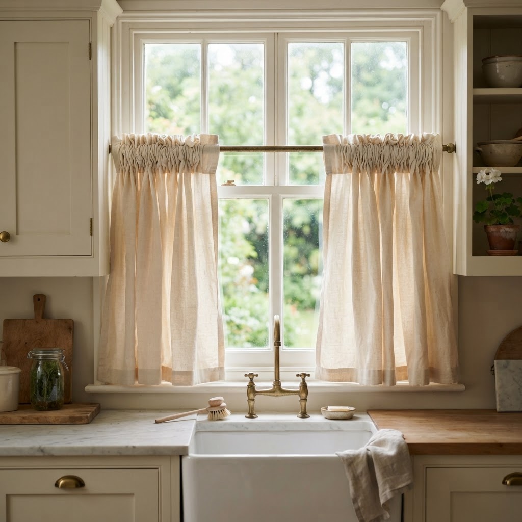
Gathered Waistband Café Curtains
A gathered waistband is a densely ruched header that runs along the top of the curtain. The volume makes a small window look generous.
Use around two and a half times the window width in fabric. That is what creates the deep gathers.
This heading suits traditional kitchens with ceramic sinks and painted cabinets.
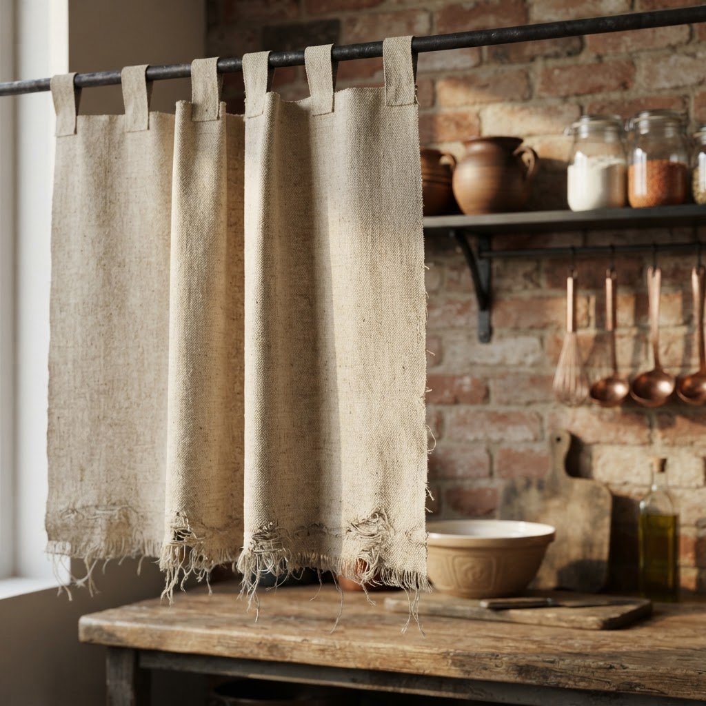
Raw-Edge Canvas Panels
Leaving the bottom edge unhemmed gives canvas a hand-made, weathered look. The loose threads are the detail.
Cut the panel a little longer than you need. Raw canvas frays upwards over time.
It suits rustic, industrial and workshop-style kitchens rather than polished ones.
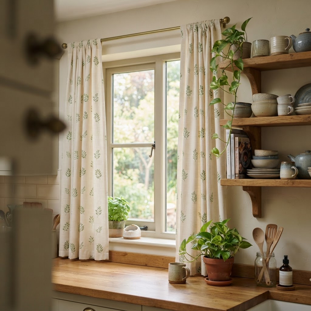
Botanical Floral Curtains
A delicate leaf print on cream cotton brings a garden feel indoors. Small motifs read as texture from across the room.
Repeat the green somewhere else, such as a bowl of herbs or a leafy plant.
Florals suit kitchens with wooden worktops and open shelving.
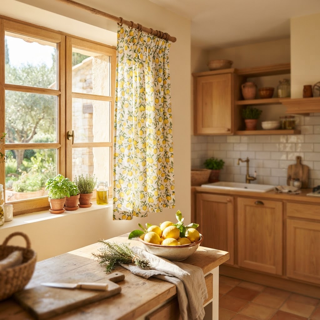
Lemon and Citrus Print Curtains
A small lemon print is cheerful without being childish. It suits bright, sunny kitchens with light wood and white tiles.
Keep the rest of the room plain so the print stays fresh.
Yellow reads warm in daylight and slightly green under artificial light. Check it in the evening.
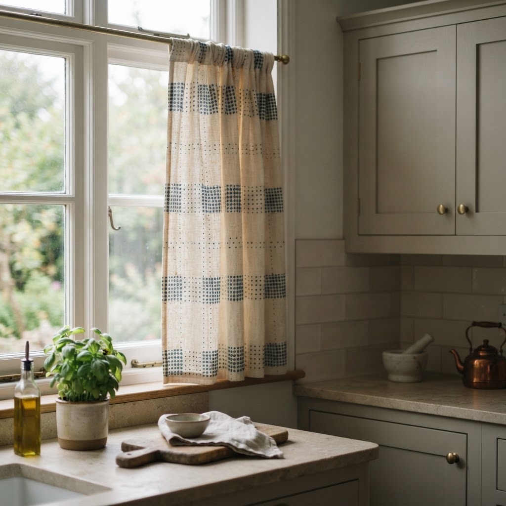
Block-Printed Geometric Curtains
Block printing leaves tiny irregularities in the pattern, and that is what makes it feel hand-made. The motifs are usually small and repeated.
A muted indigo on cream is the most versatile colourway. It works with almost any cabinet colour.
Keep the print away from patterned tiles. Two patterns in one view is one too many.
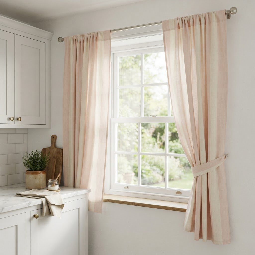
Soft Pastel Stripe Curtains
Wide pastel stripes are softer than narrow ones and easier to live with. Pale blush and cream is the gentlest combination.
Run the stripes vertically to add height, or horizontally to widen a narrow window.
Pastels need plenty of white around them to stay crisp.
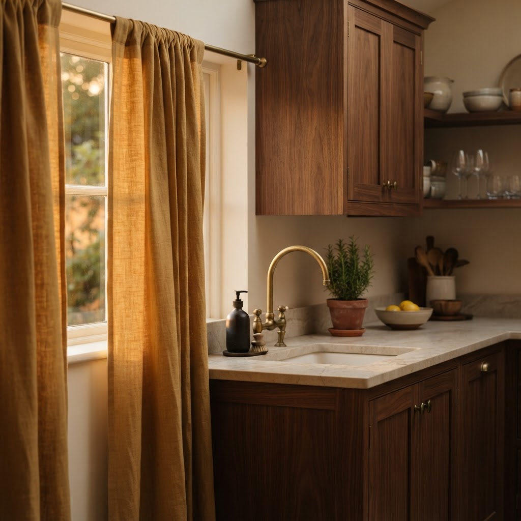
Ochre and Mustard Linen Curtains
Ochre is a warm, earthy yellow that glows in evening light. It adds real character to a plain kitchen.
Use it as a single panel or a café tier rather than a full window of colour.
Walnut, brass and stone are the materials that suit ochre best.
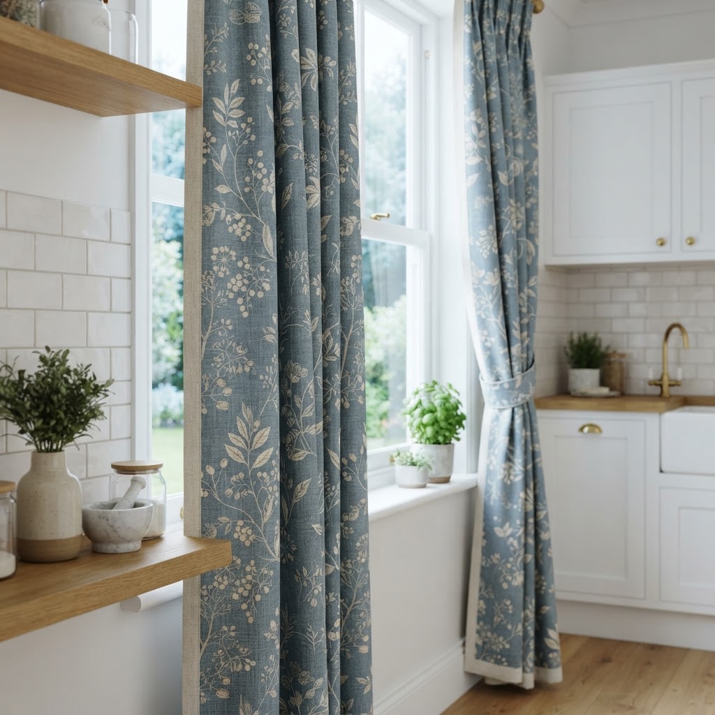
Muted Blue Botanical Curtains
A dusty blue botanical print reads calm and traditional. It suits kitchens with white tiles and warm timber.
Blue cools a warm room and warms a cool one, which is why it is so easy to live with.
Choose a print with plenty of cream in it. Solid blue blocks the light and closes the room in.
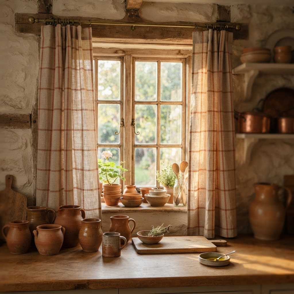
Terracotta Windowpane Check Curtains
A windowpane check is a large single grid on a plain ground. In terracotta it feels warm, earthy and a little rustic.
The open grid keeps the fabric feeling light even though the lines are bold.
Pair it with clay pots, natural wood and unglazed ceramics.
Frequently Asked Questions
What is the best curtain for a kitchen window?
Café curtains are the most practical choice for most kitchens. They cover the lower half of the window, which is where privacy actually matters, and they leave the top clear for light. Choose a cotton or linen tier if the window sits above a sink.
Should kitchen curtains touch the countertop?
No. Leave at least 15 cm between the hem and the worktop. That gap keeps the fabric away from splashes, steam and food, and it also makes the window look taller.
Are curtains or blinds better in a kitchen?
Blinds win on clearance and curtains win on softness. A roman shade lifts straight up and never blocks the sink. A fabric curtain adds warmth and texture that a blind cannot. Plenty of kitchens use both.
How do I stop kitchen curtains smelling of cooking?
Choose cotton or linen and wash them every two to three months on a cool cycle. Avoid dry-clean-only fabrics and heavy velvet, because both hold cooking smells.
Do kitchen curtains need to be lined?
Only if the sun is strong or the street is bright. A lined panel blocks light, keeps the room cooler and protects the fabric from fading. An unlined curtain is lighter and hangs more softly.
How long should café curtains be?
They should start around the middle of the window and finish just above the sill. A drop of 45 to 60 cm suits most kitchen windows. Measure to the sill and then take off 3 cm so the hem hangs clear.
What colour curtains suit a small kitchen?
Stick to one tone that matches the wall or the cabinets, and go a shade lighter. Pale oatmeal, bone and warm grey all make a small kitchen feel bigger than a bold colour does.
Final Thoughts
The right kitchen curtain is the one you stop noticing after a week.
It lets the morning in, keeps the street out, and survives steam and splashes without any fuss.
Start with the styles above, choose the fabric that suits your climate, and measure twice before you cut anything.
Whichever of these 60 ideas you choose, the window will finally look like it was dressed on purpose.


