

55 Pink Wallpaper Ideas for a Stylish, Dreamy, and Elegant Home
Pink has quietly become the most versatile colour in the interior world. Pale enough and it behaves like a neutral. Deep enough and it does the work of a statement wall.
That range is exactly why pink wallpaper design ideas have moved beyond the nursery. Designers are pairing dusty rose with oak, blush with brass, and plum with charcoal.
The trick is choosing the right finish as well as the right shade. A flat matte pink reads soft and expensive, while a gloss or mica finish turns the wall into a light source.
Below you will find fifty-five ideas, grouped by mood. Every one is shown in its own photograph, so you can judge the texture before you order a sample.
Short on time? Skim the headings, save the three that stop you, and sample only those. A wallpaper sample is the cheapest design decision you will ever make.
Soft, Subtle and Blush Pink Wallpapers
The easiest way into pink is a shade so pale it behaves like an off-white. These papers look almost neutral in daylight and turn warm at night.
They suit whole rooms, long corridors and anyone who is nervous about colour. Texture does the work that pattern usually would.
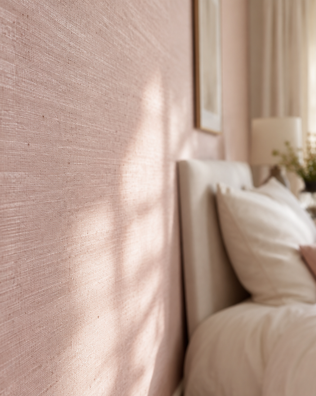
01Blush Linen Weave
Blush pink works best when it borrows a texture from fabric. A printed linen weave sits somewhere between plaster and cloth.
Choose a paper with a visible slub so the pattern catches light at an angle. It stops a pale pink room from reading flat or grey.
Style it with cream bedding, pale oak and a single brass lamp. The wall then behaves like a soft backdrop instead of a statement.
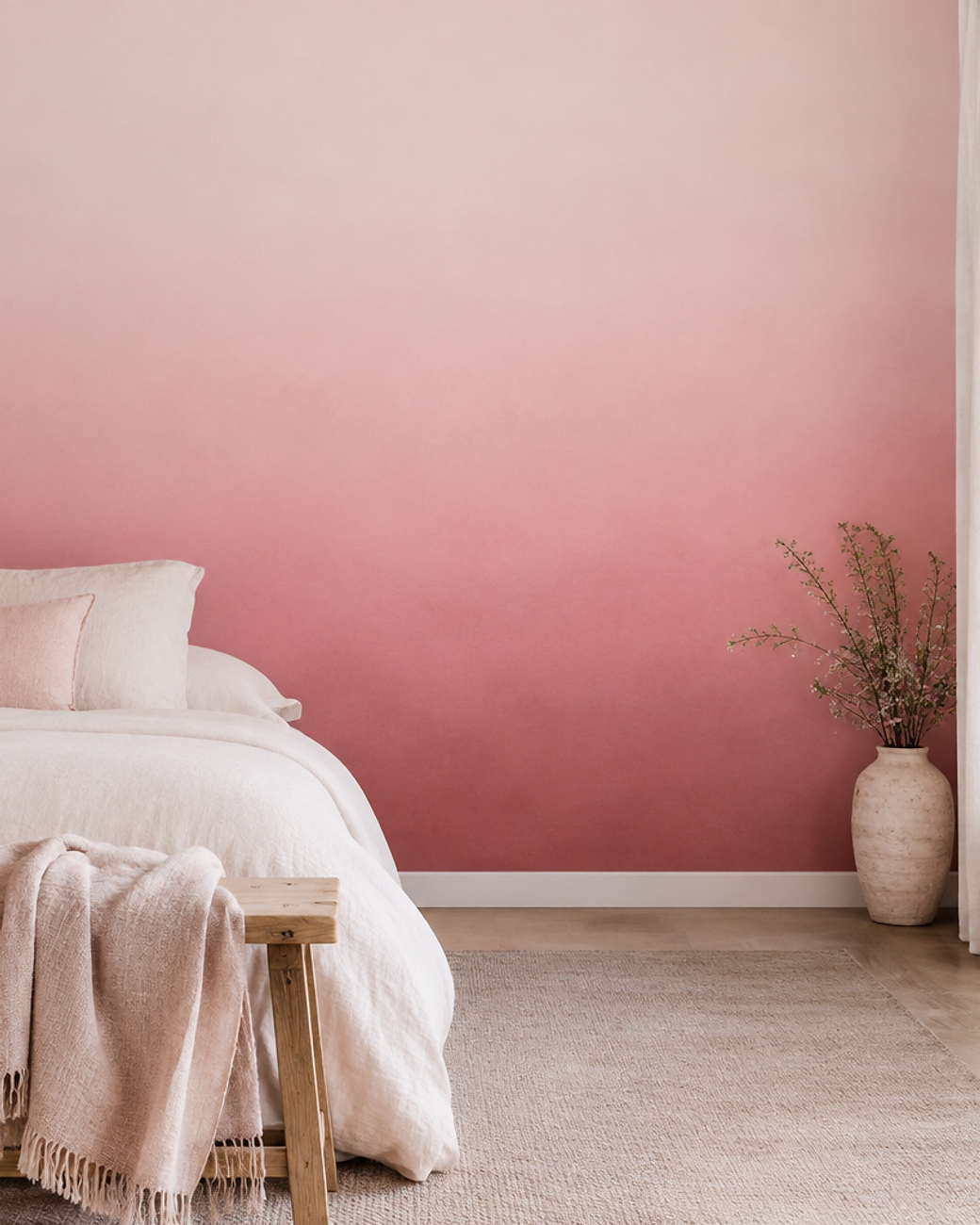
02Ballet Slipper Ombré
An ombré gradates from pale pink at the ceiling to dusty rose at the skirting. The transition should be so smooth that you cannot find the seam.
It pulls the eye upward and makes low ceilings feel taller. Ask for a floor-to-ceiling mural rather than a repeating drop.
Keep furniture simple and pale so the gradient stays the star of the room.
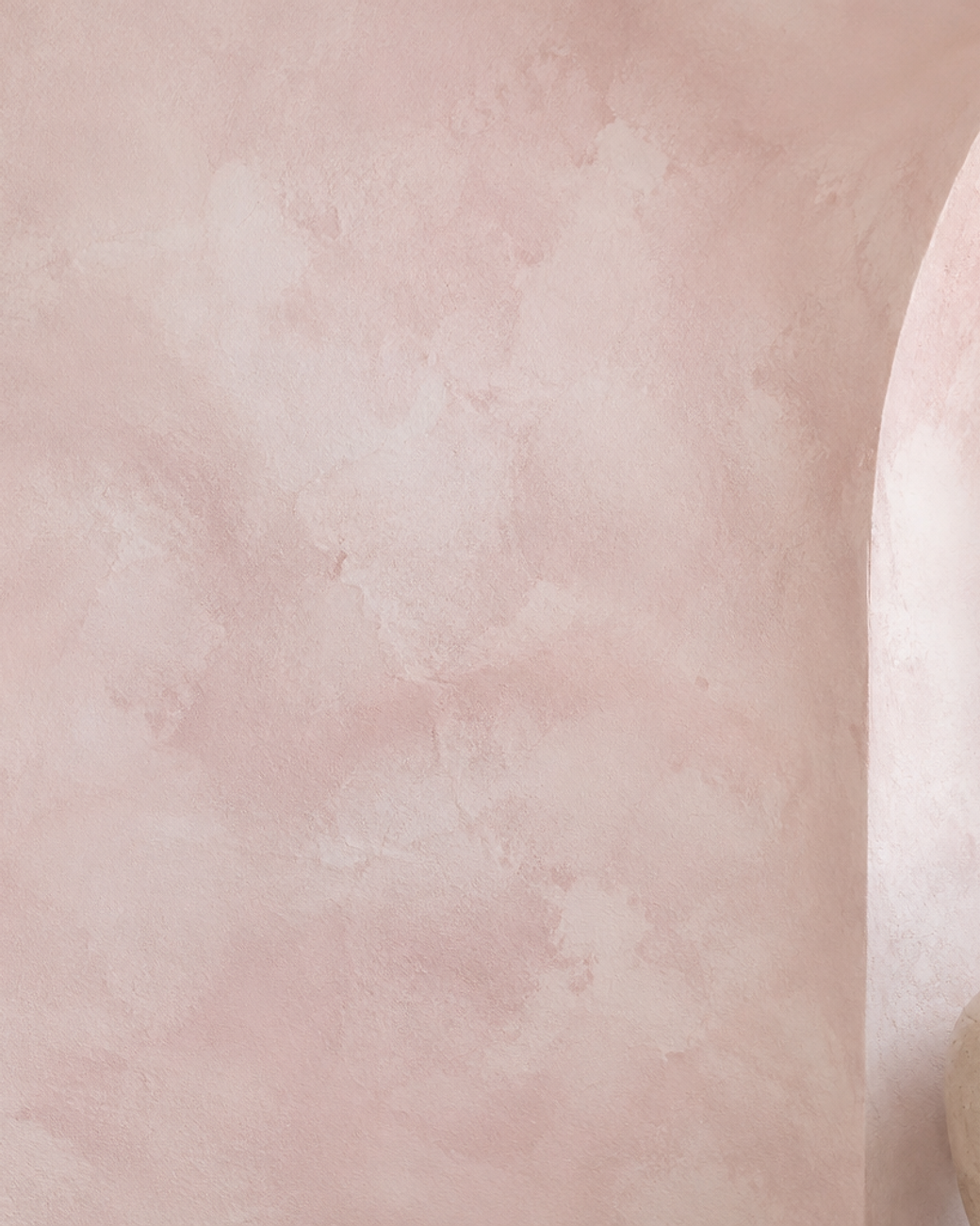
03Powder Pink Limewash
Limewash brings the cloudy depth of old European walls into a modern room. In powder pink it feels chalky, warm and almost handmade.
Printed limewash papers now replicate that troweled movement without the mess. Look for soft tonal shifts rather than hard pattern.
It flatters natural linen, honey-toned wood and matte black hardware.
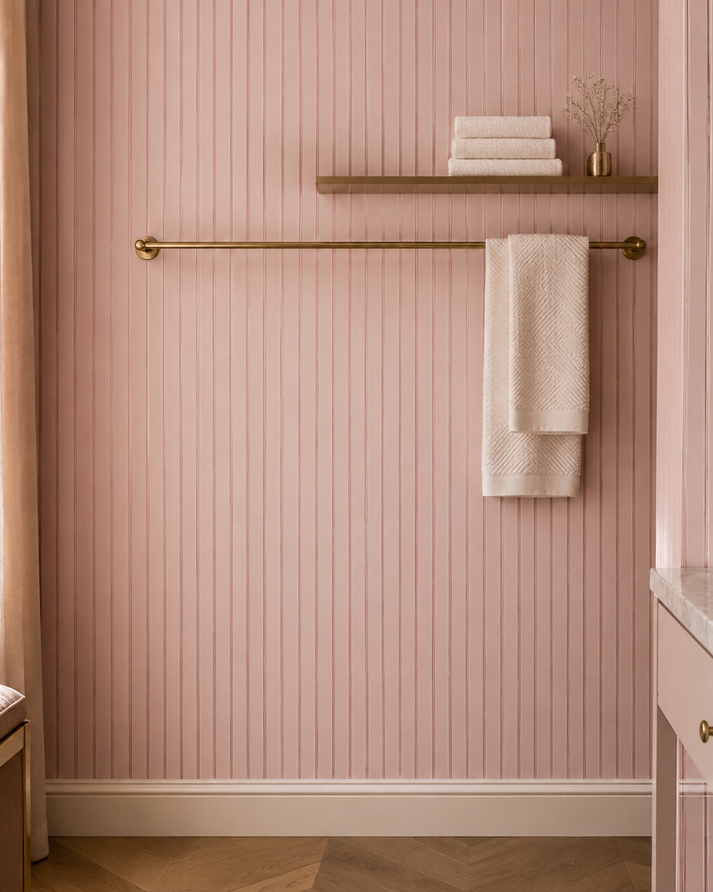
04Rosewater Pinstripe
Fine pinstripes in two close shades of pink create rhythm without noise. From a distance the wall looks like a single soft colour.
Vertical lines add height, which makes this a smart choice for small dressing rooms and narrow hallways.
Repeat the stripe somewhere small, such as a lampshade or a folded towel, to make the room feel deliberate.
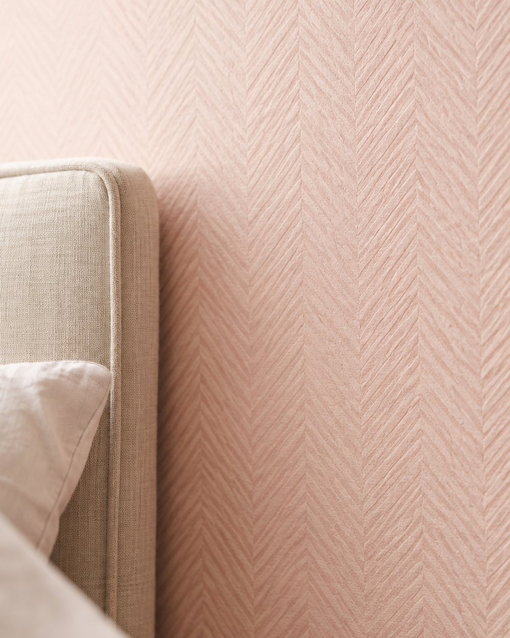
05Shell Pink Herringbone
A herringbone weave gives pink a tailored, almost menswear quality. The chevrons are subtle enough to live with for years.
The raised fibres catch side light and soften the wall in the evening.
Pair it with crisp white linen and a wool rug for a quietly expensive bedroom.
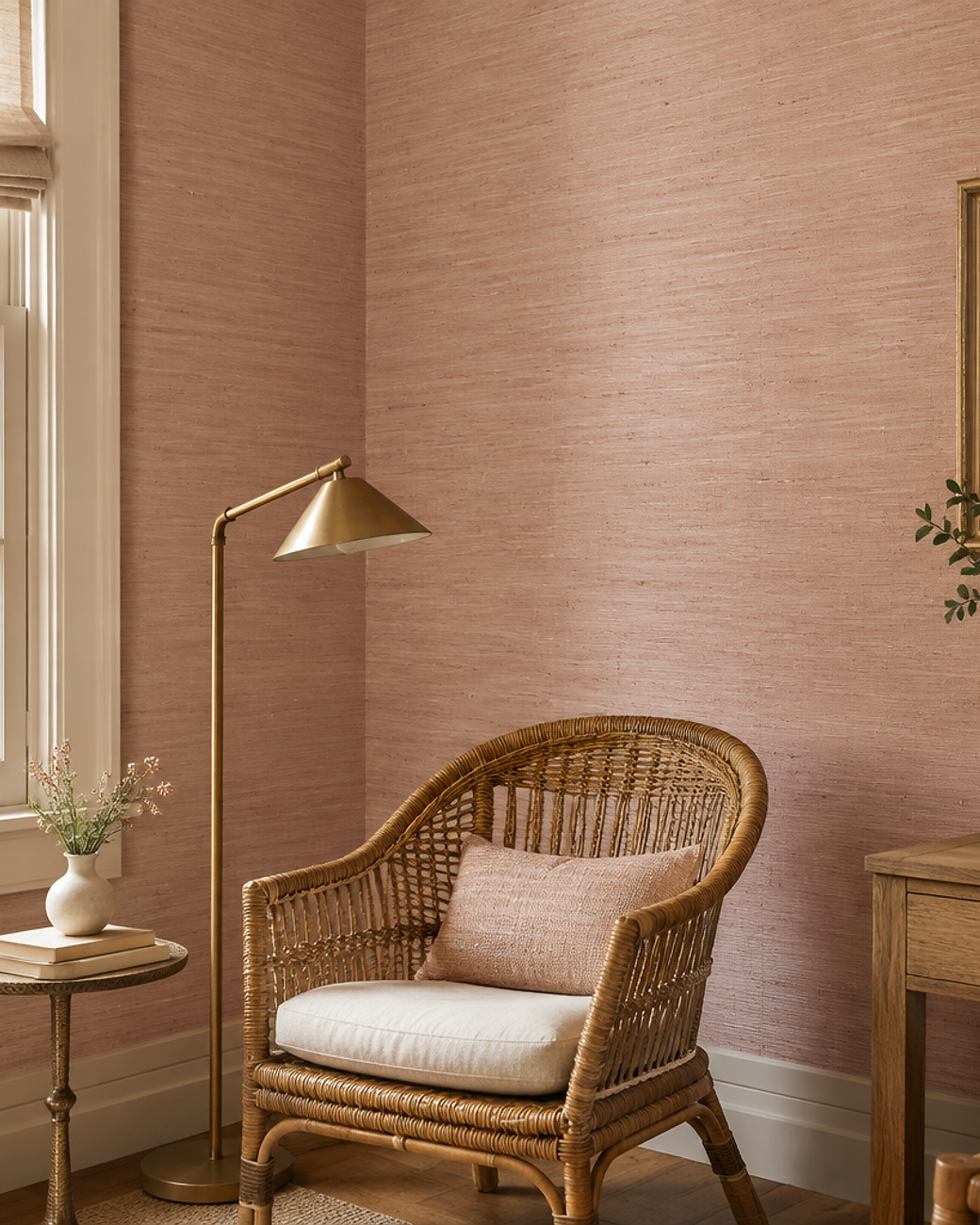
06Pale Pink Grasscloth
Grasscloth is made from natural fibres, so no two rolls look exactly alike. Dyed pale pink, it becomes warm rather than rustic.
Hang it horizontally if you want a calmer, more contemporary finish. Vertical seams suit traditional rooms.
It is a natural pairing for rattan, brass and well-worn timber.
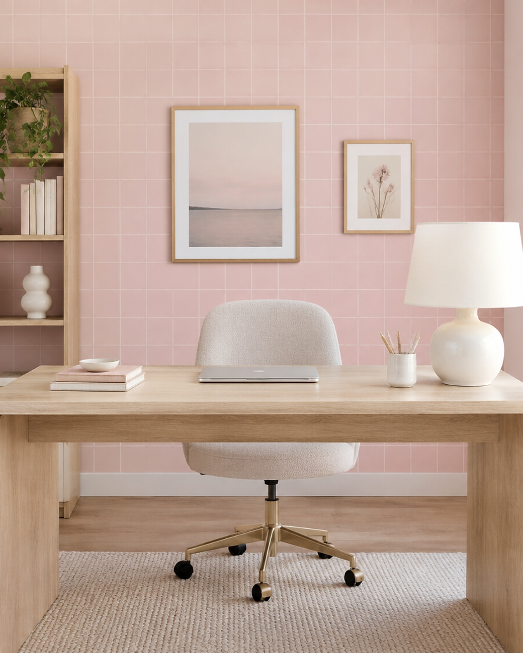
07Millennial Pink Grid
A fine cream grid over millennial pink reads as graph paper for grown-ups. It is orderly without feeling cold.
The geometry keeps a pink room from tipping into sweetness, which makes it a safe choice for shared spaces.
Use it behind a desk and keep everything else plain white and oak.
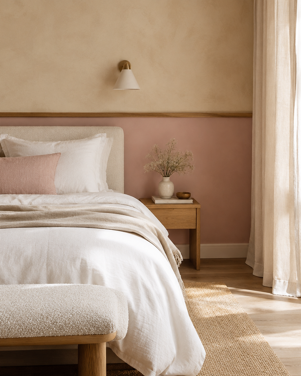
08Sand and Blush Two-Tone
A two-tone wall splits warm sand above and soft blush below. A slim trim or a painted line marks the change.
This is the cheapest way to try pink without committing to a whole room. It also protects the wall from scuffs.
Choose a blush two shades deeper than the sand so the join feels intentional.
Floral and Botanical Pink Wallpapers
Florals are where pink feels most at home. The trick is scale rather than colour: one oversized bloom looks modern, a scattered field looks cottage.
Keep the palette tight to two or three shades. Too many greens and pinks turn a beautiful print into noise.
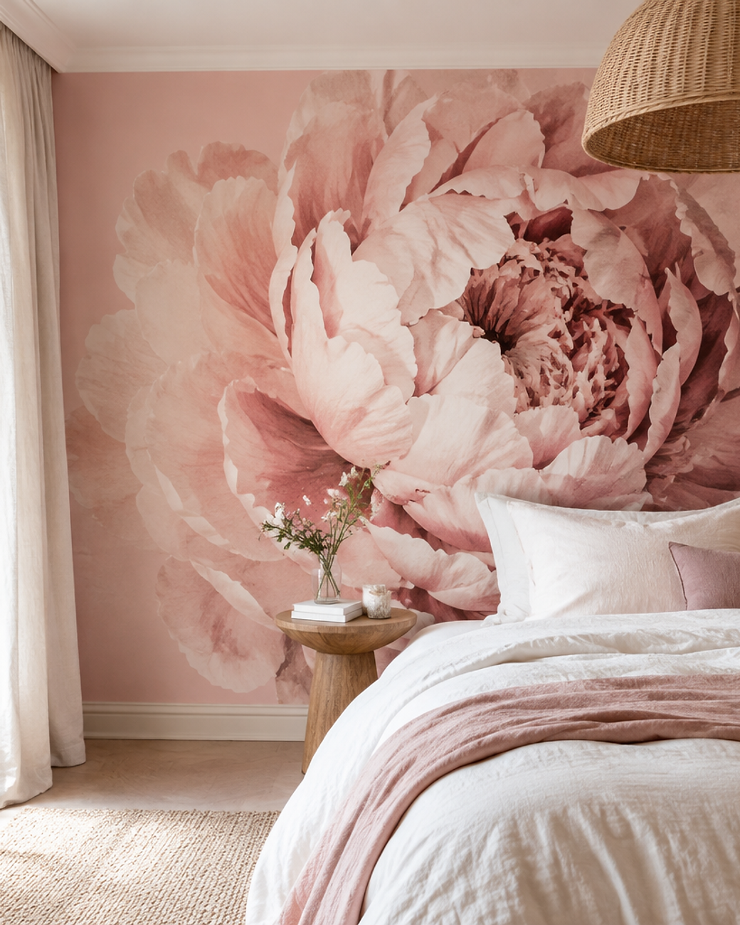
09Oversized Peony Bloom
Scale changes everything with florals. One enormous bloom feels modern, while hundreds of small ones feel traditional.
Keep the palette tight, with petals in dusty rose and cream only.
Let the flower sit off-centre behind the bed so it is discovered rather than announced.
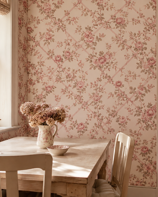
10Vintage Rose Trellis
A climbing rose trellis print carries cottage charm in faded pink ink. It suits rooms that already hold old wood and dried flowers.
Ask for a vintage colourway with a cream ground rather than a white one. The warmer base stops the pattern looking freshly printed.
It works beautifully above a low bench in a dining nook.
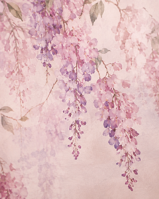
11Watercolour Wisteria
Wisteria printed in soft watercolour washes fades as it climbs. The effect is closer to a painting than a pattern.
Blurred edges are the point here, so avoid anything with hard digital linework.
Hang it in a room that gets morning light, when the pale violets look their freshest.
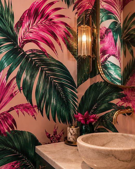
12Fuchsia Palm
Tropical leaves in fuchsia and deep green turn a tiny room into a small event. Bold pattern is easiest to live with in spaces you pass through.
A satin or wipeable finish is practical in a bathroom and adds a subtle sheen.
Balance the heat with pale stone, brass tapware and one white towel.
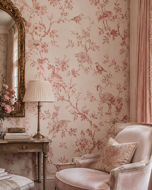
13Rose Chinoiserie Garden
Chinoiserie brings birds, branches and blossom into the room in soft rose ink. It is decorative, but the cream ground keeps it airy.
The style rewards good company, so give it an antique mirror and a velvet chair or two.
Choose a hand-painted-look paper if you want the pattern to feel collected over time.
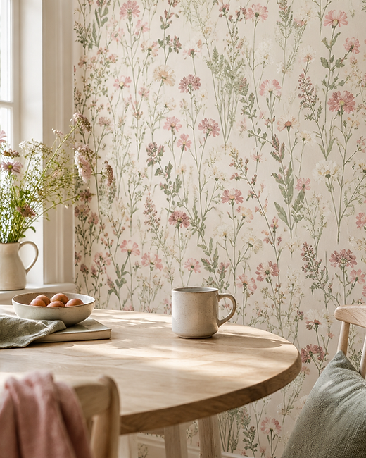
14Wildflower Meadow
Scattered wildflowers in pink, cream and sage feel like a field rather than a bouquet. The loose spacing keeps it relaxed.
It suits a breakfast corner where the wall is seen up close every morning.
Add white oak, ceramic mugs and a single glass jar of dried stems.
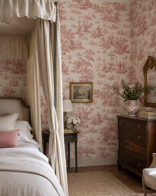
15Pink Toile de Jouy
Toile tells a story across the wall in fine dusty rose linework. Pastoral scenes give a bedroom a sense of history.
Keep the scale small so the scenes read as texture from the doorway.
Team it with linen, a canopy and one antique wooden chest.
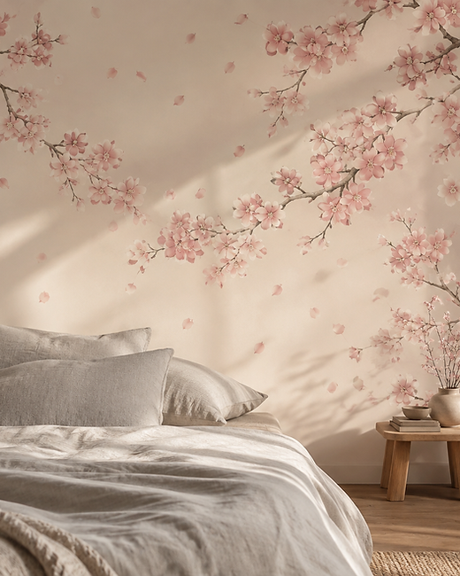
16Cherry Blossom Branch
Drifting sakura branches give pink a quiet, Japanese calm. Petals should look scattered by wind, never evenly placed.
A warm cream ground keeps the pattern soft in low evening light.
It pairs naturally with low furniture and pale timber screens.
Abstract and Geometric Pink Wallpapers
Geometry keeps pink sharp. Curves, arches and checks give the colour structure instead of sweetness.
These patterns suit modern rooms and shared spaces where softness needs a little backbone.
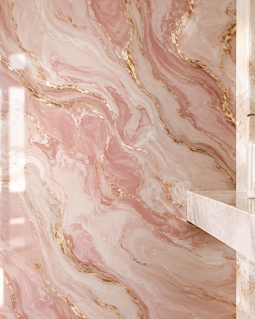
17Pink Marble Swirl
Marbled pink feels luxurious because the pattern never repeats. Fine gold veining adds warmth to cool stone tones.
Gloss finishes suit bathrooms and reflect light around small rooms.
Echo the stone with a pale basin and brushed brass fittings.
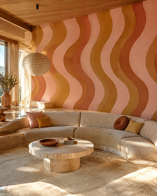
18Retro Wave Lines
Curving 1970s bands in blush, terracotta and mustard bring instant energy. The palette is retro without turning kitsch.
Use it on one wall only, behind seating, and keep the rest of the room quiet.
Curved furniture and a travertine table finish the look.
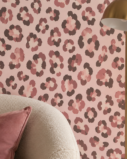
19Pink Leopard
Leopard print in blush and charcoal is playful but surprisingly elegant. The soft rosettes read as texture from a distance.
It is a great confidence boost for a hallway or a small guest bathroom.
Hold the rest of the scheme to cream, black and brass.
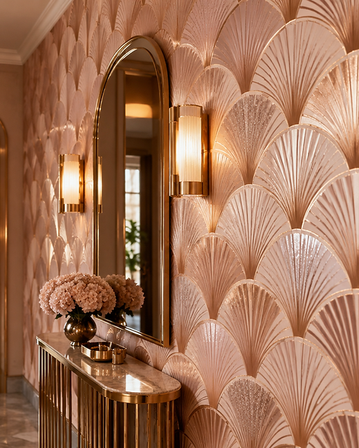
20Rose Gold Deco Fans
Art Deco fans radiate in rose gold across pale pink. The metallic sheen gives an entryway instant glamour.
Repeat the gold in a mirror frame or a slim wall light.
Keep everything else minimal so the metallic pattern stays sharp.
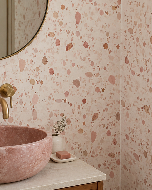
21Pink Terrazzo
Terrazzo scatters blush, rose and clay chips across a cream ground. It feels modern, tactile and slightly playful.
It pairs naturally with pink stone basins and simple brass taps.
Use it in small rooms where the pattern can be enjoyed up close.
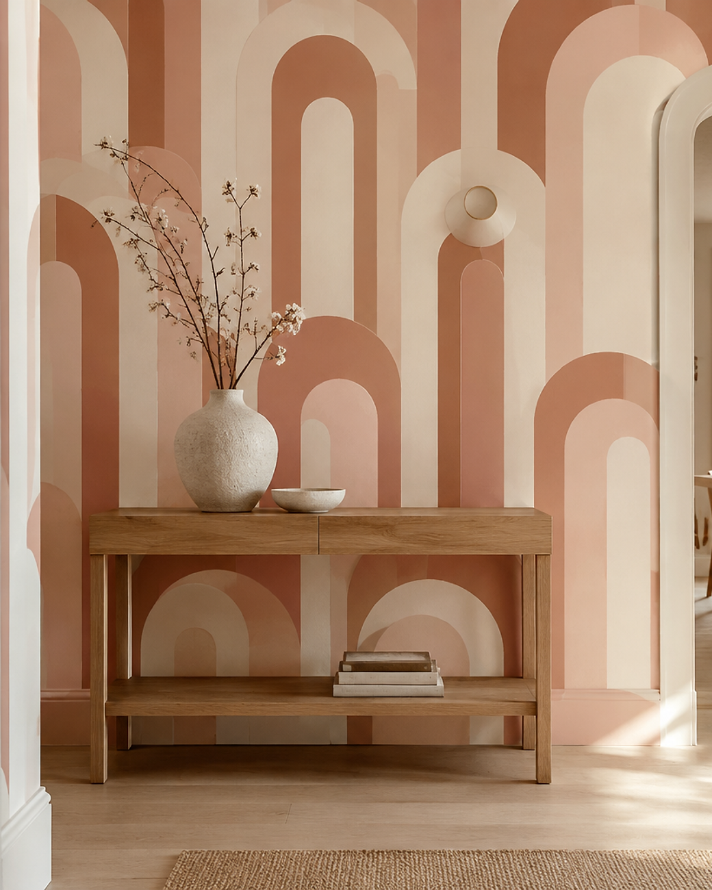
22Bauhaus Arches
Repeating arches in blush, clay and cream bring architectural geometry indoors. The rhythm feels calm because the shapes are simple.
Choose three colours at most so the pattern stays graphic.
A pale oak console and one ceramic vase are all the styling it needs.
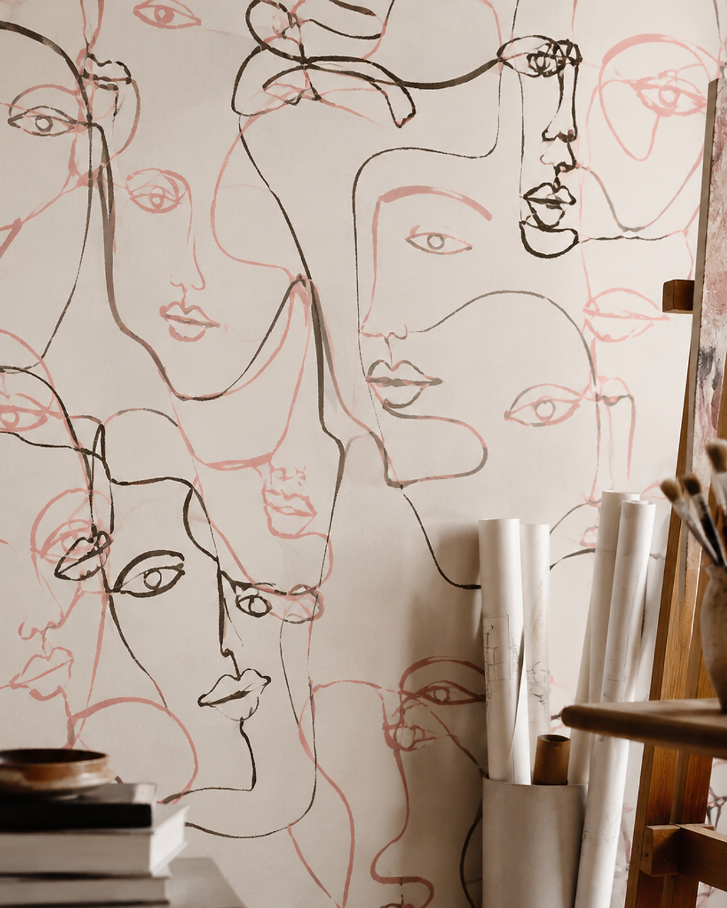
23Scribble Line Art
Loose ink lines on ivory make the wall feel hand-drawn and human. The blush accents keep it warm rather than stark.
This suits creative rooms where perfect symmetry would feel stiff.
Hang unframed sketches nearby to continue the theme.
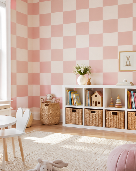
24Rose Checkerboard
A checkerboard in soft rose and cream is graphic but gentle. It brings order to a room that is rarely tidy.
Keep the squares large so the pattern does not feel busy.
White shelving and woven baskets complete the look.
Texture, Silk and Light Effect Pinks
Texture is the quietest way to use pink. The colour changes through the day as light moves across the surface.
Choose these when you want depth without a repeating pattern. They photograph beautifully and age gracefully.
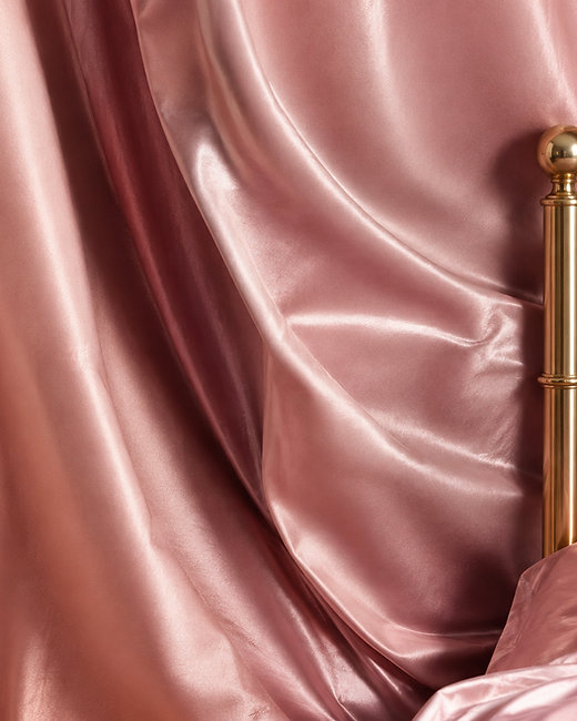
25Satin Silk Drape
Satin silk wallpaper turns a wall into folded fabric. Light pools across the sheen and shifts as you move through the room.
It brings hotel luxury to a bedroom without any extra furniture.
Pair it with a brass bed frame and crisp white sheets.
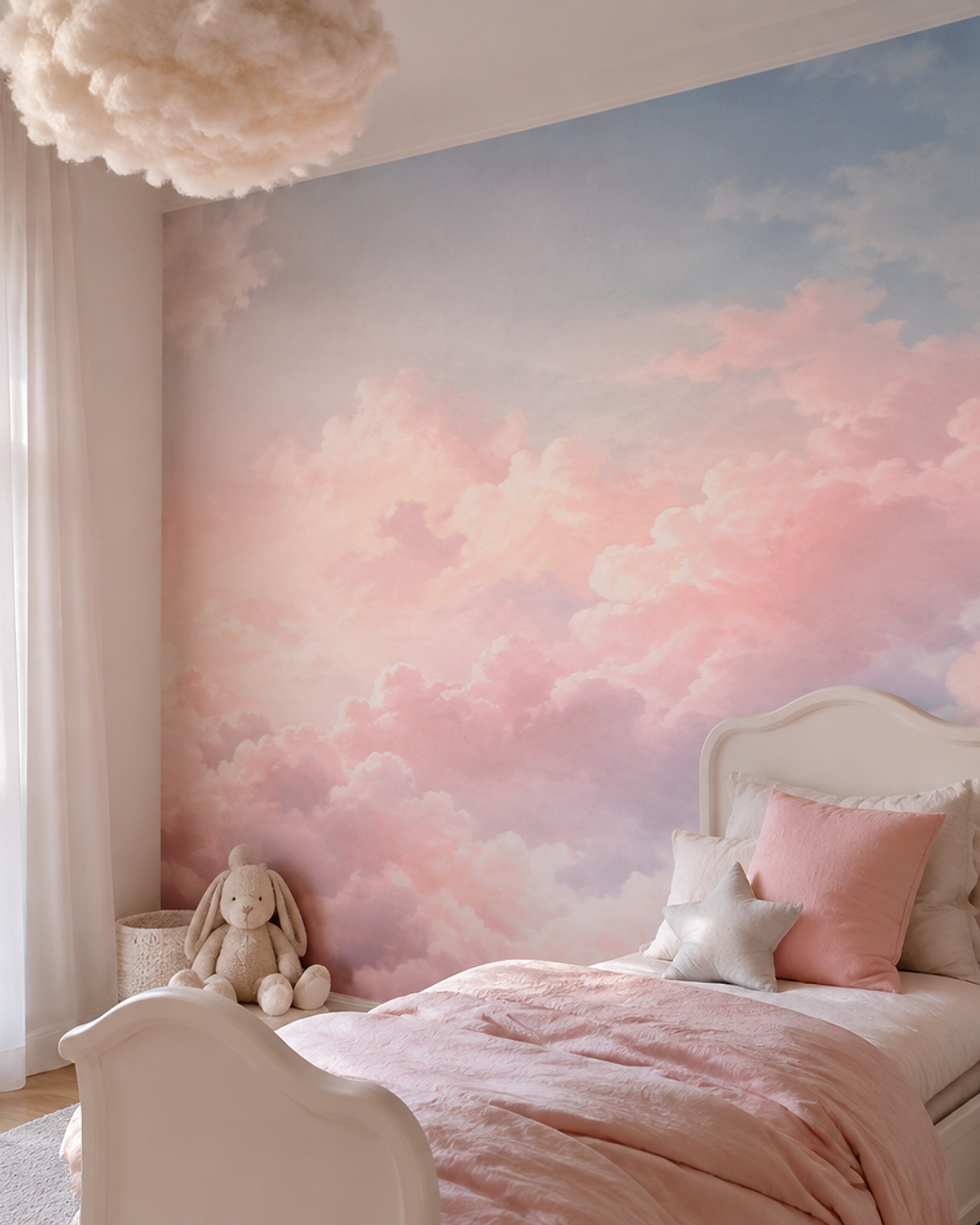
26Cloud Sky Mural
A soft cloud gradient in blush and peach makes the ceiling feel open. The palette stays calm enough for sleep.
Ask for a seamless mural rather than a repeating tile.
Sheer curtains and a white cot keep the room airy.
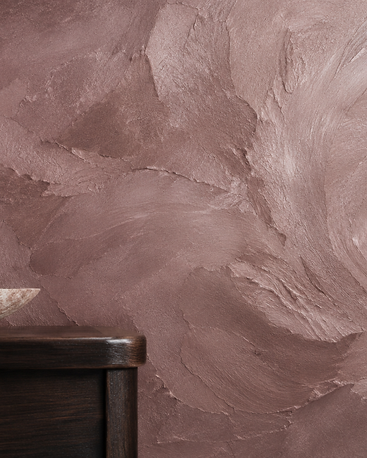
27Venetian Mauve
Venetian plaster in dusty mauve brings sculptural depth to a plain wall. Every trowel stroke reads differently in daylight and lamplight.
It is the most forgiving way to use a deeper pink in a large room.
Keep furniture tailored and let a dark wood console anchor the space.
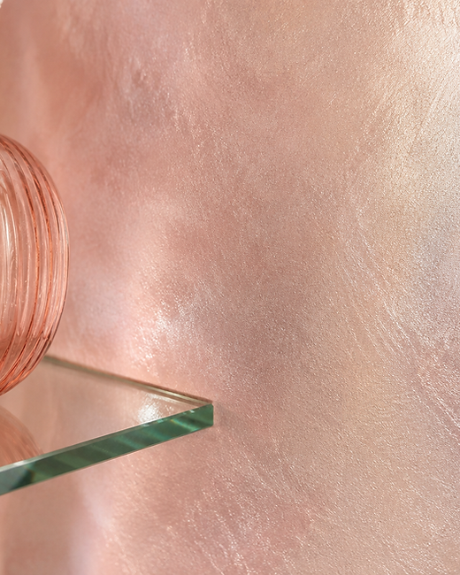
28Pearlescent Mica
Mica particles shift pale pink through champagne as the light changes. The effect is subtle enough for a restful room.
Use it on a single wall where evening lamplight can catch the shimmer.
Choose brushed brass and pink glass for accessories.
29Pink Velvet Flock
Flock printing gives pink a deep velvet pile that you want to touch. Directional nap makes the colour shift from rose to wine.
It suits a snug or a dining room used after dark.
Warm lamp light and dark wood bring out the depth.
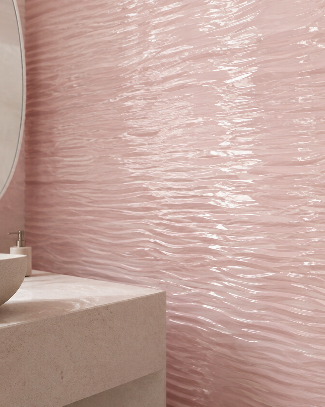
30Ripple Glass Effect
A rippled glass effect softens pink into gentle waves. Light bends across the surface like water in a pool.
The gloss finish suits bathrooms and wipes clean easily.
Keep the rest of the room pale stone and quiet.
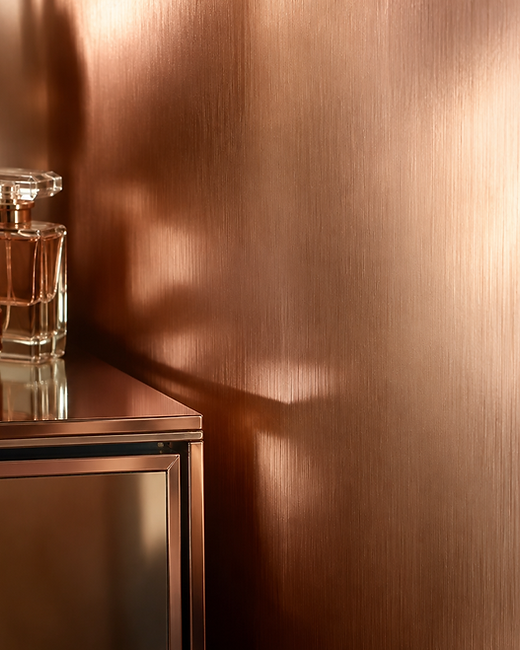
31Brushed Rose Gold
Brushed rose gold has a grained, reflective surface that glows rather than shines. It makes a small dressing room feel like a jewellery box.
Use it behind a mirror so the reflection doubles the warmth.
Add glass, cream and one dark accent for contrast.
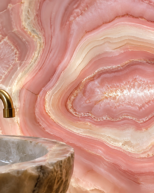
32Pink Agate Slice
Agate banding gives pink a gemstone quality with fine crystalline lines. Backlit, it looks almost translucent.
It is a beautiful choice behind a vanity or a bath.
Keep fittings minimal so the stone pattern leads.
Bold and Maximalist Pink Wallpapers
These are the wallpapers you remember after you leave the room. Saturated pinks, huge repeats and prints with real personality.
Use them in rooms you pass through, or on a single wall that carries the whole scheme. Let everything else stay quiet.
33Hot Pink Damask
Baroque damask in fuchsia and gold is unapologetically maximalist. The symmetry keeps it elegant rather than chaotic.
Use it in a room reserved for evenings, when the metallic detail comes alive.
Velvet seating and candlelight complete the mood.
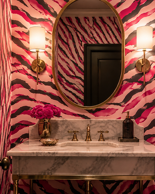
34Magenta Tiger Stripe
Tiger stripes in magenta give a small room real bite. Irregular edges keep the print from feeling mechanical.
Bold animal patterns work best in rooms you visit briefly.
Balance the print with a marble vanity and brass mirror.
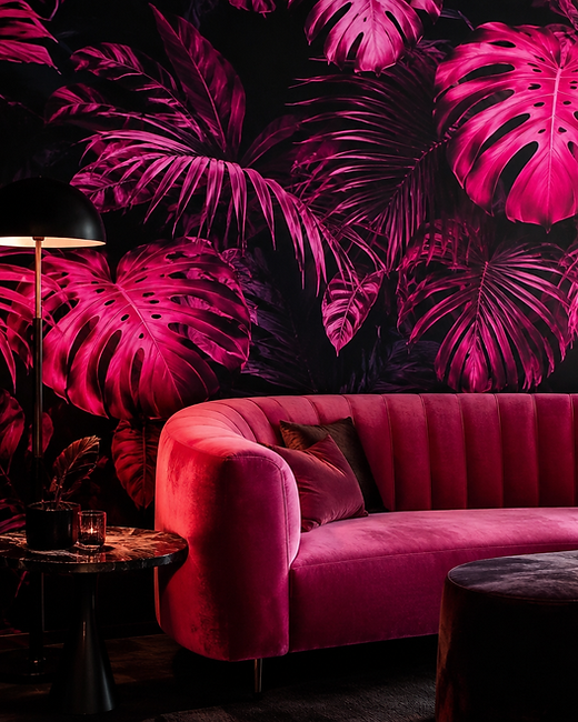
35Neon Fuchsia Jungle
Oversized tropical leaves glow against charcoal for a night-time feel. Fuchsia keeps the mood warm instead of cold.
It suits a media room or a bar corner used after dark.
Add a pink velvet sofa and low, warm lighting.
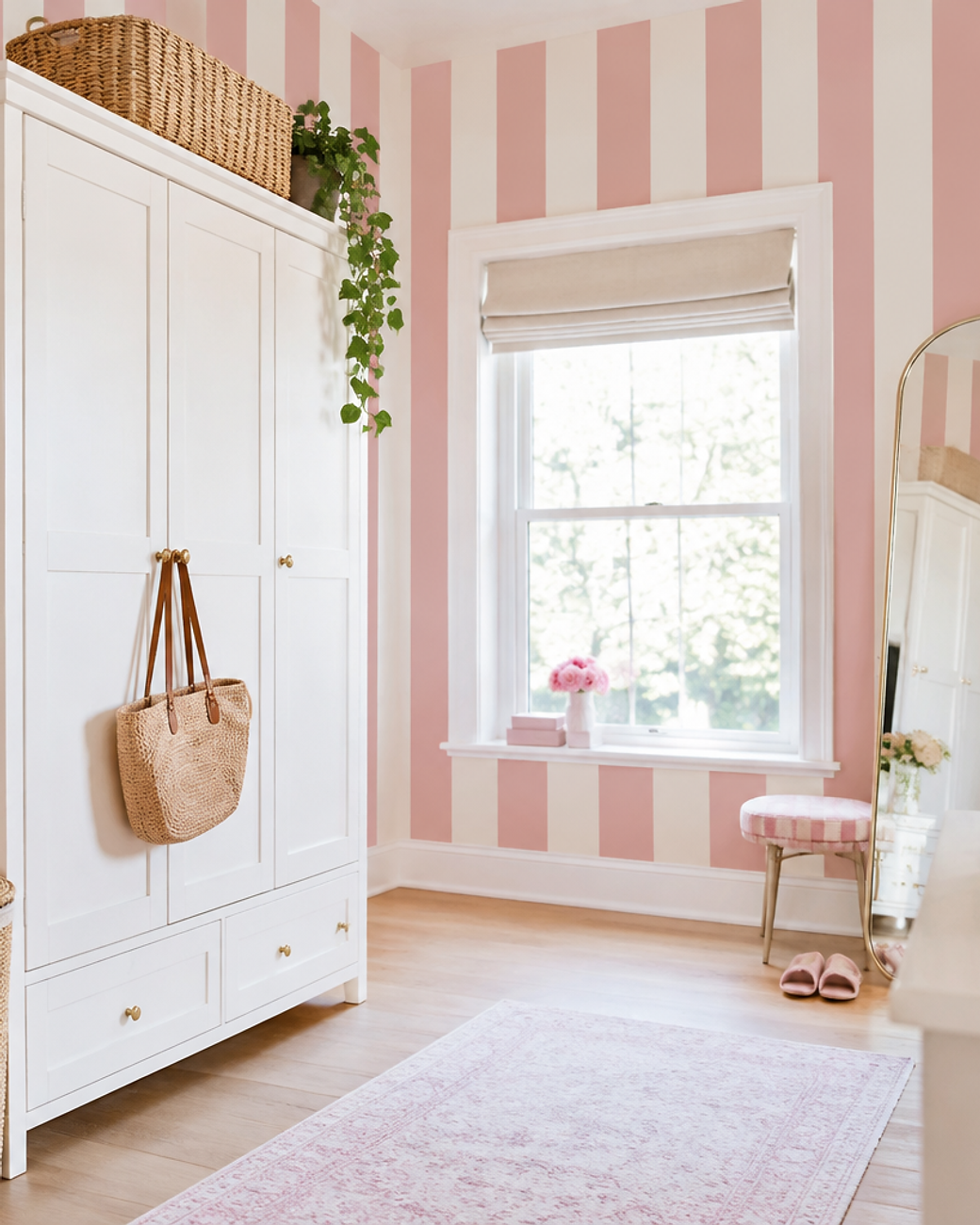
36Candy Stripe
Wide candy stripes in pink and cream feel cheerful and retro. The bold rhythm makes small rooms feel taller.
Keep the stripe width generous so the pattern stays calm.
White wardrobes and rattan baskets finish the scheme.
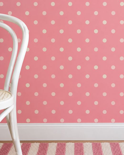
37Bubblegum Polka Dot
Bubblegum dots on rose are playful without being childish. Even spacing keeps the pattern tidy.
It works well in a dressing room or a child’s bedroom that will grow up with them.
Add white furniture and one striped rug.
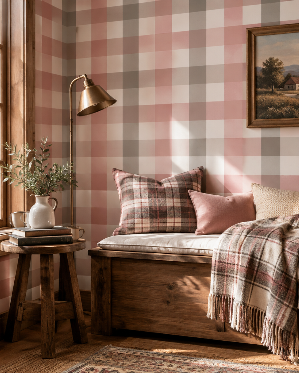
38Pink Buffalo Check
A large gingham check in rose and cream feels warm and familiar. The oversized scale keeps it modern.
It suits a snug, a reading corner or a cabin-style bedroom.
Wood, wool and a plaid throw complete the picture.
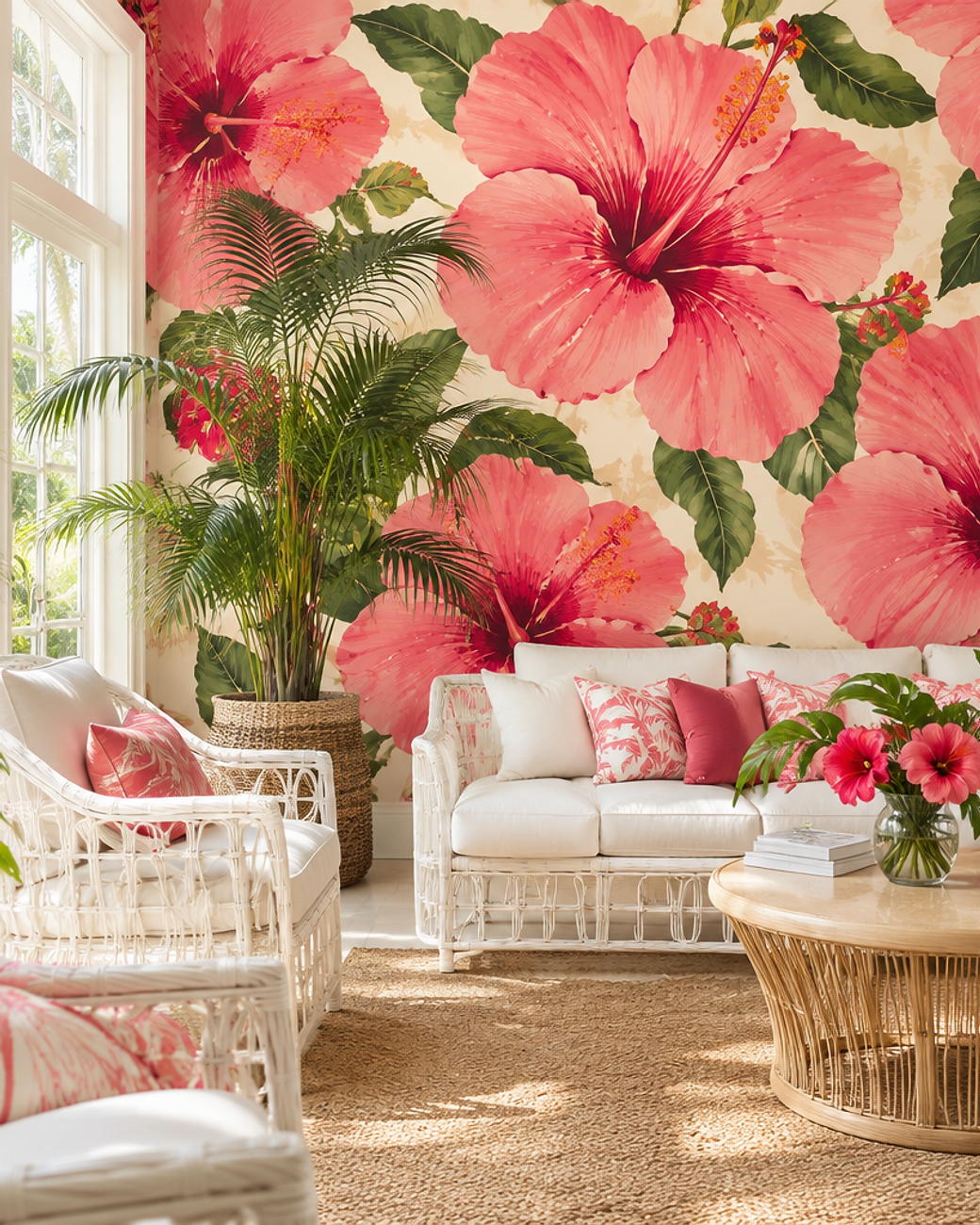
39Oversized Pink Hibiscus
Oversized hibiscus blooms in coral and magenta bring holiday energy home. Painterly petals stop the pattern feeling like a postcard.
It thrives in bright rooms filled with plants.
White rattan seating keeps the scheme light.
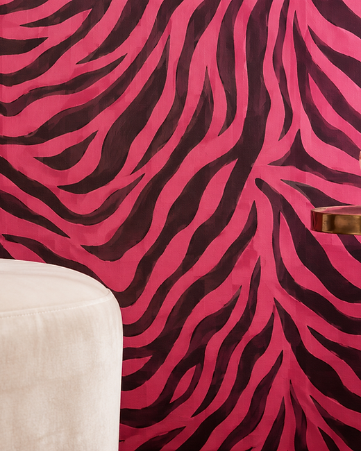
40Hot Pink Zebra
Zebra stripes in hot pink are bold, graphic and unexpectedly fun. Flowing lines keep the print from looking rigid.
Use it behind a bed as a single dramatic gesture.
Cream velvet and brass keep the room from tipping over.
Nursery, Kids and Whimsical Pinks
Children’s rooms are where pink can be playful again. Soft palettes keep the fun without the cartoon clutter.
Every idea below is gentle enough to stay in place as a child grows, which saves repainting in three years.
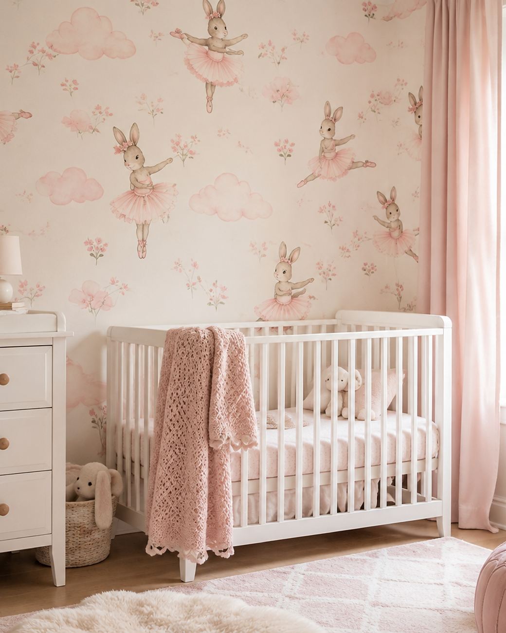
41Ballerina Bunny
Ballerina bunnies in tutus drift across soft pink clouds. It is whimsical without relying on cartoon characters.
The muted pinks mean the room will not need redecorating too soon.
White furniture and a knitted blanket soften it further.
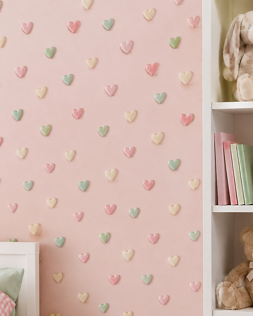
42Candy Hearts
Retro conversation hearts add a sweet, nostalgic note. Small repeats stop the pattern becoming overwhelming.
It suits playrooms and small bedrooms where joy matters more than restraint.
Keep toys pale and add one woven basket for storage.
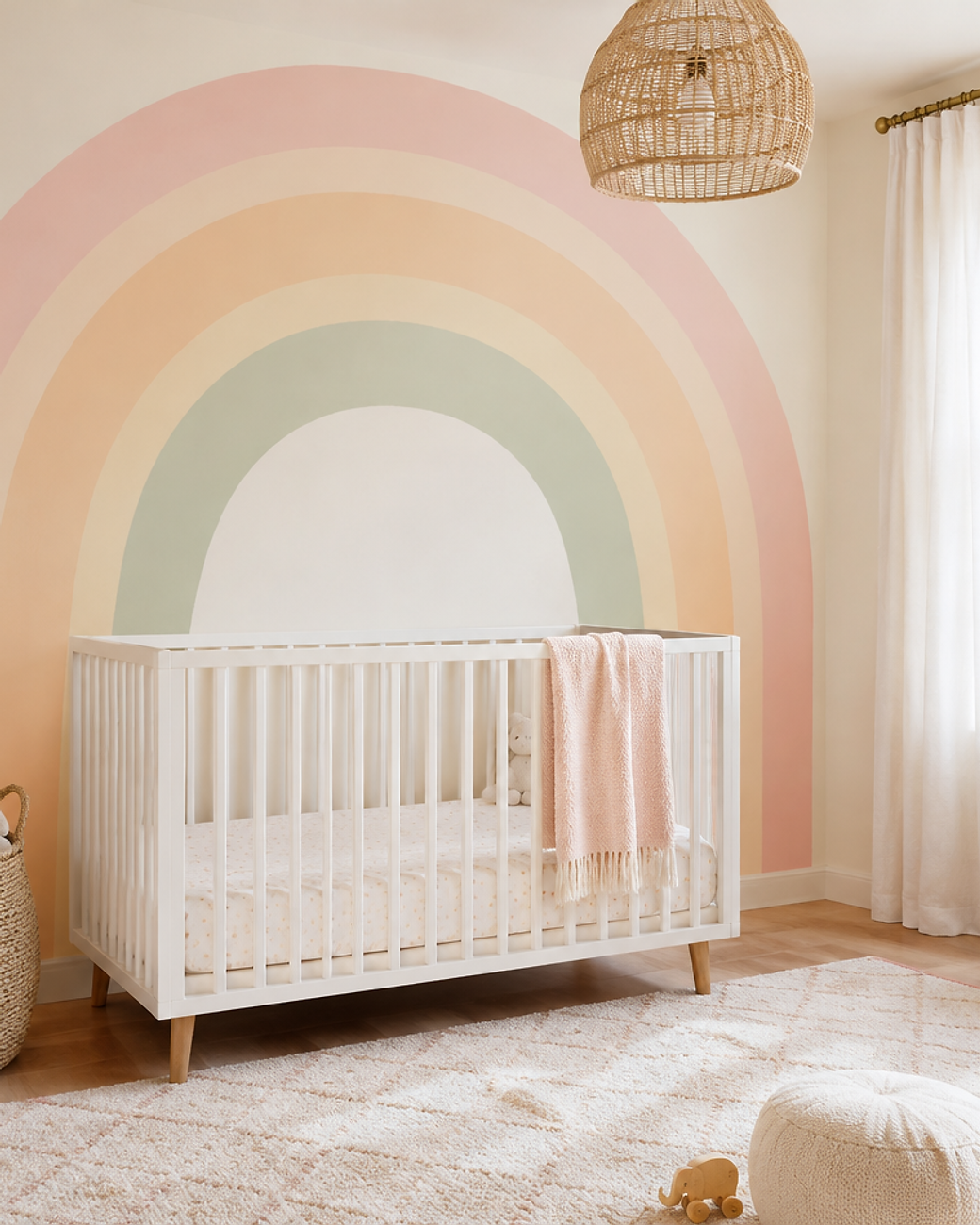
43Pastel Rainbow Arches
Pastel rainbow arches in blush, peach, butter and sage feel hopeful and calm. Painted bands look softer than printed ones.
The mural can grow with a child because the colours are muted.
A white cot and woven pendant complete the room.
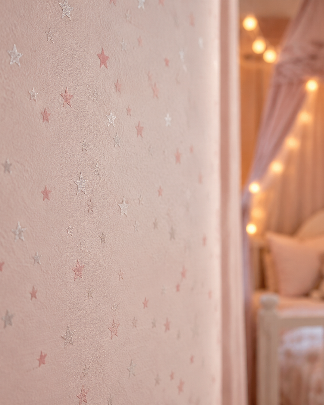
44Tiny Pink Stars
Scattered stars in pale rose and pearl bring a little night magic. A faint shimmer catches evening light.
Keep the stars small and loosely spaced so the wall stays quiet.
Fairy lights and a canopy make it feel enchanted.
45Ditsy Daisy Field
Small daisies in pink and white with sage stems feel freshly picked. Dense repeats create a soft, almost dotted texture.
It brings warmth to a bright playroom without any strong colour.
Pale wood toys and a woven rug finish the look.
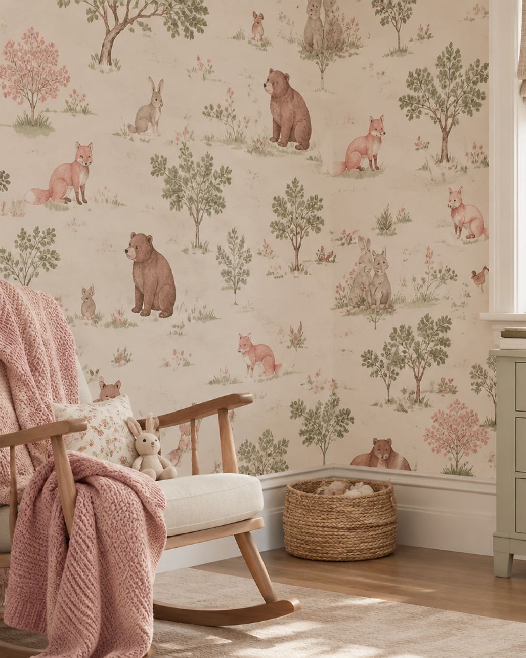
46Storybook Animal Friends
Hand-painted foxes, rabbits and bears wander a cream landscape. The dusty palette keeps it gentle and timeless.
It gives a nursery a story without a single character logo.
A rocking chair and knitted throw make the corner complete.
Luxe, Moody and Modern Pinks
Deep pinks come alive in the evening. Plum, mauve and mulberry feel rich, calm and grown-up.
Texture matters more than pattern here. Velvet, silk and plaster all reward warm lamplight.
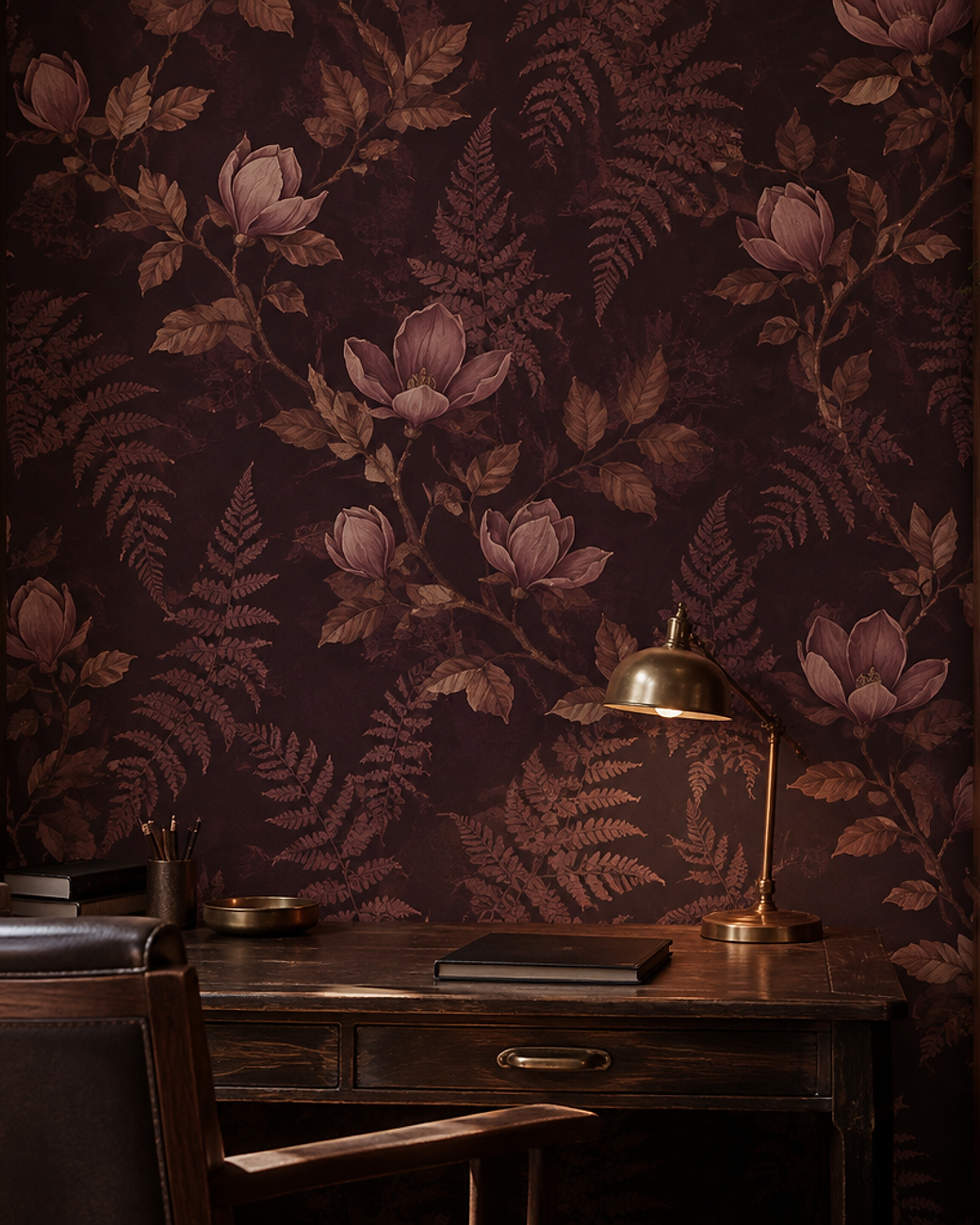
47Mauve Noir Botanical
Dark plum with silhouetted ferns and magnolia branches is dramatic and calm. The botanical shapes keep the darkness from feeling heavy.
It suits a study or a library used in the evening.
Brass lamps and dark wood desks look at home against it.
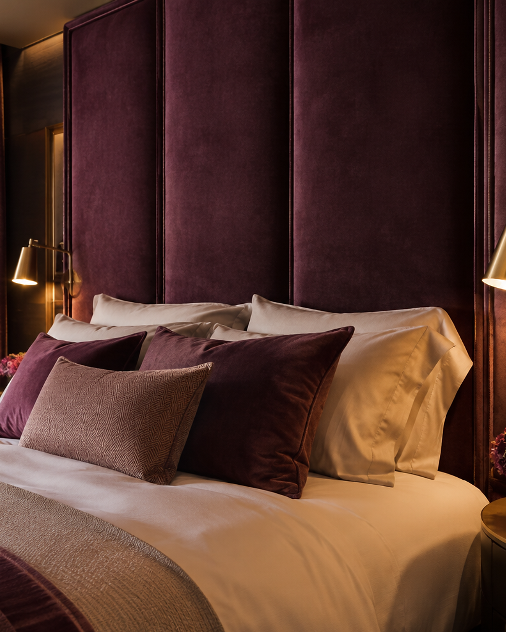
48Deep Plum Velvet Panels
Upholstered panels in deep plum bring hotel elegance to a bedroom. Piped edges add a tailored finish.
Velvet absorbs sound, so the room feels noticeably quieter.
Pale bedding and brass reading lights stop it feeling closed in.
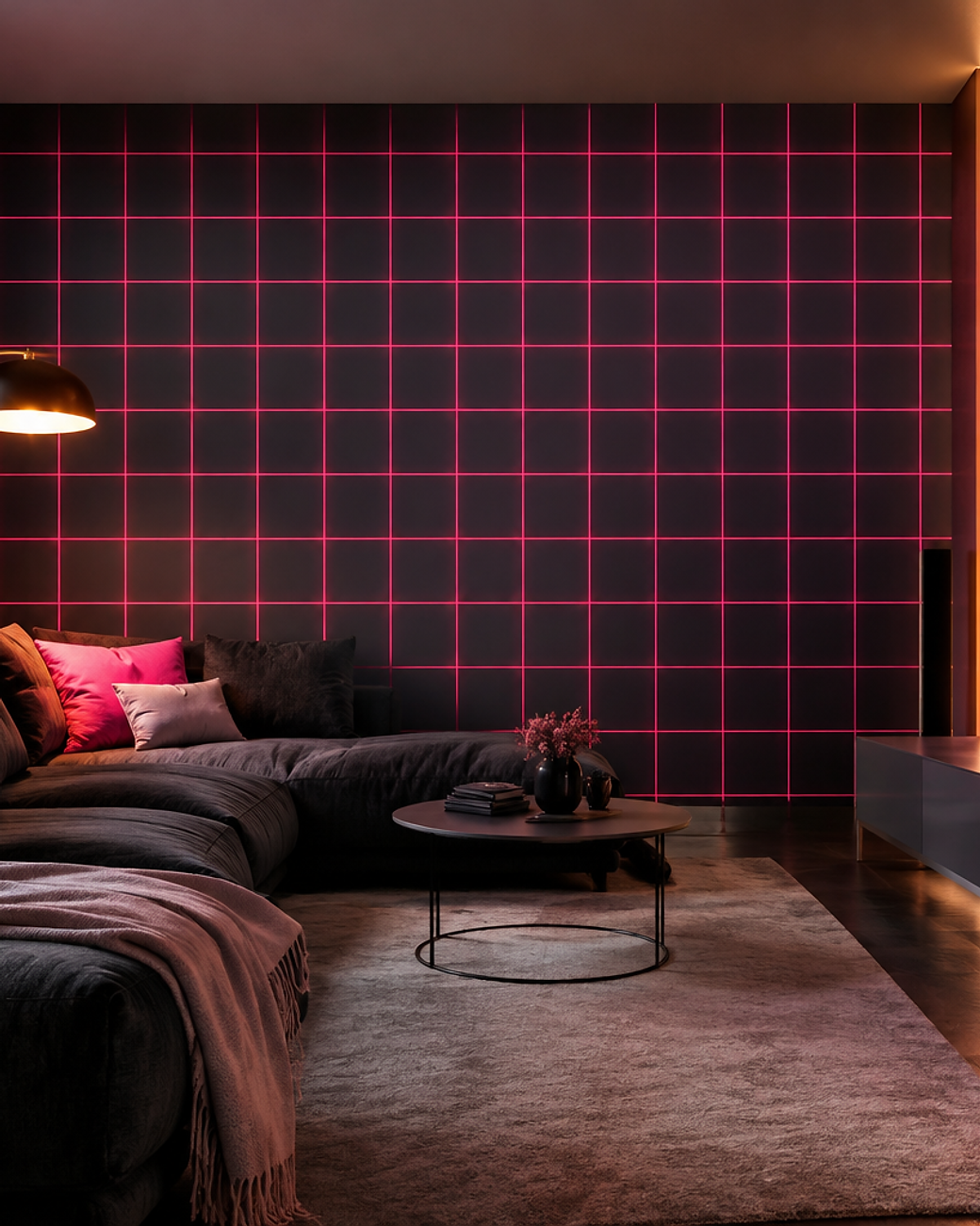
49Neon Pink Grid
A glowing pink grid over charcoal feels graphic and modern. The thin lines keep the pattern precise.
It works well in a media room where the wall is seen in low light.
Dark seating and warm accent lighting complete the effect.
50Mulberry Silk Damask
Tonal damask in mulberry and plum lets the pattern emerge from the sheen. It reads as texture until the light moves.
It is a refined way to use a deeply saturated pink.
Add a gilded frame and a velvet chair for contrast.
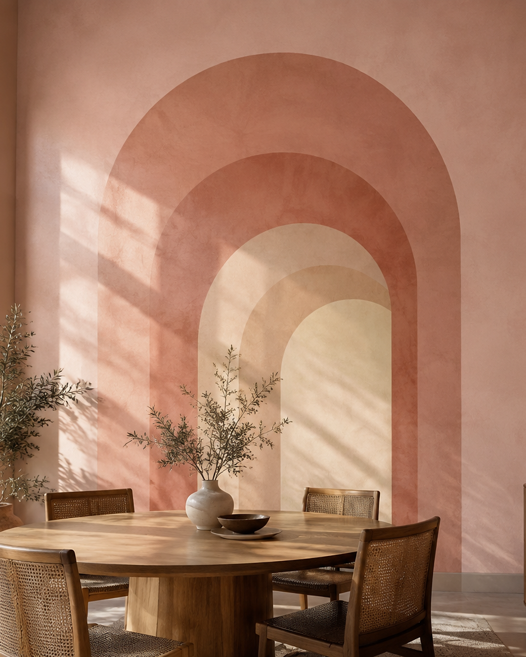
51Blush Plaster Arches
Layered plaster arches in rose, clay and cream add depth to a tall wall. Each arch recedes further into colour.
It feels like architecture rather than decoration.
Round tables and cane chairs suit the Mediterranean mood.
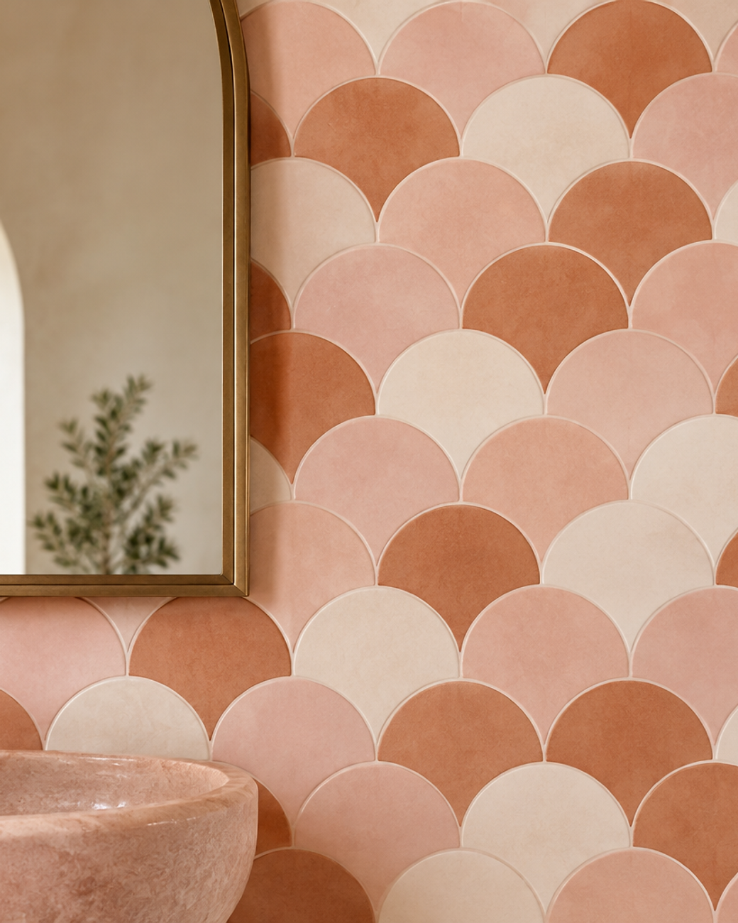
52Terracotta and Pink Scallop
Scalloped fans in clay, blush and cream mimic hand-made tile. The repeat is soft and rhythmic.
It brings texture to a bathroom without real tiling work.
A pink stone basin and arched mirror finish the scheme.
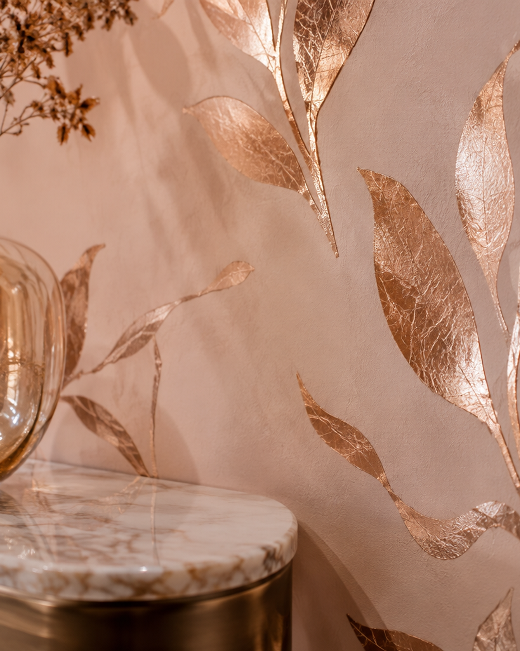
53Gilded Rose Accent
Hand-gilded rose gold leaf over blush plaster is quietly opulent. Fine crackle makes the finish look aged and artisanal.
Use it in a small area where the metal can be appreciated.
Marble and glass accessories keep the scheme from feeling busy.
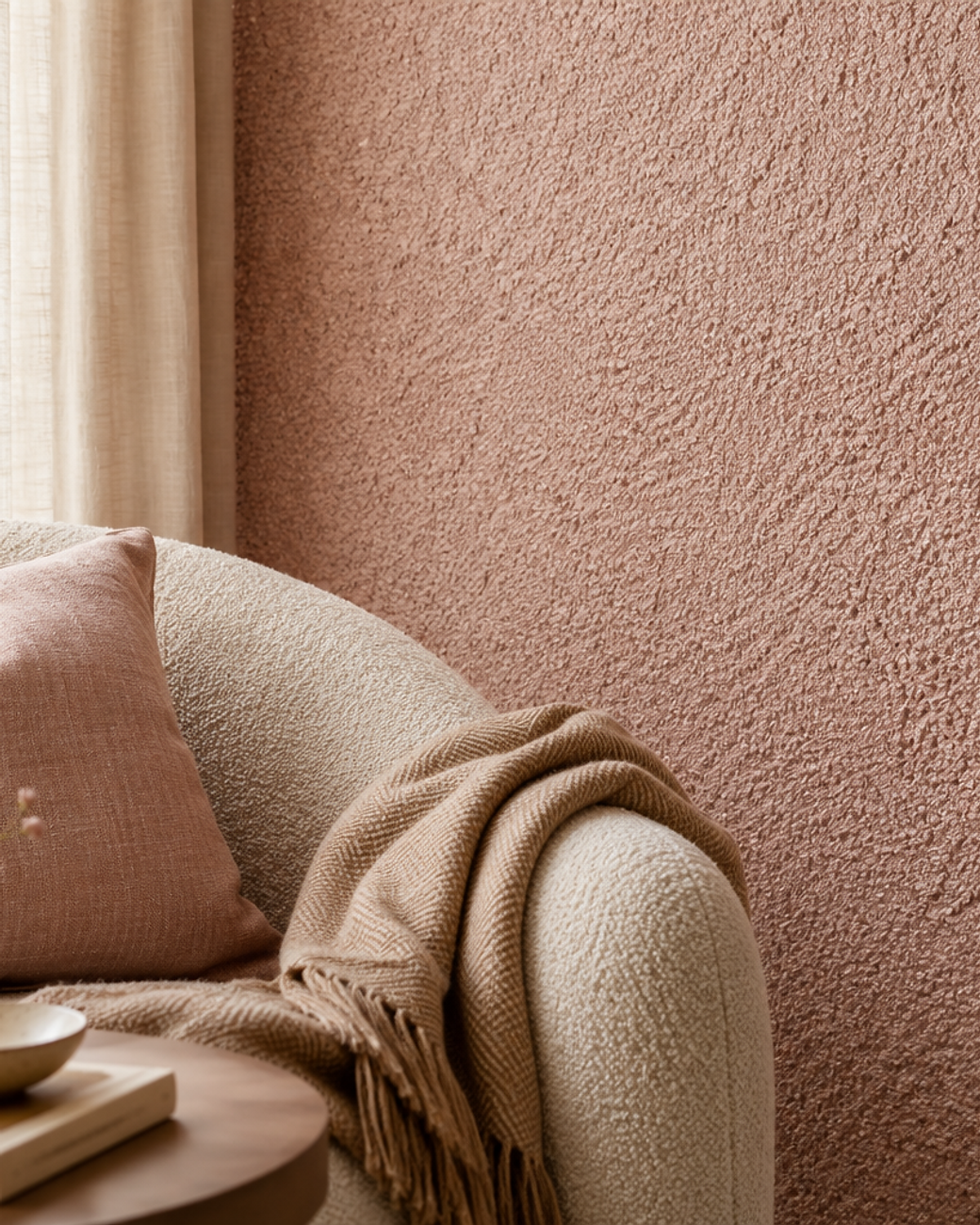
54Blush Bouclé Texture
Bouclé texture in blush brings the softness of a knitted throw onto the wall. The loops create deep, tactile shadow.
It is one of the warmest ways to use pink in a cool room.
A bouclé chair and linen curtain repeat the texture gently.
55Sunset Ombré Mural
A sunset gradient runs from peach through coral to deep plum. It turns a plain wall into the main event of the room.
Ask for a seamless floor-to-ceiling print so the horizon never breaks.
Curved seating and travertine keep the mood calm.
How to choose pink wallpaper for your room
A pink that looks perfect online can look grey on your wall. The light in your room decides far more than the swatch does.
Work through the five steps below in order. It takes one afternoon and saves a very expensive mistake.
1. Read your light before you read the shade
North-facing rooms wash pink out and push it towards grey. Choose a warmer blush with a peach undertone to compensate.
South-facing rooms make pink glow and can turn cool pinks slightly lilac. In those rooms a dusty rose stays true.
2. Match the undertone to your wood
Oak and cane have yellow undertones, so they love warm blush and clay pinks. Walnut and mahogany have red undertones, which suit mauve and mulberry.
Cool grey furniture is happiest with a pink that has a touch of blue, such as rosewater or powder pink.
3. Decide the scale from the doorway
Stand at the door and look at the wall from six metres away. If the pattern disappears into a mush, it is too small for that room.
Large repeats need large rooms or generous wall heights. Small repeats work in powder rooms, hallways and studies.
4. Pick the finish for the room’s job
Matte and plaster finishes hide wall imperfections and feel calm. Use them in bedrooms, living rooms and dining rooms.
Gloss, mica and silk finishes reflect light and wipe clean. Save them for bathrooms, dressing rooms and ceilings.
5. Sample in the actual room
Tape an A4 sample to the wall and look at it at breakfast, at noon and under lamplight. Pink changes more than almost any other colour.
View it next to your actual flooring and fabric offcuts, not against a white page.
6. Buy the correct quantity
Measure wall width and height, then divide by the roll coverage on the label. Add ten percent for mistakes and fifteen percent for large repeats.
Always order from one batch. Pink is the colour most likely to show a batch difference between rolls.
How to hang and care for pink wallpaper
Pink hides marks better than white, but it shows seams and fading more clearly than a busy print. Preparation is most of the job.
Prepare the wall properly
Fill and sand every imperfection before lining. A lining paper costs little and stops the pink reading unevenly under light.
Follow the paste instruction exactly
Paste-the-wall papers need a roller and a steady hand. Paste-the-paper papers need a booked fold and a few minutes of rest.
Protect it from direct sun
Strong afternoon sun will fade any pink over a few years. Sheer curtains or a UV film on that window solve it.
Clean with a dry cloth first
Most marks lift with a soft eraser or a dry microfibre cloth. Washable and vinyl finishes can take a damp cloth with mild soap.
Control moisture in bathrooms
Use a proper extractor fan and a wipeable paper. Never hang standard paper directly behind a shower.
Pink wallpaper questions, answered
Is pink wallpaper still in style in 2026?
Yes. Pink has moved from trend colour to a modern neutral. The 2026 version leans softer and more textured, with dusty rose, blush plaster and mauve leading over bright bubblegum.
What colours go with pink wallpaper?
Cream, warm white, pale oak, brass, olive green and charcoal all work. For contrast, deep plum and forest green make saturated pinks look expensive rather than sweet.
Does pink wallpaper make a room look smaller?
Only if the shade is dark or the pattern is dense. Pale blush and vertical stripes make a room feel taller and lighter, so small rooms can absolutely take pink.
Which pink suits a north-facing room?
Choose a warm blush with a peach or coral undertone. Cool pinks turn grey in north light, while warm ones keep their glow.
How much wallpaper do I need for a feature wall?
Multiply the wall width by its height for the square metres, then add fifteen percent. Check the roll coverage and pattern repeat on the label before ordering.
Can pink wallpaper go in a bathroom?
Yes, if you choose a wipeable or vinyl finish and keep it away from direct shower spray. Good ventilation is essential in any wallpapered bathroom.
Pick one wall and start there
Pink wallpaper works because it does two jobs at once. It warms a room and it gives the eye something to rest on.
You do not need to commit to a whole house. Choose one wall, order three samples from this list, and live with them for a week.
The right pink will look softer every morning you wake up to it. That is usually how you know.
Fifty-five ideas, one wall at a time. Photography styled for this guide. Sample your shortlist in your own light before ordering.


